Next up on the Last Word on Hockey Adidas reverse retro jersey rankings is the Atlantic division. As shown by the grades below, many of these jerseys were quite successful by their respective teams. They arguably might have the best reverse retro division collection of jerseys in the league. Here is the Reverse Retro review for the 2.0 sweaters in the Atlantic Division.
#ReverseRetro is back!
In collaboration with teams, @adidashockey and the @NHL unveiled jerseys that call back to unique historic moments in each Club’s history and will be worn during the 2022-23 season beginning in November. https://t.co/hCCrvqEOJh pic.twitter.com/XY0uzv3lxF
— NHL Public Relations (@PR_NHL) October 20, 2022
Reverse Retro Review 2.0: Atlantic Division
Boston Bruins (A)
(Pooh) Bear necessities. #reverseretro
Get yours 11.15#NHLBruins x @adidashockey pic.twitter.com/stgQ4QyUUp
— Boston Bruins (@NHLBruins) October 20, 2022
Here is the first grade for the 2022-23 Reverse Retro Jerseys. The Boston Bruins are finally giving the people what they want. When you think of this jersey, it brings back Patrice Bergeron’s rookie vibes. After going back to the “meth bear” on-the-shoulder patches last go-round, the Bruins are bringing back a classic. Bringing back the Bear head as the logo is a great move. This time around, instead of going with the golden yellow, the team will go with a white road concept. It looks exactly like the original and has the same shoulder patches, but it seems crisper with white.
Buffalo Sabres (A-)
The #ReverseRetro jersey will be available November 15!#LetsGoBuffalo x @adidashockey pic.twitter.com/vZFJOdfvHK
— Buffalo Sabres (@BuffaloSabres) October 20, 2022
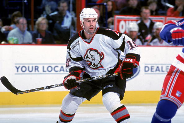
Instead of two goat head jerseys, why not have two? The team has confirmed that the goat head will be returning in the black and red colour scheme, but now the fans get one in the current colour scheme. Another white road concept, but bringing back the 2000s logo. The blue and yellow striping wrapping around the sleeves gives the jersey some character. Nothing beats the original goat head jersey, but it still is a nice jersey overall.
Detroit Red Wings (D)
🤩 #reverseretro⁰⁰Get yours 11.15⁰⁰#LGRW x @adidashockey pic.twitter.com/87kRDN3c2l
— Detroit Red Wings (@DetroitRedWings) October 20, 2022
The Red Wings passed the assignment this go-round, but overall still not great. Detroit has one of the most iconic jerseys in sports and is something that should never be tampered with. But in this case, they have to get creative. Detroit is throwing it back to the early days of its existence. The Detroit red is the base for the jersey, but instead of incorporating white stripes, they added black, giving it a bolder look. It isn’t the greatest, in my opinion, but it offers Detroit a different look on the ice.
Florida Panthers (B+)
CAN YOU EVEN BELIEVE
☀️🌴🏒 » https://t.co/1scA7KeX0m pic.twitter.com/KH4Cdwon1m
— Florida Panthers (@FlaPanthers) October 20, 2022
This is masterfully done. Taking the shoulder patch from the 2000’s jersey and making it the primary logo is beautiful. The baby blue base comes from an alternate they used back in 2009. It is a bit of a reverse from the last round and incorporates the red and the navy in the stripes. A clean and crisp jersey will have the Panthers looking great on the ice.
Montreal Canadiens (A+)
Procurez-vous en précommande le chandail @adidas #ReverseRetro 2022 dès maintenant!https://t.co/zdEz5ta42E
Preorder your @adidas #ReverseRetro 2022 jersey now!https://t.co/LvzrzC3Hdq pic.twitter.com/sxk0dPTSsZ
— Tricolore Sports (@TricoloreSports) October 20, 2022
This may be my favourite of the bunch. With years of retro uniforms, the Montreal Canadiens are paying tribute to another Montreal team. The Montreal Expos baseball team rocked these same colours and was iconic in the baseball world. The baby blue base comes from the same colour the Expos used. There is still more blue and white in the stripes in the centre of the jersey, like they’ve used in the past. All around, this is a great jersey and screams Montreal in all aspects. They are seeing Cole Caufield celly in these beauties will be fun.
Ottawa Senators (A-)
#reverseretro
Commande le tien 11.15#GoSensGo x @adidashockey pic.twitter.com/LTHUJtmCDk— Ottawa Senators (@Senators) October 20, 2022
Another black jersey for the Ottawa Senators. Keeping their current logo which they fully rebranded to, they incorporated their old black alternate jersey in some capacity. The team added red sleeves to give it more pop and character. A red stripe at the bottom gives it a bit more flare to it as well. The only thing missing is gold, but overall a good concept but similar to their current home jerseys.
Tampa Bay Lightning (C+)
It’s allllllll in the details. ⛈ pic.twitter.com/6Ds9ZShR8X
— Tampa Bay Sports (@ShopTBSports) October 20, 2022
The storm jersey is returning to the ice. After making its debut in 1997, the Lightning are bringing back the uniform. The sleeves remain the same, bringing back the iconic lightning bolts. Ocean water at the bottom remains and wraps around the jersey. Tampa bay swapped the colours as the original had a black base with grey on the sides and sleeves. Gray is now the base, and the sleeves are black. It screams everything in the team name looking like a storm. Should be interesting to see how they look on the ice.
Toronto Maple Leafs (A)
2022 ⏪ 1962#reverseretro Get yours 11.15#LeafsForever x @adidashockey pic.twitter.com/sxoQZx5ObI
— Toronto Maple Leafs (@MapleLeafs) October 20, 2022
This jersey is beautiful. Blue and white through and through. A solid blue base with a white shoulder gives it a lot more pop than their current home jersey. A reverse concept of their white jersey alternate in 2003-04. We’re talking about Alexander Mogilny’s days when that beautiful thing was worn. The stripes are white on the sleeves and in the base. Even the maple leaf’s crest is a throwback to the 2003-04 white alternate jersey. Just a beautiful jersey and gives the leafs a nice bold look on the ice.
Conclusion
As the Atlantic Division Reverse Retro review comes to an end, we get one conclusion. Overall this division had plenty of standout jerseys and nailed the concept. Some classics are coming back, while the original six teams are going back to an older time period. It’s just a great set of jerseys that will look great on the ice when worn.
Main photo:
Embed from Getty Images


