The Reverse Retro 2.0 jerseys from Adidas were revealed on Thursday. Each sweater takes pieces from the team’s past and gives them a modern spin. The Metropolitan Division had some solid outings in the first go-around. However, there were also a few misses. Let’s take on the Reverse Retro Review for the 2.0 sweaters in the Metropolitan Division.
Reverse Retro Review 2.0: Metropolitan Division
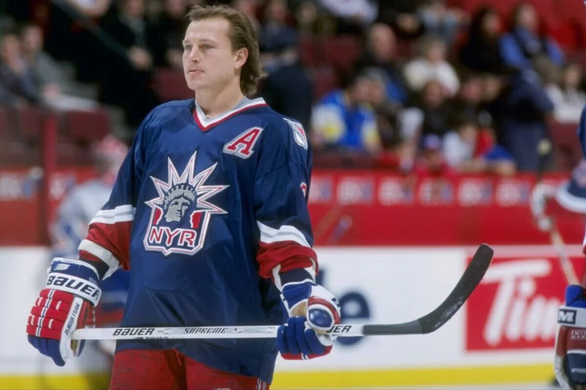
New York Rangers (A)
Iconic. Perfection. 😍
Available for preorder at 12 PM today on https://t.co/wT6lc1Qyxb or at the MSG Team Store on Nov. 15. #NYR x @adidashockey. https://t.co/GyKRmyJvtU pic.twitter.com/nVlqCrqAo2
— New York Rangers (@NYRangers) October 20, 2022
Why fix what’s not broken? The Lady Liberty jerseys are some of the most fondly remembered alternate sweaters. Adidas’ last incarnation was well-received and it’s the same this time around. The shade of royal blue is a little lighter this time around, but it’s still a good-looking sweater. Red makes a return to the sleeves and it’s similar to what’s on their pants. Rangers fans have been fairly lucky in having some great alternate jerseys. Looking at the anniversary and outdoor game jerseys shows the Rangers’ good fortune in the sweater department.
Pittsburgh Penguins (A-)
1992 would be proud 🤩
Get your #reverseretro on 11.15.#LetsGoPens x @adidashockey pic.twitter.com/lvO3waW79R
— Pittsburgh Penguins (@penguins) October 20, 2022
Welcome back to the Robo Penguin of the 1990s. This sweater was also fondly remembered and many hoped the 90s twist on the Pens’ logo would return. It was the most-requested Reverse Retro concept the last time around, so Adidas listened and gave the public what they wanted. There’s yellow shoulder piping that adds to the jersey and makes it one of the better ones. Maybe Snoop Dogg will wear this in a video as he did in the video for “Gin and Juice.”
Washington Capitals (B+)
𝗘𝗘𝗘𝗘𝗘𝗘𝗘𝗘𝗔𝗚𝗟𝗘
Get your #ReverseRetro 11.15#ALLCAPS x @adidashockey pic.twitter.com/0GOyOPtPAj
— Washington Capitals (@Capitals) October 20, 2022
The Caps go back to the Screaming Eagle concept from the first round of Reverse This time Washington fully returns to the black, blue and copper colour scheme that was part of the 2005 sweaters. The red, white and blue remix of the eagle was a solid one, but this is up there with some of the better sweaters. Going back to the future works in this instance. It’ll be nice to see Alex Ovechkin in this look once again.
Carolina Hurricanes (A-)
2019 ➡️ 2022 😅 #ReverseRetro
Get yours 11.15#LetsGoCanes x @adidashockey pic.twitter.com/pgwJXJ0vBG
— Carolina Hurricanes (@Canes) October 20, 2022
The Canes stay away from the temptation of using the Hartford Whalers colours once again. However, this jersey is pretty nice in its own right. Most teams have decided to use white as a base, but Carolina went with red and it pops. Some may think the diagonal Canes is simple, but that can be effective. The use of the Hurricane flags for shoulder crests is a nice touch. One of the better-looking ones of the bunch. A nice rendition of the road whites that have similar traits.
New Jersey Devils (B-)
In ’82 the Rockies relocated to Jersey and became the #NJDevils.
Our 2022 @adidashockey #ReverseRetro uniform pays homage to that history.
📰: https://t.co/Z2miy7I9di pic.twitter.com/A6hXgior73
— New Jersey Devils (@NJDevils) October 20, 2022
Props to the Devils being experimental and remixing some of their non-New Jersey past. This sweater pays homage to the Devils’ inaugural ones but has the twist of the Colorado Rockies’ colours. Reverse Retros allow the past to combine with the future to make something solid. Some were probably hoping for green to be part of the colour scheme, but this works too. It’s the second sweater to an homage to the Rockies (not the baseball one) franchise. The Colorado Avalanche have the big “C” that was influenced by the state flag.
New York Islanders (B-)
The Fisherman. Remastered for the 50th Anniversary. #ReverseRetro
Get your jersey in-store starting 11/15 or preorder below starting at 12PM today via the link below.#Isles x @adidashockey
— New York Islanders (@NYIslanders) October 20, 2022
The Islanders actually tried this time around and brought back the Gorton’s Fisherman. One wonders if general manager Lou Lamoriello was left out of the design process because he would have griped the whole time about anything fun. There was hope the waves at the bottom of the jerseys would be brought back. However, these are decent considering the last effort was made with seemingly little effort. More of the 1990s colours would have been nice, but it’s a much better outing this time out.
Columbus Blue Jackets (C)
The old with the new. Remixed for 2022.#reverseretro
Get yours 11.15#CBJ x @adidashockey pic.twitter.com/bUOKkkkDzO
— Columbus Blue Jackets (@BlueJacketsNHL) October 20, 2022
It’s a decent effort, but one would have loved to have seen the cannon make an appearance. The use of Civil War battle stars on the sleeves is one of the better touches for any sweater. Some of the more cynical fans say that it’s the Blue Jackets logo slapped onto the Winnipeg Jets’ first Reverse Retro entry. It’s a little better than that, but it’s also a little better than the red entry that was Columbus’ first Reverse Retro sweater. It could be better, but it’s also not the worst.
Philadelphia Flyers (F)
⚪️🟠⚫️#ReverseRetro
Get yours 11.15.#FueledByPhilly x @adidashockey pic.twitter.com/yeJXE1VeAW— Philadelphia Flyers (@NHLFlyers) October 20, 2022
As we wrap the Reverse retro review, the honour (or dishonour) of the worst jersey in the Metro goes to the Flyers for their seemingly plain offering. The sweater is a tribute to the Stanley Cup championship teams of the 1970s. However, it seems to be a bland offering from the Broad Street Bullies. A little more orange would have been nice. However, the Flyers really haven’t had to change much with the well-known logo and colour scheme. Maybe a look at the 1930s Philadelphia Quakers would have been more appropriate. Despite this, one saving grace is the fact the jersey unveiling is the return of Cooperalls. These were long pants that the team wore during the 1980s. However, they’ll only wear long pants during the warm-ups. What a missed opportunity.