Next up on the Last Word on Hockey Adidas reverse retro jersey reviews is the Pacific division. Yes, the NHL Retro jerseys are back again! Because the league is looking for a way to get their post-pandemic money back, and soon. So why not go with what worked last time, right? Here is the Reverse Retro review for the 2.0 sweaters in the Pacific Division.
Reverse Retro Review 2.0: Pacific Division
The thing about art is that it is entirely subjective. Sure, there are things like understanding perspective and colour theory and experimental dynamism and other stuff. But the bottom line is if you like it, you like it. And clearly, the NHL is hoping that there are enough fans or collectors out there to fill the coffers once again. Heck, look at it as a way to not only support your team but support the players, too. That salary cap ain’t gonna raise itself, don’t ya know!
Seattle Kraken: D+
Blame the league for pushing a one-year-old team to do a “retro” anything. The Seattle Kraken already did the “Pride Runs Deep” thing – which looks great – so there aren’t a lot of choices left.
New sweaters coming to The Deep! 👀
Introducing our @adidas Reverse Retro 2022 #reverseretro
Pre-order online today, available in store on 11.15#SeaKraken x @adidashockey pic.twitter.com/0BDwADh4el
— Seattle Kraken (@SeattleKraken) October 20, 2022
Buoy’s face was probably a no-go decision by the NHL retro jerseys because they hate fun. And removable teeth.
Opinion: Some teams go with simpler lines, harkening back to earlier configurations. Some use old mascots or colours to hit the nostalgia jones of old men with bad memories. Without those options, Seattle’s trying for them anyway.
Verdict: Oof. Again, it’s hard to blame the team for being told to simultaneously get new buyers and appease old ones. They’ve been working hard at the former and don’t have any of the latter.
Vancouver Canucks: C
Vancouver Canucks fans, welcome… Johnny Canuck!
Throwback to 1962.
Introducing our @adidas Reverse Retro 2022 #ReverseRetro
Available 11.15 – pre-order on https://t.co/LrfISlAneT#Canucks x @adidashockey pic.twitter.com/qjXXnE8cMN— Vancouver Canucks (@Canucks) October 20, 2022
Oh, you already met? Huh. Well, he’s going to be your roommate this year, whether you want one or not. Yes, we know he already has his own place, but that’s way out in Abbotsford so it’s like he’s not even here.
Opinion: Remember when you were a kid and your parents were tired of needing to buy you new clothes every month? Those big ol’ stripes on the bottom are a flashback to when mom would stitch a new length on your sweater so she could cut down on trips to Zellers.
Verdict: Meh. The number on the front is a nice touch, but what else is here? Announcers are going to love that bit – easier to call the games if you’re not familiar with the players. The lace neck isn’t really doing it, and the colours are just “adding black”.
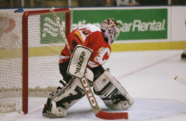
Calgary Flames: C+
The Calgary Flames are not-quite shaking things up here.
Straight 🔥
Introducing our @adidas Reverse Retro 2022 🔥 #ReverseRetro
Available 11.15#Flames | @adidashockey pic.twitter.com/CtdwSECku6
— Calgary Flames (@NHLFlames) October 20, 2022
Educational, though, with the clear illustration of plate tectonics on the front, there.
Opinion: That jagged angle works pretty well, especially with it getting mirrored on the sleeves. Otherwise, nothing to write home about except for adding black.
Verdict: Keeping what’s now a classic design classic isn’t really the point of the exercise, is it? It’s okay, but it definitely feels like a one-off instead of a potential “real” jersey.
Anaheim Ducks: C+
Wildwing Flashblade alert! Okay, it’s not quite all the way back to their superhero origins, but who wouldn’t pay for a Duke L’Orange jersey now?
Introducing our @adidas Reverse Retro 2022 #reverseretro⁰
Available 11.15
⁰#FlyTogether x @adidashockey pic.twitter.com/0gdU0kFg2H— Anaheim Ducks (@AnaheimDucks) October 20, 2022
Having all the powers of A Certain Mouse(TM) backing the team, there was always going to be some cartoon elements to the Anaheim Ducks. They can try to shed it with a name change – even an ownership change – but it’s always going to be a part of their history.
Opinion: Some colour to it, which is nice, but the purple/green combo was better. Orange is a strong colour, but pairing it with white mutes it down.
Verdict: Feels like filtered nostalgia and not much else.
Edmonton Oilers: B
“Knock, knock!”
“Who’s there?”
“Orange you glad it’s not the – oh, it is. Never mind.”
A classic updated for a new era in Oil Country.
Introducing our @adidas Reverse Retro 2022. #reverseretro
Available 11.15#LetsGoOilers x @adidashockey pic.twitter.com/Wblm36OGFh
— Edmonton Oilers (@EdmontonOilers) October 20, 2022
The Edmonton Oilers understood the mission better than their Albertan neighbours, at least. It’s not exactly “different” from an older jersey of theirs, but they added a hint of their classics with colour.
Opinion: The orange borders are a nice touch to break up the black & white. Shoulder patches with the steel shield/gears/oil drop are well done, and best left small.
Verdict: That dynamic logo still looks a bit minor-league, but those tend to be more fun that the NHL jerseys anyway. It’s a good setup.
San Jose Sharks: A
Past? What is the past? What is a team? Sharks eat seals, and that’s never more clear than this absolute theft of the Golden Seals jerseys.
Bay Area Past 🤝 Bay Area Future
Introducing our @adidas Reverse Retro 2022 #reverseretro!
Available 11.15
#SJSharks x @adidashockey pic.twitter.com/sfUzKIXasp— San Jose Sharks (@SanJoseSharks) October 20, 2022
That’s them. That’s the Golden Seals – who were, appropriately enough – bloody awful. The Oakland Seals lasted for nine years before eventually moving to Cleveland and then merging with the Minnesota North Stars. Ironically, because of how that whole thing turned out as half the team moved back to California as… the San Jose Sharks. This is certainly the right time to harken back to a team that never reached a .500 season in nine years.
Opinion: It’s not really theft of another team if you squint really hard, but it is a delight for old codgers. And it does hint at the original teal of the Sharks themselves. If it was a new team bringing this look out they would be widely hailed as big and bold.
Verdict: Ignore the history, and it is a dramatic, classic “old sports” look. And if you know the history, that’s a bonus.
Los Angeles Kings: A+
Here we go. When you have Snoop Dogg as a fan, you lean into the royalty theme.
Forum Blue & Gold 👑
Introducing our @adidas Reverse Retro 2022 #reverseretro
Available 11.15#GoKingsGo x @adidashockey pic.twitter.com/sYXE8u8U7y
— LA Kings (@LAKings) October 20, 2022
A whole lot of Marcel Dionne flashbacks showing up in the timeline, now. That’s our personal, in-our-heads timeline. You wouldn’t know it unless you were there.
Opinion: Are purple and gold a really good combination of colours? One that really encourages younger people with a bit of spare money in their pockets to spend? The answer, of course, is who gives a rip? This is the Los Angeles Kings of the past, and they’re letting everyone know it.
Verdict: Here’s the good stuff in NHL retro jerseys. Completely unabashed in the cheezy logo and the royal purple and gold colours. If you’re going to tap into the past, make it yours and make it unafraid.
Vegas Golden Knights: A
It’s okay if you don’t know chessboard notation. The ones who do are saying things like “Oh, SNAP!” and other young-person stuff. Trust us.
IT’S HERE AND IT’S PERFECT 😍
Introducing our @adidas Reverse Retro 2022 #reverseretro
Available for pre-order at all VGK team stores today, in-store 11.15#VegasBorn x @adidashockey pic.twitter.com/1kwrIqf8sF
— 🏆 – Vegas Golden Knights (@GoldenKnights) October 20, 2022
It looks exactly like the Vegas Golden Knights jerseys, though. The NHL retro jerseys are supposed to – oh. OH!
Opinion: It GLOWS IN THE DARK.
Verdict: GLOWS! IN! THE! DARK!
And with that, we will end our Pacific Division Reverse Retro Reviews.
Main Photo:


