The Minnesota Twins introduced a brand new logo and uniform for the upcoming 20223 season. Players for the Twins were the first to unveil the new design this morning at Mall of America in Bloomington, Minnesota. It’s the Twins’ first full brand overhaul since 1987. For the first time in 35 years, they wanted to celebrate the legacy that means a lot to Minnesota. A motto from the team’s website is the following: “Inspired by the past; built for the future.” Here is the breakdown of the Twins new look, which has four uniforms with a touching tribute to the Twin cities.
— Minnesota Twins (@Twins) November 18, 2022
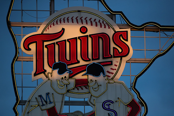
The Twins New Look
The Twins unveiled a new primary “Twins” script logo with a return and transformation of the “M” on the hat. They also included a distinct “MINNESOTA” block script on all four uniform combinations. The four all-new uniforms feature a home setting, a primary road grey set with pinstripes, and a navy blue alternate that can be worn for any game. Their most impressive uniform is a cream alternate with “Twin Cities” across its chest.
Dark as the Minnesota night sky, presenting our new home and road navy. #AllTwins https://t.co/LxEqMsUlYK pic.twitter.com/7VGQhIzkY6
— Minnesota Twins (@Twins) November 18, 2022
The new home jersey has the Twins script across the chest but no longer has the drop shadow or multiple colors. Instead, it’s now written in red with the “win” in Twins underlined. The away uniforms that feature pinstripes were previously on the alternate home uniforms from 2010-2018.
PINSTRIPES. ARE. BACK. #AllTwins pic.twitter.com/DJcQBsfbuk
— Minnesota Twins (@Twins) November 18, 2022
The new uniforms come with a new hat with a white “M” and a red mark representing the North Star. The “M” hat represents the first time since 2013 that the team will wear a hat showcasing the letter. The Twins did their homework to emphasize their pride in being Minnesota’s baseball team. The new brand hopes to unify its state along with its community. It will be exciting to see the new uniforms on the field for Opening Day 2023.
For the first time ever: Twin Cities. #AllTwins https://t.co/KklRxsdVK8 pic.twitter.com/Gw8e2iyXSf
— Minnesota Twins (@Twins) November 18, 2022
Main Photo