Sweaters and hockey have been synonymous with each other since the infancy of the sport. Teams have been identified by their iconic colours and patterns. Some of them are classic while others are classically awful. This summer our annual series focuses on the best and the worst sweaters in each team’s history. Today we have the best and the worst San Jose Sharks sweaters in team history.
San Jose Sharks Sweaters: The Best and Worst
How We Did It?
We at Last Word on Hockey used a variety of methods to compile this list. Polling came from social media, our writers, and fans. We wanted to get a variety of opinions when we put out our list. This compilation will likely spur debate. However, we wanted to see who had the most memorable sweaters in each team’s history. Let’s put our best foot forward with the best sweaters.
The Best of the San Jose Sharks
Getting a Feel for Teal
The Sharks are very much a product of the 1990s in their look. One of the colours that was more visible in that era was teal. That decade was mostly about bold colours or black and San Jose used them both in spades in its history.
https://www.twitter.com/sjsharkshistory/status/899388964687052800
San Jose debuted the teal sweaters in 1991 and they were a hit even with non-hockey fans. We saw many a Starter jacket adorned with Sharks colours in that decade from people that didn’t know hockey was a thing.
The striping was also very good and the contrasting colours of black, white and gray worked well. Players like Shawn Cronin and Link Gaetz may have donned these uniforms in the early days of the Sharks.
San Jose has even brought back this design in 2022. However, the shells are teal instead of black.
Fin is In
The Sharks also jumped on the trend of black sweaters a number of times in its history. San Jose has three different black uniforms in its history, so it would be wrong not to include one. The best of the bunch is the “Cali Fin” sweater.
This one is part of the current rotation and was unveiled in January 2024. The crest is a repurposing of the patch from the 2015 Stadium Series sweaters.
There’s also a unique shark-tooth pattern on the neckline that’s a nice touch. This uniform also uses the current colour scheme as accents and it just works.
Golden Seals
The Sharks weren’t the first Bay Area NHL team of record. Hockey was a thing when the California Seals were introduced to the league in 1967. There would name changes to the Oakland Seals and California Golden Seals before the team became the Cleveland Barons.
San Jose would use the last sweaters the team wore from 1974-76 as the basis of its 2022-23 Reverse Retros. There would be elements of gold from the old franchise and teal from San Jose.
The jersey has a Roller Derby type look to it, but it’s a nice homage. This is a cool idea from the Reverse Retro program.
The Worst of the San Jose Sharks
Losing Your Edge- Sharks Home Edition
It’s another entry from the Reebok collection of sweaters. We do appreciate the brand trying to go with more elements in this look. Some clubs like the Edmonton Oilers had pretty plain-looking uniforms.
However, the Sharks entry was pretty busy. This uniform that debuted in 2007 was the one of the few to have shoulder yokes and introduced orange trim as part of the striping pattern.
This one just seems really busy and not a good look. One has to strike a balance with teal as a base, but this one is easily the worst Sharks sweater.
Losing Your Edge- Sharks Road Edition
We can pretty much copy and paste the same complaints from the home sweater onto the road one.The contrast of the white base does help its case a little bit. However, it’s still on our list for the worst Sharks sweaters.
ICYMI: We had a JUMBO announcement this weekend😆
Congrats to the one and only, Joe Thornton on an incredible career! pic.twitter.com/e0hCyGgDV9
— San Jose Sharks (@SanJoseSharks) October 30, 2023
These uniforms would be discontinued in 2013 when the shoulder yokes and bottom striping was removed.
Stadium Series 2015
We did like the Cali Fin patch that came out of this. However, these sweaters had teal, white and black blocks on them. The same stripes would be used on the team’s socks.
One other odd element was the SJ on the side of the pants. San Jose would lose to the rival Los Angeles Kings, 2-1, in Santa Clara.
At least we got the cool Fin patch out of it.
Other Considerations
The current set is a play off the originals, but with teal pants. It’s a decent look and one of the better current sets.
San Jose’s first Reverse Retros is a play on the late 90s and early 2000s. Gray was the main colour and it’s not a good main colour.
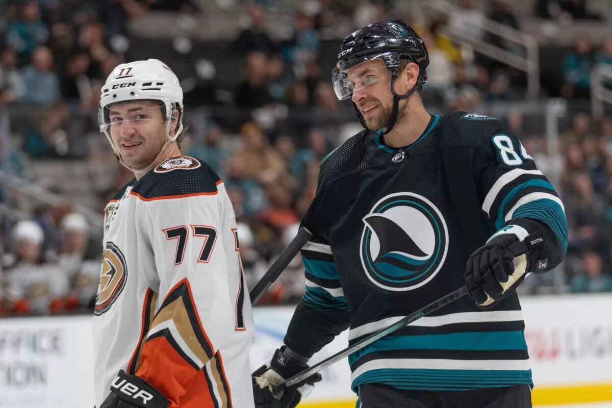
Main photo by: Stan Szeto-USA TODAY Sports