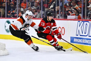
Combining the past and present, the NHL, along with their sponsor, Adidas, recently released their Reverse Retro jerseys for every team. Each club will wear these nostalgic sweaters multiple times this season. Here at Last Word on Hockey, we will be looking at all 31 jerseys and grading them by division. Last on the list is the Pacific Division.
Pacific Division Reverse Retro Jerseys
Anaheim Ducks – A+
The Anaheim Ducks nailed it with their jerseys. Going back to the Mighty Ducks logo embraced the theme of the reverse retro jerseys, as well as improving on the design. Wild Wing crashing through the ice, wearing the original Mighty Ducks logo, as well as all of the ice coming from the bottom of the jersey is a great touch. The teal colour, meant to represent water on the bottom, is a really nice colour scheme that is pleasing to the eye. The white, teal and black colours work really well together, making for a simple and clean design.
Arizona Coyotes – A-
The Arizona Coyotes incorporated the best parts of their designs into their jersey. The desert wrapped around the bottom of their jersey looks amazing, giving the impression of the logo floating around in the night. The actual logo is the Kachina logo, a fan favourite. Many people regard the Kachina jerseys as the best in the league right now, so designing their reverse retro jerseys with that logo is a great move. The purple and orange add to the “cool” vibe that the nighttime desert sets in the jersey as well. Overall, a very great-looking jersey that represents the Coyotes well.
Calgary Flames – B
The Calgary Flames‘ reverse retro jersey is one that seems confusing at first. The logo is from the 1990s when the Flames used the jersey as their alternates. “Ol’ Blasty”, the name given to the horse by fans, is the central piece of the jersey. The fire-breathing horse is the best part of the sweater, but everything else is not exciting. The bottom of the jersey is just red and yellow lines, nothing creative about it. Overall, the logo carries the jersey, but they are solid and fans should look forward to seeing them on the ice.
Edmonton Oilers – D-
It seems the Edmonton Oilers‘ designer fell asleep and forgot about the deadline, then proceeded to turn in a slightly different version of their away jerseys. The only difference between the reverse retro and the away jersey is a slight colour change and the bottom stripes ordering orange-blue-orange instead of blue-orange-blue. There was no effort put into these and they failed to live up to expectations. Oilers fans shouldn’t waste their money on these, and instead settle for their away jerseys.
Los Angeles Kings – A
The Los Angeles Kings produce another beautiful purple and gold jersey. The logo is a throwback from the 1990s, with the italicized lettering with a crown below. They also chose to use purple and gold, one of the best colour combinations in existence. The only thing that might have improved the jersey would have been to make the logo just the crown, instead of the wording as well. The gold arm bands are an additional detail that improves the jersey. However, this jersey will be a top seller without a doubt. A classic blast from the past mixed with modern technology to make a beautiful jersey.
San Jose Sharks – C-
The San Jose Sharks tried to go with a simple design, but it ended up looking like a practice jersey. Altering the Shark logo was a poor decision, as it now looks like a downgraded version of the original. The grey on the jersey also looks matte, and while it does make the logo pop, it is uncomfortably different than their current ones. The best part of the jersey is the black, white, and teal stripes on their arms, but otherwise, the jersey is a massive letdown from what is could have been.
Vancouver Canucks – B+
The Vancouver Canucks went with a bold decision, and it paid off big time. They decided to have a gradient background between their blue and green, and it looks amazing. There has not been a gradient jersey in a very long time, and definitely not recently in the league. However, it seems as though the gradient took all of the creative ideas out of the design team. They went back to the old logo of the orca, without text. Overall, a very visually pleasing jersey, but not much else to look at other than the gradient.
Vegas Golden Knights – B
The Vegas Golden Knights seemingly went along with fans’ requests to make a jersey out of their shoulder patch logo on their home and away jerseys. The star with two crossed swords behind it is one of the best-looking logos in the league. However, Vegas strayed away from their main colours. Their home jerseys consist of dark grey, white, gold, and a hint of red. Their third jerseys being golden, they decided to go with red for these reverse retro jerseys. The dark grey and gold are on the bottom of the jersey in the form of two angled stripes. However, red does not really fit the theme of their other jerseys. An extremely cool logo mixed with poor colour choice leads to an interesting combination that will attract some fans and repel others.
Main Photo


