Sweaters and hockey have been synonymous with each other since the infancy of the sport. Teams have been identified by their iconic colours and patterns. Some of them are classic while others are classically awful. This summer our annual series focuses on the best and the worst sweaters in each team’s history. Today we have the best and the worst Pittsburgh Penguins sweaters in team history.
Pittsburgh Penguins Sweaters: The Best and Worst
How We Did It?
We at Last Word on Hockey used a variety of methods to compile this list. Polling came from social media, our writers, and fans. We wanted to get a variety of opinions when we put out our list. This compilation will likely spur debate. However, we wanted to see who had the most memorable sweaters in each team’s history. Let’s put our best foot forward with the best sweaters.
The Best of the Pittsburgh Penguins
Back to the Future
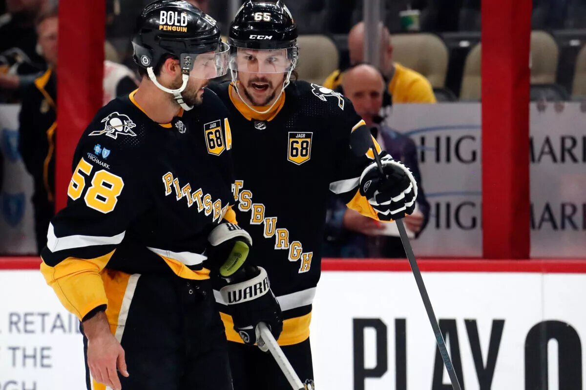
One of the greatest periods in the history of the franchise was when Mario Lemieux, Jaromir Jagr and company were terrorizing opposing defences. Pittsburgh went to black and gold in the 1980s to match the Pittsburgh Steelers and the Pittsburgh Pirates. The colour changed happened after initial objections from the Boston Bruins about having the same palette.
Pittsburgh started to bring this look back with the black sweaters in 2014. However, they would return the white version to the rotation in 2016-17. The black ones were iconic and many Pens fans clamoured for a return of the Lemieux era sweaters.
These uniforms have a couple different touches than their 80s template. However, these sweaters are fantastic and the revival of the skating Penguins was nice to see.
RoboPenguin Alternates
Pittsburgh moved away from the skating Penguin for the 90s in 1992. The logo made its debut on a white sweater, but many remember the black alternate that came into being in 1995.
On this day in 1996, @penguins’ Petr Nedved scored the game-winning goal at the tail end of the fourth overtime to even the series against the Capitals. It remains the fifth longest game in NHL history #Hockey365 #ALLCAPS #3elieve pic.twitter.com/57Y6bgiGim
— Mike Commito (@mikecommito) April 24, 2018
Alternate jerseys started to become a thing in the 90s, but it was Pittsburgh that brought this alternate sweater to light. The uniform was certainly a risk, but it’s now regarded as ahead of its time.
There were many elements like gradients, different coloured striping and other things that would become part of modern sweaters. Pittsburgh took a risk and it paid off in spades. The RoboPenguin would make a return in the 2022-23 season.
Going Diagonally
Some were shocked when the skating Penguin was swapped out, but Pittsburgh made some good calls on their sweaters in the 1990s. Both uniforms that featured the skating Penguins were replaced in 1992-93.
We’ll talk about the black one that had Pittsburgh with gold lettering and going down the chest, diagonally. Some may think it’s too close in looks to the rival New York Rangers. However, former owner Howard Baldwin and designer Gary Adams were open about the look according to a 2020 story in The Athletic.
The look was a throwback to the team’s original sweaters in the late 1960s. There are plenty more fans that love this look and it featured in the 2021 Reverse Retros. However, that had a white base instead of a black one.
These sweaters have been the Penguins alternates since 2021.
The Worst of the Pittsburgh Penguins
The 2023 Winter Classic
We’ll always be fans of honouring a city’s hockey past. The Steel City has produced many great hockey teams, but the Penguins aren’t the only team that called Pittsburgh home.
The Penguins' Winter Classic jersey, inspired by the 1925 Pittsburgh (hockey) Pirates: pic.twitter.com/DLrpKvlDnk
— Wes Crosby (@OtherNHLCrosby) November 25, 2022
Pittsburgh had a brief flirtation with the NHL from 1925 to 1930 with the Pirates. This Winter Classic sweater has elements of the Pirates 1925 sweater, but had cream as a colour instead of gold.
The sweater seems a little dark and it’s just a pedestrian effort. Maybe going gold on these sweaters like the originals would have been the better play.
The Originals
We mentioned that the Penguins have been pretty good since the 1980s when it comes to sweaters. However, Pittsburgh didn’t always have the Pittsburgh-based black and yellow colours.
As mentioned before, Boston put up a fight to prevent Pittsburgh from donning those black and yellow colours. The Penguins franchise went with a light blue, black and white colour palette.
There were some interesting uniform choices with the striping and the numbering. Pittsburgh would finally get its preferred colour choice in 1980. However, there would be some tributes to the old colour scheme in outdoor games.
The Navy Blues
Early Penguins sweaters had somewhat of an identity crisis with having the skating penguin in black and gold. However, the rest of the sweater would have shades of blue and white on them.
The worst of the bunch was the navy blue road sweaters that came to pass in the 1977 campaign. Pittsburgh seemingly made numerous changes to their sweaters in the early years. A total of nine variants happened between 1967 until black and gold became the team colours in 1980.
Pittsburgh still tinkers with its sweaters, but it’s been a lot more enjoyable seeing them match the other sports teams in town.
Other Considerations
The Penguins had some dark times before Sidney Crosby was drafted and changed the team’s fate. However, the Vegas Gold accents on a black jersey that debuted in 2000 had a very nice look.
We hate to keep picking on the older sweaters before the colour change. However, there were some bad-looking uniforms prior to the 1980s.
Main photo by: Charles LeClaire-USA TODAY Sports