Sweaters and hockey have been synonymous with each other since the infancy of the sport. Teams have been identified by their iconic colors and patterns. Some of them are classic while others are classically awful. This summer our annual series focuses on the best and the worst sweaters in each team’s history. Today we have the best and the worst Edmonton Oilers sweaters in team history.
Edmonton Oilers Sweaters: The Best and Worst
How We Did It?
We at Last Word on Hockey used a variety of methods to compile this list. Polling came from social media, our writers, and fans. We wanted to get a variety of opinions when we put out our list. This compilation will likely spur debate. However, we wanted to see who had the most memorable sweaters in each team’s history.
Let’s put our best foot forward with the best sweaters
The Best of the Edmonton Oilers
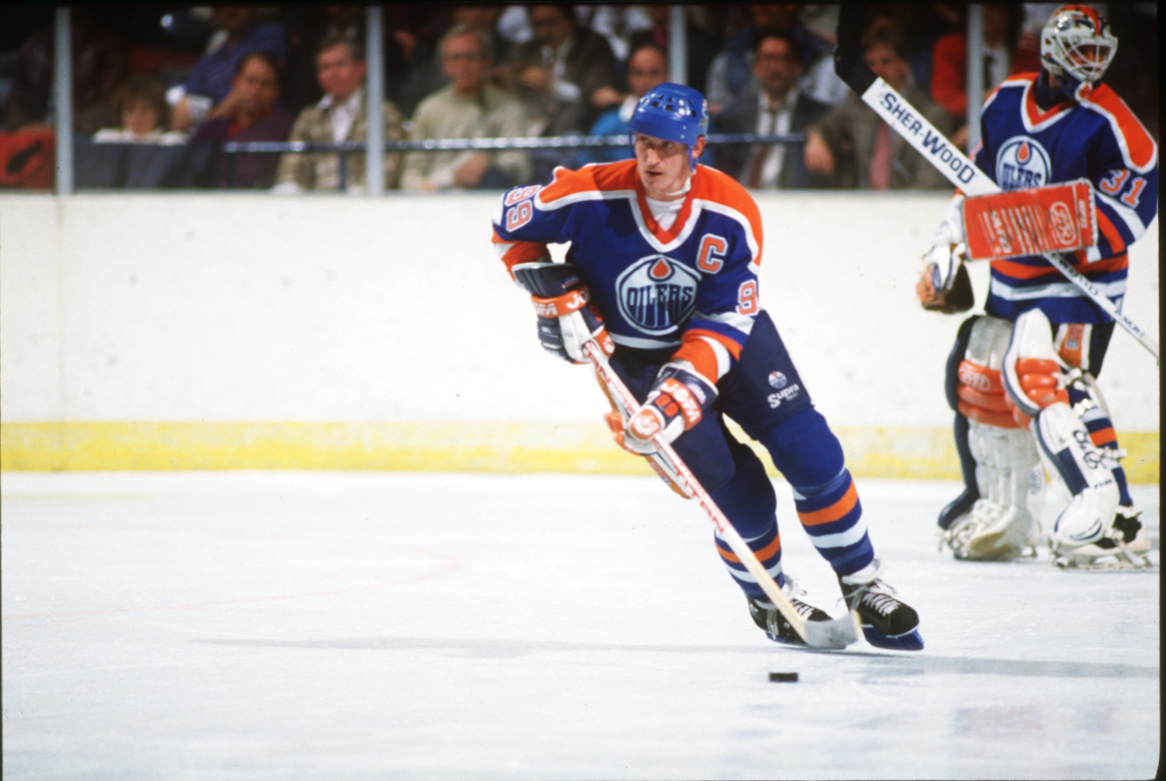
The Dynasty Sweaters – Blue
Edmonton’s franchise moved over from the World Hockey Association in 1979 and carried their uniforms over. However, there were a few cosmetic changes according to the great resource NHL Uniform Database. The team went with blue lettering instead of orange lettering when they moved to the NHL.
They decided to mostly keep these sweaters with minor changes to the piping and numbers here and there until the team went in a different direction. Copper and midnight blue came into being in the 1996-97 season with the shoulder yokes and other older elements for the home sweaters. The team would ditch the yokes completely in 1997-98.
After much demand, the old-school blues would return in 2008 with the third jersey program’s return. This much-loved sweater would make its full-time return in 2013. We like the blues just a bit better, but the whites are going to talked about soon enough.
The Dynasty Sweaters – White
Many Oilers fans saw Wayne Gretzky, Mark Messier and Jari Kurri light up the scoreboards at the Northlands Coliseum in these sweaters. These uniforms came into the league from the team’s WHA days and stuck with the club until the 1997-98 season.
Nothin’ like that first Cup feeling 🏆
On this day 36 years ago, Wayne Gretzky won his first Stanley Cup, leading the Edmonton Oilers past the New York Islanders four games to one pic.twitter.com/4sxCrhy3pk
— Hockey Night in Canada (@hockeynight) May 19, 2020
The traditional blues came back first, but the whites came back soon after in the 2011-12 season. It was nice to see these and the blue jerseys make their return.
These sweaters hold a special place in the hearts of Oilers’ fans. Edmonton fans are hoping for another Stanley Cup to be hoisted soon rather than later.
The WHA Oranges
Many people think this is a colour swap of the current set. However, the orange jerseys have roots in the WHA. Edmonton had orange sweaters in their first two seasons in the league.
The franchise marked their final season at Rexall Place in 2015 with the return of the orange sweaters. These uniforms even had the TV numbers inside the shoulder yoke.
Oilers fans loved the orange so much that they became the home sweaters in 2017-18. Blue would return in 2022-23, but we hope this homage returns soon.
The Worst of the Edmonton Oilers
Losing Your Edge – White Edition
The 2007-08 season saw Reebok and their Edge designs take centre stage. There were some good-looking sweaters from that era. However, the Oilers seemed to be out to lunch when the good designs were handed out.
The white edition scores worse than the blues because of the sheer blandness of thing. Edmonton’s trademark bottom piping disappeared and it just had the logo.
There were some unique touches like vertical striping and and arm stripes. However, this one was a complete miss.
Losing Your Edge – Blue Edition
You can pretty much list the same reasons in the home blues in this one. However, this one could have been salvaged with some bottom piping like just the season before.
These ones seem very bland and very meh. We understand teams want to rebrand to try and keep up with times. However, Edmonton was right to go back to their old look.
2023 Heritage Classic
Throwback sweaters can be a risky proposition. Some designs can be classic, but some can be a miss. We like the concept of honouring a city’s past in hockey, but some jerseys can be a bit busy.
First up close look at the new 2023 Edmonton Oilers Heritage Classic jerseys. Thoughts? 🤔
via @McDangler97 pic.twitter.com/s86cfkd6Py
— Hockey Jerseyz (@HKYJersey) September 26, 2023
The Oilers tried to pay tribute to the Edmonton Mercurys that were an intermediate-level senior hockey team that won Olympic and World Championship gold. We like the idea, but there’s so much going on with the crest, piping and numbers.
Tan pants can also ring alarm bells, too. This colour of shell can work if you see the Dallas Stars. However, this was just not working.
Other Considerations
The 1996-97 blues are good and were kept until the Reebok Edge redesign. There are some that love the Todd McFarlane Oil Drop design and that logo has caused some division. However, that got a Reverse Retro sequel in 2022-23.
The first Reverse Retro had a nice idea, but the orange pants were pretty jarring to look at. Edmonton’s current alternate with no white is a bold choice, but seems odd.
Main photo by: Porter Binks/USA TODAY NETWORK


