Sweaters and hockey have been synonymous with each other since the infancy of the sport. Teams have been identified by their iconic colors and patterns. Some of them are classic while others are classically awful. This summer our annual series focuses on the best and the worst sweaters in each team’s history. Today we have the best and the worst Dallas Stars sweaters in team history.
Dallas Stars Sweaters: The Best and Worst
How We Did It?
We at Last Word on Hockey used a variety of methods to compile this list. Polling came from social media, our writers, and fans. We wanted to get a variety of opinions when we put out our list. This compilation will likely spur debate. However, we wanted to see who had the most memorable sweaters in each team’s history.
Let’s put our best foot forward with the best sweaters
The Best of the Dallas Stars
The Green All-Star
Just a reminder that we will not be counting the Minnesota North Stars in this recap. However, you may see those North Stars sweaters in our teams gone by countdown. This dark outline sweater actually started off an alternate sweater in the 1997-98 season. However, these sweaters would graduate to their full-time road sweaters in 1999-2000 and the Stars would win their only Stanley Cup in them.
https://twitter.com/DallasStarsDDH/status/1803444447658778739
A white home sweater was spawned in that same 1999-2000 season and a Reverse Retro came to be in 2021 season. These jerseys hold a lot of memories for Stars fans and would stick around as the main sweaters until a rebrand in the 2007-08 season.
Dallas got it right with these sweaters with the contrasting colours and it just works. Nice work by Dallas and we wouldn’t mind these coming back as a throwback sometime.
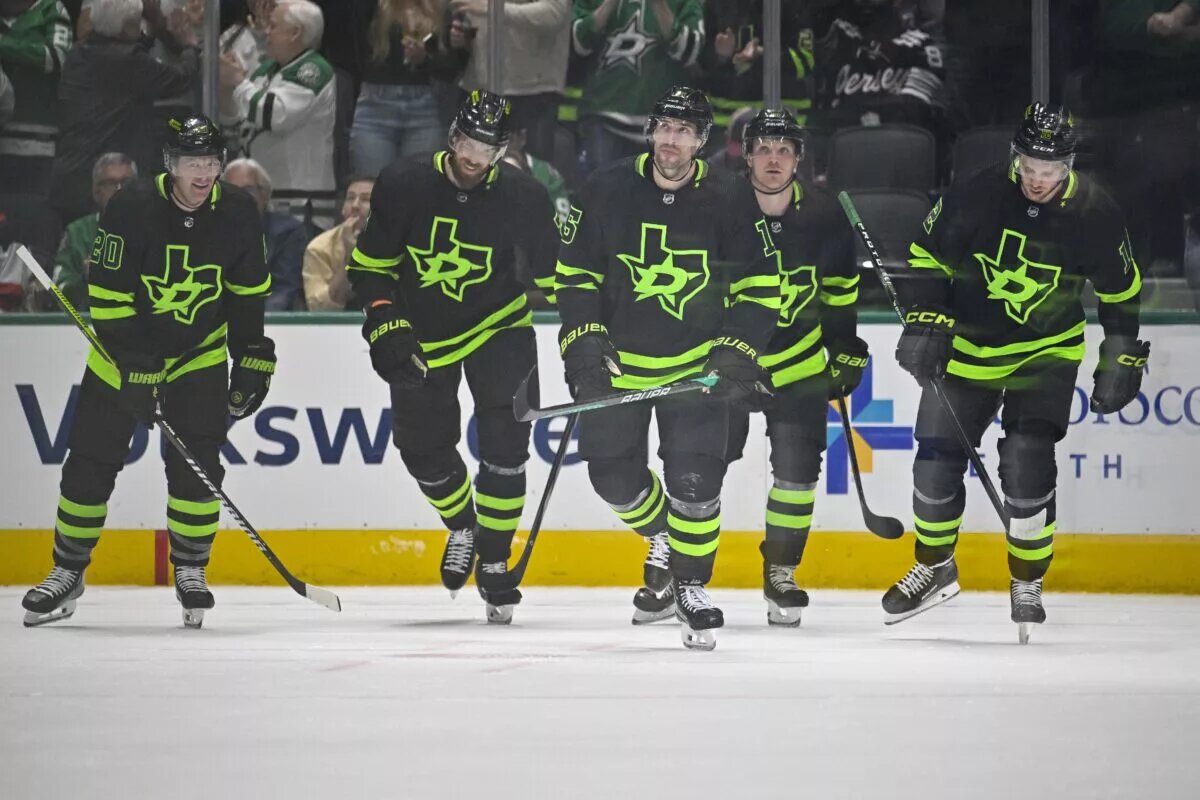
The Highlighter
We usually bemoan the black sweaters and we also usually complain about neon colours. However, Dallas got these alternates right. According to NHL Uniform Database, called the colour Skyline Green.
This was added to Dallas’ rotation in 2021 and has stuck around for a few seasons. It has the current letter D and star logo, but it also has the state of Texas in the background.
Some people may complain about the font of the D, but we like this one. Dallas’ current uniform lineup is actually pretty good compared to other franchises.
The Big “D”
These ones were used for the 2020 Winter Classic against the Nashville Predators. The jerseys are inspired by the old Dallas Texans (not the ones that became the Kansas City Chiefs) of the United States Hockey League.
We’re usually leery of tan pants, but these do work with the green stripe. The colour green just works and the combination of “D” and Stars is a solid one.
The Worst of the Dallas Stars
The Mooterus
You knew this one was coming. Easily one of the worst sweaters in the modern history of the NHL. Dallas trotted this unfortunate entry out in 2003 and boy this one is just awful.
https://twitter.com/sjsharkshistory/status/1246276992112062464
The crest was supposed to represent the constellation Taurus, but bore a striking resemblance to a part of the female anatomy. We honestly can’t come up with fresh new jokes about this one.
The concept colours are actually OK, but this is one of the worst we’ve seen so far in this series. Even the Stars have joked about how ghastly these are.
The Rebrand
Dallas moved away from the original beloved All-Star looking sweaters in 2007. Rebrands usually mean exciting changes, but this one just falls so flat.
It looked like the Stars goofed off instead of doing their homework and realized they hadn’t done their work. The Stars threw something together really quick so they wouldn’t get a 0 on the assignment.
However, these get a failing grade for just being too plain. Simple can be good, but these ones are just a bit too simple. The Athletic’s Sean Shapiro did a recap on the Stars uniform history in 2020 and mentioned that they looked like football jerseys.
The Texas Debut
Dallas completed its move from the Twin Cities in time for the 1993-94 season, but the Dallas on the sweaters got lost in transit. These sweaters had pretty much the same look as the ones they wore for the last season in Minnesota before Norm Green moved the franchise.
The one good thing about these is the state of Texas patch on the shoulder. We do love a good shoulder patch in this series.
There was a Reverse Retro for the 2022-23 season that used this base as a template. However, it was updated with the current green and that one was a tad bit better.
Other Considerations
Dallas’ current set of uniforms almost made our countdown and is one of the favourite current jersey lineups in the league. The 2013 rebrand was welcomed by this point.
Dallas did a white Reverse Retro in 2021 and it’s good if wear it with casual clothes. However, the all-white uniform setup is a bit of a shocker to the eyes. A little more colour could have made this one better.
Main photo by: Jerome Miron-USA TODAY Sports