For the 2022-23 NHL Season, Adidas and the NHL have teamed up to create the second wave of Reverse Retro jerseys for all NHL teams, now including the Seattle Kraken. Under the motto “History Never Repeats,” Adidas and the NHL, alongside each team, have created designs combining and blending retro jersey styles with modern ones currently used by the given team. Here on Last Word on Hockey, we will be grading all 32 jerseys by division. Next on the docket: the Central Division.
Central Division Reverse Retro Review
Arizona Coyotes – A-
Stirring up a (dust) storm. 💨
Introducing our @adidas Reverse Retro 2022#ReverseRetro Available 11.15#Yotes x @adidashockey pic.twitter.com/O9Wsbj4hUs
— Arizona Coyotes (@ArizonaCoyotes) October 20, 2022
The Arizona Coyotes once again splash with an excellent jersey in the Reverse Retro series, with a great mix of returning elements from the previous Reverse Retro jersey and the addition of refreshing elements incorporated for the new one. The Coyotes’ second remix sees a return of the Kachina logo’s head and an illustration of a desert at the bottom of the jersey, much like the first. Arizona refreshes one of the better previous Reverse Retro jerseys with a sienna desert base that truly emphasizes the evening heat of the desert setting, contrasting with the first Reverse Retro’s representation of a cool, humid desert climate.
Chicago Blackhawks – D
𝙍𝙚𝙫𝙚𝙧𝙨𝙚 𝙍𝙚𝙩𝙧𝙤 🔥
Pre-order at https://t.co/z00JjWzbba 🛍 pic.twitter.com/6YpLsvSnqA
— Blackhawks Store (@BlackhawksStore) October 20, 2022
Chicago’s jersey seems to have less of a consensus among the league’s fans than many of the jerseys in the series. However, it appears the Hawks missed the mark with the second edition of Reverse Retro. The Chicago Blackhawks and Adidas set to modernize the barber pole-like jerseys of the 1930s and 1940s and flip the colour scheme and did so with some success (excluding awkward piping just under the crest). Unfortunately, that is largely where the positives end for this jersey. Aside from the inconvenience of a fairly similar Reverse Retro jersey to Detroit’s, Chicago chose to include an awkwardly small print of the city’s name across the chest, replacing where a logo would otherwise be. The small inclusion of text leaves the top of the jersey (by the shoulders) starkly and awkwardly empty, creating an overall bottom-heavy jersey.
Colorado Avalanche – A-
Colorado Proud. #ReverseRetro
Preorder today from Altitude Authentics, jerseys ship November 15.#GoAvsGo x @adidashockey pic.twitter.com/znO7JPRtSG
— Colorado Avalanche (@Avalanche) October 20, 2022
The Avalanche drew inspiration from the first Colorado NHL franchise in the Colorado Rockies (not the only too!), and for the most part, stuck to a simple, but clean, design. The Colorado Avalanche have used the ‘C” logo filled in the middle in their current colours for some time now as an alternate logo. Its re-inclusion in Rockies’ colours appears fantastic (although the main Rockies’ logo may have enhanced the jersey), with blue sleeves in the Avalanche main design creating a filling and proper contrast in its presentation. Yellow and red piping give outline to the jersey and further enhance its presence on a white base which will most certainly look amazing on the ice.
Dallas Stars – B+
Back when #TexasHockey began.
Introducing our @adidas Reverse Retro 2022 #reverseretro
Available 11.15#DallasStars x @adidashockey pic.twitter.com/jPBtm1oGJB
— Dallas Stars (@DallasStars) October 20, 2022
The Dallas Stars point to the jerseys first dawned by the team in their first year in Texas for inspiration in the second wave of Reverse Retro jerseys. Dallas did a great job paying homage to the jersey in its original style while modifying it in a manner that would allow it to be worn most often at home, with a great black-green combo on the base and sleeves, respectively. The glaring issue with the jersey (which is overall minor) is the choice of colour for the star logo on the jersey. Dallas’ choice to mark the logo with a cream-like colour creates a logo appearing saturated and unfocused compared to the black base, and an awkward and competitively contrasting appearance with the white piping and colour. Aside from this, however, the jersey appears to be well-pieced and cleanly presentable.
Minnesota Wild – A-
A #StateOfHockey classic look. Introducing our @adidas #ReverseRetro 2022. Available 11/16.#mnwild x @adidashockey pic.twitter.com/HQqrU2R6L4
— Minnesota Wild (@mnwild) October 20, 2022
Minnesota once again chose a North Stars-inspired design, with the same colours and an overall similar appearance to the previous Reverse Retro jersey. Interestingly, Minnesota is one of the few teams to select an almost exact copy of an inspired design for their own, only adding their current logo to the crest and replacing Wild colours with North Stars yellow and bright, emphatic green. Considering this, the jersey still holds well in modernity; the green base with white shoulder yoke conveys a bright and loud tone in its presentation. Minnesota’s logo fits well into the design, adding and filling more yellow into the jersey effectively. Yellow and White stripes fill out the rest of the jersey quite well. The second edition of the Minnesota Wild Reverse Retro jersey is similar but still stellar.
Nashville Predators – B-
🗣️ MUSTARD CAT IS BACK
Introducing our @adidas Reverse Retro 2022 #ReverseRetro
Available 11.15#Preds x @adidashockey pic.twitter.com/wKJ9okBDAk— Nashville Predators (@PredsNHL) October 20, 2022
Despite bringing back a logo and jersey base often considered one of the worst in NHL history, the Nashville Predators executed a design that is an actual improvement upon the original design. Swapping mustard with the typical gold used by the Predators filters out the saturated feel of the original design, and helps the stripes aid in the jersey’s overall look. Using the Adidas collar is another simple fix; however, the choice to include the “Nashville” print below the collar feels forced and out of place, especially with its individual patch on the jersey. Considering these factors and the fundamentally poor qualities of the logo, Nashville has a good, but not excellent, Reverse Retro jersey.
St. Louis Blues – C
An original, reimagined for now. Introducing our @adidas #ReverseRetro 2022. Available 11.15 or for presale today at 11 a.m.#stlblues x @adidashockey pic.twitter.com/O97tKttedH
— St. Louis Blues (@StLouisBlues) October 20, 2022
The St. Louis Blues bring a fittingly noisy design to the table, with a unique backstory on the inspiration of the design (a prototype, rather than a completed design). Unfortunately, the jersey contains many inefficiencies. The logo almost appears to have a poorly executed foreground and background set-up; text that slices part of the logo in uneven unison with the bottom-accompanying text of “BLUES.” The jersey itself features a bold, gold base fitted with small striping that is well-organized through the sleeves but awkwardly included by the shoulders. The logo’s placement and sizing on the jersey are quite large and uncomfortable as well, with a look seemingly taking up slightly more of the bottom half of the crest than the top, instead of a design more central. Despite some more fascinating intangible elements of the jersey, St. Louis just missed the mark with these.
Winnipeg Jets – C+
’93 ’til Infinity ∞
Introducing our @adidas Reverse Retro 2022 #reverseretro
Available 11.15#GoJetsGo x @adidashockey pic.twitter.com/nOvADJNpvC— Winnipeg Jets (@NHLJets) October 20, 2022
For the Jets, a clean but extremely boring design was created by Adidas. New colours on the retro logo give it quite a refreshing look, but the jersey itself is largely white with little to fill out the remaining space. A simple royal-navy-royal stripping pattern occupies the bottom of the body and the sleeves; while cleanly implemented with the logo, the size of the middle stripe seems to be the only attempt to create a slightly remixed base of the 1990 Winnipeg Jets design. No alternate logos appear on the shoulders, no yoke or designs occupy open space at the top, and the logos are a single colour – navy – on both the sleeves and the body. These elements largely worked with blue and red; however, the relative similarity in every colour used in the jersey makes the remix a more bland and boring version of its original heart.
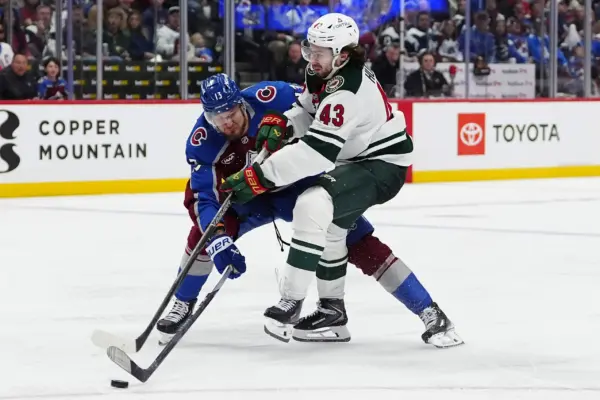
MAIN PHOTO:
Embed from Getty Images