Combining the past and present, the NHL, along with their sponsor, Adidas, recently released their Reverse Retro jerseys for every team. Each club will wear these nostalgic sweaters multiple times this season. Here at Last Word on Hockey, we will be looking at all 31 jerseys and grading them by division. Next up is the Central Division.
A closer look at all 31 new #ReverseRetro jerseys 👀 (📷 – @nhl) pic.twitter.com/gX0rNmodEt
— NHL News (@PuckReportNHL) November 16, 2020
Central Division Reverse Retro Jerseys
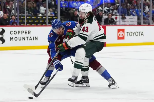
Colorado Avalanche – (A+)
Not only does the Colorado Avalanche boast the best reverse retro jersey in the Central Division, but quite possibly takes the cake when it comes to the entire league. Throwing it all the way back to 1979, when the Avalanche were the Quebec Nordiques, this jersey features the iconic Nordiques igloo logo and their fleur-de-lis in the current team’s colours. The mostly white jersey is reminiscent of both the Rocky Mountains and the snow found in the Northern Nordiques.
The Avalanche took their past and blended it with their present, seamlessly. This stunning jersey will be an instant crowd-pleaser and go down in history as one of the most unique and notable alternates in NHL history.
Chicago Blackhawks – (A-)
The Chicago Blackhawks are bringing it all the way back to the days of the Original Six. Featuring several elements from their jerseys in the 1940s, the Blackhawks are the definition of retro with these sweaters. Incorporating a variation of their white alternate design worn from 1937-55 and paying tribute to the barber pole-striped primary uniforms of the same time, the Blackhawks really knocked this one out of the park. These red and black jerseys embody the Blackhawks’ rich history all while keeping it modern for their 21st-century fanbase.
St. Louis Blues – (A-)
Sitting close to the top are the St. Louis Blues. This A- sweater brings back a well-established colour scheme that makes for a stunning jersey sure to draw eyes on the ice. Rearranging the colours of their mid-90’s sweater worn by the likes of Wayne Gretzky, Chris Pronger, Grant Fuhr, Al MacInnis, and Brett Hull, the St. Louis Blues take a classic look and modernize it for a new generation of fans. Reinstating the 90’s version of the Blue Note and adding a trumpet to the patch on the shoulder brings the Blues back to their jazz roots.
Minnesota Wild – (A-)
The current Minnesota Wild logo is, arguably, one of the best in professional sports. But, for 20 years, they have kept the same muted colour scheme. This revamping of style brings a fresh look to the club, while also celebrating Minnesotan and NHL history. Incorporating the former North Stars’ green and gold make for an impactful sweater. While considerably neon, these jerseys will be fan-favourites due to the incredible combination of old and new. Maybe these simple, clean-cut jerseys can aid the Wild in a Stanley Cup run in the next couple of years.
Dallas Stars – (B)
This white version of the sweaters the Dallas Stars wore when they won the Stanley Cup in 1999 is a contemporary take on the franchise’s defining period. The 1999 jerseys were extraordinary and the reconfiguring of the colours make them even better. As they haven’t won a Cup since maybe this nostalgic jersey will give them the boost they need to raise the Stanley Cup again.
Winnipeg Jets – (C)
The Winnipeg Jets are throwing it back to their inaugural season. The updated colours of Polar Night and Aviator Blue with silver for the body make for a striking colour combination. The revival of the sweater popularized by Dale Hawerchuk is a nod to their history in such an enthusiastic hockey market. The heritage plane crest and “Winnipeg” lettering makes for a good look, but not an overly special one.
Nashville Predators – (D+)
With very little history of hockey in the state of Tennesee combined with the fact that the Nashville Predators have only been a team since 1998, makes for a very familiar jersey. One that looks almost exactly the same as the current sweaters of the Nashville Predators. Nashville’s jerseys are awesome, but they make for a very lacklustre retro look if nostalgia is what they were going for. A silver sleeve and crest from the 1998 sweater don’t do much to make this particular sweater special.
There you have it. Here are grades and rankings for the 2020-21 Reverse Retro jerseys for the Central Division. Let us know your comments below or right here.
Main Photo:
Embed from Getty Images