The recent release of the Los Angeles Kings and Colorado Avalanche Stadium Series jerseys has livened up the ugly-jersey debate. Many fans note that the Kings jerseys look like a cheap version of the Gretzky-era jerseys, while the Avalanche released jerseys that simply look like Pepsi cans. These jerseys make one think what the ugliest jerseys in each team’s franchise could be. Today, we’ll take a look at the ugliest jersey from the NHL Pacific Division.
Before we look, though, it’s important to remember that ugly jerseys aren’t a bad thing. They should be worn like a badge of honour, for the humour. Much like you would wear an ugly sweater at Christmas time, and as we all know hockey season is better than Christmas.
Ugliest Jerseys in the NHL Pacific Division
Anaheim Ducks
The Anaheim Ducks entered the NHL in the 1993-1994 season. In 26 seasons they have had several different jerseys that go from the iconic eggplant and jade to the current bright orange third jerseys. They have had roughly 12 different jersey styles depending on how you look at it. The ugliest by far is the “Wild Wing through the ice jersey”.

The jersey depicts the Ducks long-time mascot ‘Wild Wing’ breaking through a sheet of ice. It’s not ugly, per se, but it seems very dated. Screaming of the early 1990s, from the font for the player’s names to the very bright colors chosen. It’s not the worst on the list but surely the worst in Ducks history.
Arizona Coyotes
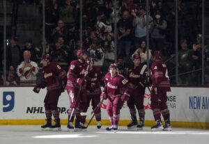
The Arizona Coyotes started to play in the desert after the first incarnation of the Winnipeg Jets left Canada to come south in the 1996 season. They have had some interesting jerseys, usually a maroon and white combination with a coyote head howling. Very simple but still appealing. The ugliest jersey in the franchise was also the first in franchise history. Its black green and maroon and depicts a kachina-style coyote very unique to the southwest.
It’s a good fit for the southwest and for the fans it’s a classic. It currently serves as the team’s third jersey.
Calgary Flames
Serving as the team’s third jersey in Jarome Iginla‘s deepest run into the postseason during his hall of fame career, it holds a special spot in fans’ hearts much like the other jerseys on this list.
Edmonton Oilers
The Edmonton Oilers came into the NHL in the merger between the WHA and the NHL before the 1979 season. As the alma mater of Wayne Gretzky and the home of his four Stanley Cups amongst one other before the dynasty fell in the early 1990s. After more than a decade in obscurity, they have emerged with arguably one of the greatest hockey players in the world at the helm and the future looks bright for the franchise. The ugliest jersey in the history of this franchise is the current third jersey.
Embed from Getty Images
While most of the other jerseys on this list are ugly because they are too bright or stand out too much, this jersey is ugly for the opposite reason. It has nothing going on, it’s very bland. It doesn’t show any of the spark that other jerseys worn across the league boast.
Los Angeles Kings
The Los Angeles Kings were part of the first great expansion for the NHL. They began play in the 1967 season. The original Kings jerseys were very bright and exactly what you would expect from a late 60’s hockey franchise. They matched the Los Angeles lakers color schemes and they were worn until the Oakland Raiders moved to Los Angeles in 1988. The Kings then adopted to take the black and silver color scheme of the raiders after that and have stuck to it more or less since then. The ugliest jersey they have in the franchise was ironically worn by the greatest hockey player of all time.

The “Burger King” jersey was worn during the 1995-1996 season. The jersey depicts a “King” on the shoulder with purple accents. For a team that for the most part has stuck to a very traditional style this jersey just sticks out. Like the Ducks ugly jersey, it just screams of the 1990s.
San Jose Sharks
The San Jose Sharks became the second team to represent the bay area in the 1991-1992 season. With the likes of Joe Thornton and Patrick Marleau representing them for most of the team’s history, they have a relatively good track record. They have taken absolutely no risks with the jerseys the team wears. They’ve all been very simple, using the same logo that the fans know and love. The only jersey that can be remotely considered as an ugly jersey was the third jersey that the team wore for an entire decade.

Abandoning the usual white that’s found in the traditional colour scheme for a darker grey and black scheme. The team takes no risks with the jerseys and that’s playing it safe but as we all know, no risk no reward.
Vancouver Canucks
The Vancouver Canucks, unlike the Sharks, have taken some pretty big risks with the jerseys they have worn on the 50 seasons they’ve been playing. Coming into the NHL in the 1970 season, they have had several different colour schemes and logos to choose from. From the blue and green that we currently know to the red, yellow, and black of the ’70s and everything in between. The ugliest jersey that the Canucks have worn in gameplay has to be the third jersey worn from the 1995 season up until the end of the 1997 season.

It’s an odd layout on the jersey in a unique colour scheme. Like most on the list, it screams of the 1990s. It’s not as terrible as it could be but it does definitely constitute an ugly jersey.
Vegas Golden Knights
The Vegas Golden Knights only have two jerseys in franchise history. A home and an away jersey. It just isn’t fair to critique them. The team has announced plans to introduce a third jersey some time throughout the season so maybe we will get an ugly jersey to add to the list.
Main Photo:
Embed from Getty Images


