Sweaters and hockey have been synonymous with each other since the infancy of the sport. Teams have been identified by their iconic colours and patterns. Some of them are classic while others are classically awful. This summer our annual series focuses on the best and the worst sweaters in each team’s history. Today we have the best and the worst Vancouver Canucks sweaters in team history.
Vancouver Canucks Sweaters: The Best and Worst
How We Did It?
We at Last Word on Hockey used a variety of methods to compile this list. Polling came from social media, our writers, and fans. We wanted to get a variety of opinions when we put out our list. This compilation will likely spur debate. However, we wanted to see who had the most memorable sweaters in each team’s history. Let’s put our best foot forward with the best sweaters.
The Best of the Vancouver Canucks
The Flying Skate
Vancouver has had an interesting colour palette over their 50-plus tenure. This team has bounced in its colour choices more than a Jackson Pollock painting. They started off with blue, green and white, but moved to gold, black and red in 1978-79 season.
On this day in 1993, Pavel Bure scored twice to become the first player in Canucks history to record 50 goals in a season #Hockey365 #Canucks pic.twitter.com/LyNikwKNPu
— Mike Commito (@mikecommito) March 1, 2022
The franchise struggled through the wilderness with their sweater, but found a sweet spot in the 1988-89 season. These uniforms were donned by the team during one of their stronger periods in the 1990s before another rebrand in 1997-98.
The skate logo jerseys would finally return in 2019-20 for the 50th anniversary and have become part of the rotation as alternate since 2022. Many Canucks fans have fond memories of these uniforms and we’re glad they’ve returned.
The Current Homes
Vancouver combined one of their 90s looks with their original colours and made a pretty nice current sweater. Like with most Canucks jerseys, there was some trial and error.
This new look debuted in 2008 with Vancouver placed on top of the Orca logo. The Vancouver workmark would be eliminated in 2019 and would expand the logo.
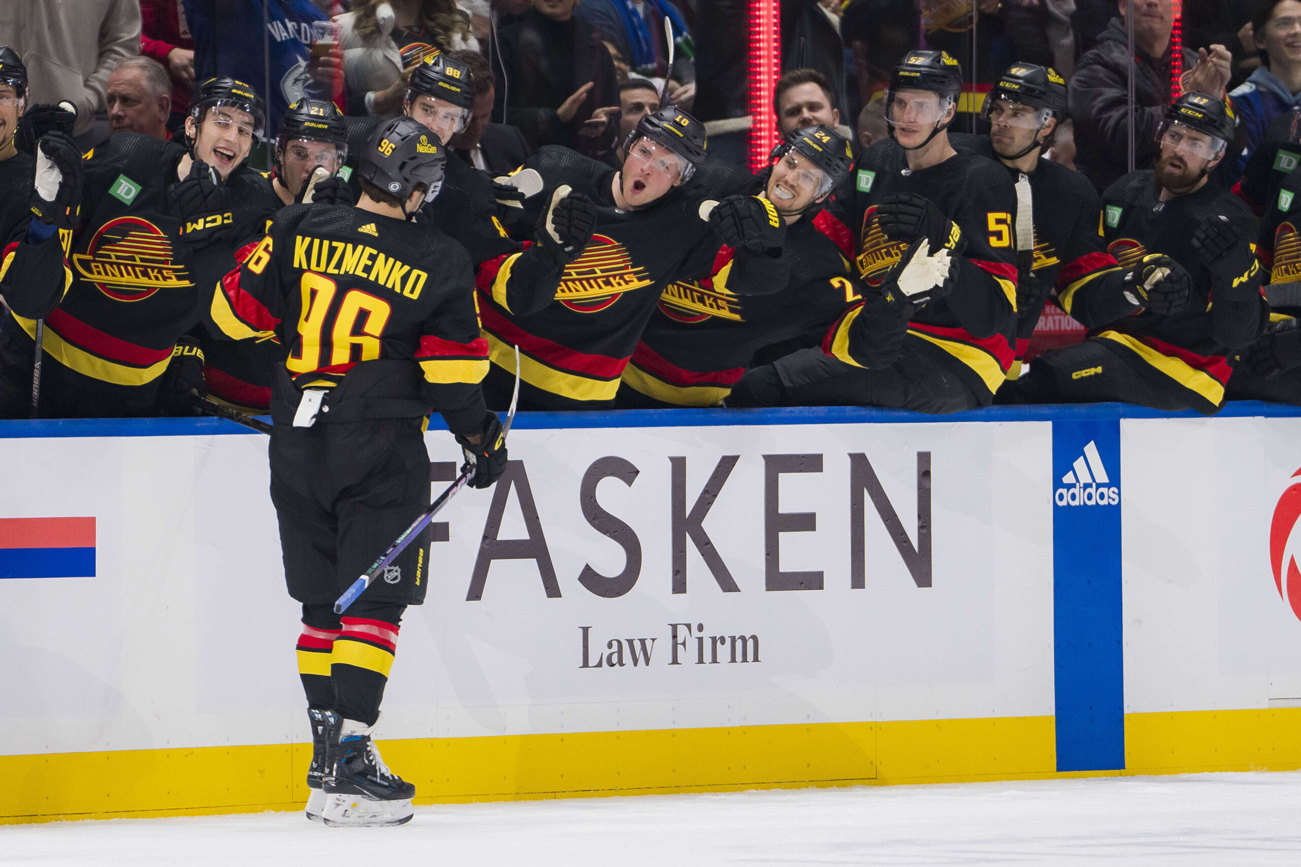
These sweaters are one of the nicer looks in the NHL as of now. The club added the TD Bank patch on the shoulder and removed the green strip to make its current look.
Johnny Canuck
Vancouver has used blue and green as part of both of their Reverse Retro sweaters. The second edition made in 2022-23 is based on the 1962 Western Hockey League team of the same name. According to NHL Uniform Database, the logo is that of Johnny Canuck.
The Canucks did a good job with these sweaters and even did era-appropriate numbers. These Reverse Retros were re-worked to have Vancouver’s colour scheme of blue and green, but with cream instead of white.
Vancouver’s AHL affiliate in Abbotsford currently has Johnny Canuck adorning the front of their sweaters. We’re glad to see this look live on.
The Worst of the Vancouver Canucks
The “V” Sweater
This may make some Canucks fans mad, but these sweaters are just plain awful. It’s easily one of the most talked-about uniforms in the history of the NHL.
Happy birthday Stan Smyl 🥳#CanucksAlumni pic.twitter.com/QI77yft8Vk
— Vancouver Canucks Alumni (@canucksalumni) January 28, 2024
The uniform contains seven different “V”s all over the uniform. The sweater, socks and socks all have the letter “V” on them. Players like Stan Smyl and Harold Snepsts were seen in these sweaters. Vancouver even made a Stanley Cup Final wearing these in the 1981-82 season.
These jerseys would be retired in 1985 for a more subdued look that would eventually morph into the beloved skate logo. However, there are some people that absolutely love this look and will defend it.
Not Making the Gradient
The Canucks would make another seismic shift away from a well-liked logo in the 1997-98 season. Gone were the red, black and yellow and in were the colours of navy blue, sky blue, maroon and silver. This was due to Orca Bay Sports and Entertainment taking control of the franchise.
The skate logo was replaced with an Orca whale, but the biggest shocker would come into the being in the 2001-02 season. Vancouver would be one of the first teams to use a gradient fade on their sweaters.
This fade would go from navy blue to red and it wasn’t not well-received. Gradients would eventually become more prominent and the Canucks would try again with the 2021 Reverse Retro. However, this one was pretty bad.
The Red Skate
We saw the combination of Canucks uniforms and outrageous colours from the 1990s meet head-on in 1995. Vancouver was one of the first adoptees of the third jersey program and it went poorly.
Both the Los Angeles Kings and Anaheim Ducks had jerseys that were panned and this is lumped in there with them. Vancouver’s third would keep these until the end of the 1996-97 season when the rebrand banished them forever.
We’re surprised the Reverse Retro program didn’t go with a resurrection of these. However, we’re glad these have been relegated to the back of the closer.
Other Considerations
The stick logo that’s an alternate now is a pretty good sweater. This one came to pass in 2019 and is an ode to their original logo.
On the bad side, the Vancouver Millionaires tribute sweaters weren’t the best look. It has all the usual pitfalls of an old-time sweater in the off-colour pants and striping.
Main photo by: Bob Frid-USA TODAY Sports