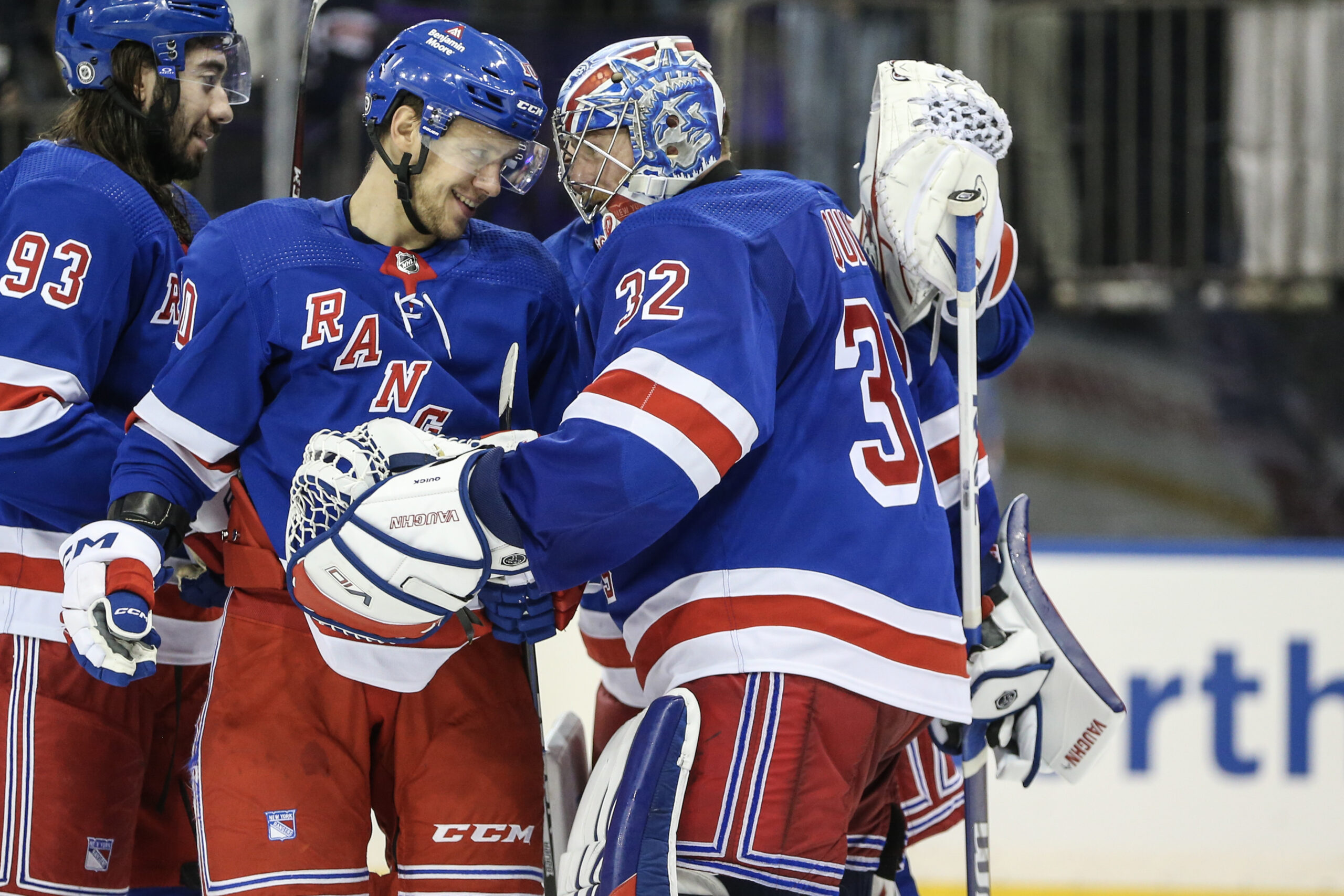
Sweaters and hockey have been synonymous with each other since the infancy of the sport. Teams have been identified by their iconic colours and patterns. Some of them are classic while others are classically awful. This summer our annual series focuses on the best and the worst sweaters in each team’s history. Today we have the best and the worst New York Rangers sweaters in team history.
New York Rangers Sweaters: The Best and Worst
How We Did It?
We at Last Word on Hockey used a variety of methods to compile this list. Polling came from social media, our writers, and fans. We wanted to get a variety of opinions when we put out our list. This compilation will likely spur debate. However, we wanted to see who had the most memorable sweaters in each team’s history. Let’s put our best foot forward with the best sweaters.
The Best of the New York Rangers
Lady Liberty Shines Bright
The Rangers franchise had pretty much had the words “New York” or “Rangers” across their chest for most of their history. There were a couple of exceptions and we’ll get to those down the way. Manhattan’s hockey team had rarely dipped its toe into having a logo on its chest.
Lady Liberty: You've been good to us. 💙❤️ pic.twitter.com/tvjMDFw2CD
— New York Rangers (@NYRangers) April 16, 2021
However, that would change in the 1996-97 season when a logo featuring the Statue of Liberty with the initials NYR on the bottom. This alternate was very well received and stayed an alternate for a number of seasons until 2007.
The Reverse Retro program brought these sweaters back until the Rangers went with a black alternate. However, we hope Lady Liberty doesn’t stay away for too much longer. If we had a pick, go with the original or the 2023 Reverse Retro.
The Ranger Blues
New York has been pretty consistent in its look with its dark sweater for most of its nearly 100-year run. The basic Blueshirts design with a shade of blue and diagonal lettering came into being in the 1926-27 campaign.
There have been minimal cosmetic changes save for a few seasons, but the sweater has stayed pretty much the same. Some variants with darker shades of blue and different colours of numbers were tested, but the basic concept has been unchanged.
Many fans love the late 80s to 90s brand of bottom striping. However, the current stripe alignment that started from 1999 onward is our favourite.
The Whites
New York had always worn blue, but needed an alternate sweater to avoid colour clashes. An NHL rule mandated teams have two sweaters and the white one came to in 1951.
This sweater served as the Rangers home sweater until dark uniforms were the home kits in 2003-04. It’s the old adage about don’t fix what isn’t broken.
Many Blueshirts fans hold jersey in high regard because they saw Mark Messier end the 54-year Stanley Cup drought. This sweater has undergone minimal changes and for a very good reason.
The Worst of the New York Rangers
The 70s Crest Sweaters
This sweater usually ranks as one of the worst sweaters of all-time. New York made the switch in the 1976-77 season when John Ferguson became general manager. This look was quickly panned by the Rangers faithful, who were used to the same uniform combo since 1951.
Did you know?
Back in the '70s, former Rangers GM John Ferguson made what many Rangers fans considered a fatal mistake at the time- he changed their uniform!
After leaving New York, Ferguson took the design to the Winnipeg Jets when he became their GM, and the rest is history. pic.twitter.com/i3MOWEJBLe
— Keener Jerseys (@Keener_Jerseys) January 3, 2024
Ferguson did believe in recycling if you have a keen eye for sweaters. Hockey history fans can see the Winnipeg Jets used these in 1979 when he took that job. It’s pretty much a straight swap according to NHL Uniform Database.
A better-received crest sweater would be introduced as an alternate for the Rangers in 2023-24. There are other better alternate sweaters, but it’s not as offensive on the eyes as the 70s model.
Name and Number
We did mention that the Rangers blue sweaters are iconic. However, there was some trial and error when it came to the design.
The Rangers would put both the name and the player number on the front of the sweater in the 1946-47 season. Gone was the diagonal writing and it was in a semi-circle on the front with the number placed below.
This would only last for the one year and the Blueshirts would revert back to their classic design. We wouldn’t see someone attempt this name and number sweater idea for over 60 years.
The 2014 Stadium Series
Normally a team only gets one outdoor game in a season. However, the Rangers got a pair of outdoor games in 2014 when the Rangers at iconic Yankee Stadium in The Bronx.
The setting was iconic, but the Blueshirts look was not. It seemed like the Rangers raided the Buffalo Sabres closet in the 1990s and put New York on the front instead of the Goathead.
The only good news was that the Rangers won both games over the New Jersey Devils and New York Islanders.
Other Considerations
New York’s sweater history has been pretty good. The 2012 and 2018 Winter Classic sweaters look great while the 2024 Stadium Series sweaters almost cracked the top three.
The only remotely bad entry is in 1927-28 season where the red numbers had no outline. The outline was added in the very next season.
Main photo by: Wendell Cruz- USA Today Sports


