Sweaters and hockey have been synonymous with each other since the infancy of the sport. Teams have been identified by their iconic colours and patterns. Some of them are classic while others are classically awful. This summer our annual series focuses on the best and the worst sweaters in each team’s history. Today we have the best and the worst New York Islanders sweaters in team history.
New York Islanderss Sweaters: The Best and Worst
How We Did It?
We at Last Word on Hockey used a variety of methods to compile this list. Polling came from social media, our writers, and fans. We wanted to get a variety of opinions when we put out our list. This compilation will likely spur debate. However, we wanted to see who had the most memorable sweaters in each team’s history. Let’s put our best foot forward with the best sweaters.
The Best of the New York Islanders
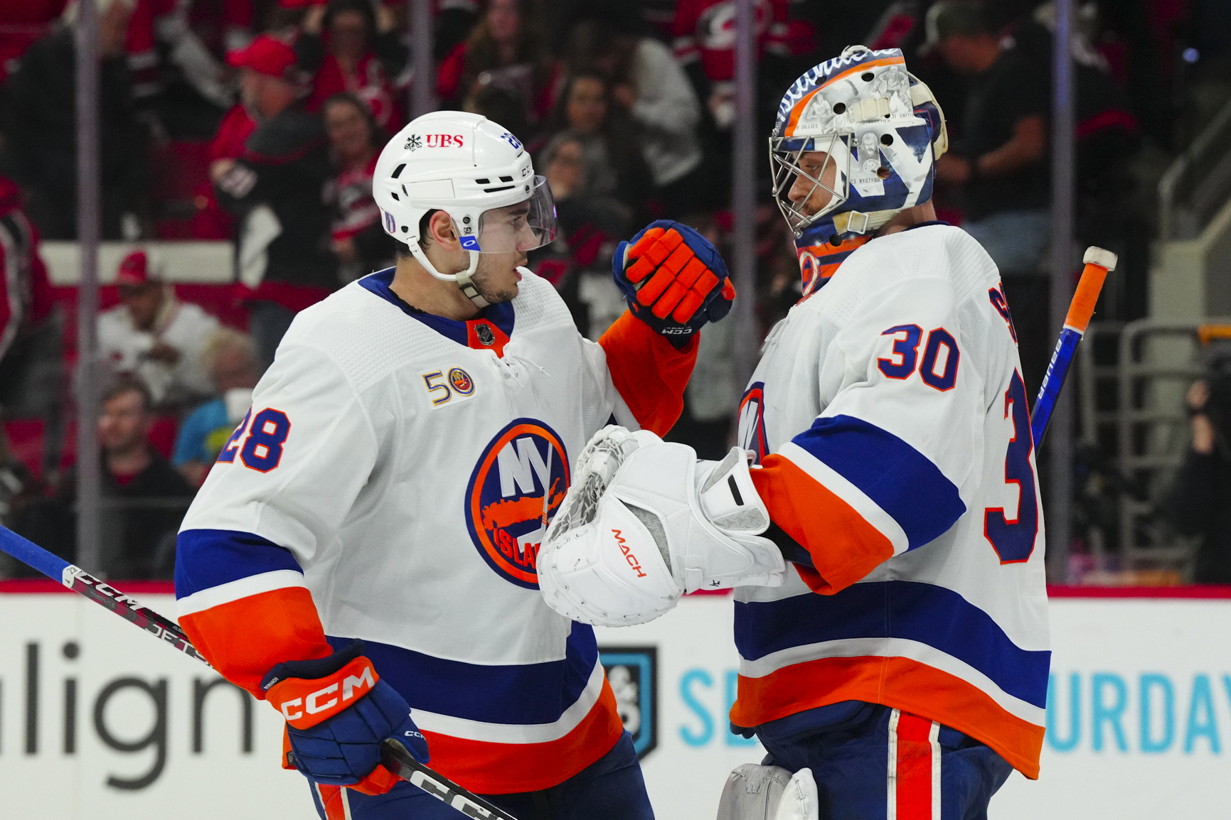
The Originals Whites
Long Island was awarded a franchise that would start play in the 1972-73 to give the New York metropolitan area a second team. This was the first season the tri-state area would have two NHL clubs since the Brooklyn Americans went under after the 1941-42 season.
This month's #HockeyFightsCancer 25th Anniversary feature honors the legacy of Hockey Hall of Famer Mike Bossy and his battle with lung cancer.
Watch the full story presented by @AstraZeneca: https://t.co/jbdnSWpE19 pic.twitter.com/H7IG221eP7
— NHL (@NHL) June 25, 2024
The Islanders would make some small cosmetic changes to the team in numbering and striping. However, these were synonymous with the Islanders dynasty years that yielded four Stanley Cups.
These uniforms would be mostly unchanged from 1972 until the end of the 1994-95 season. Islanders would see a rebrand, but these white sweaters would come back from 1998 to 2007 and once again from 2010 onwards.
The Dark Rebrand… of the Rebrand
The Isles would change things up in 1995, but quickly found the change did not do them good. New York would switch back everything from the jerseys to the logo to run away from the failed rebrand that we’ll talk about later.
New York would use a darker navy blue when reverting back to the dark sweaters. Navy blue would be the primary colour before switching back to a lighter shade after 2010.
However, navy wouldn’t completely disappear from the colour palette as other incarnations would have this shade.
2014 Stadium Series
Islanders fans would experience the best and worst with their Stadium Series sweaters. These 2014 Stadium Series sweaters were donned when the New York Rangers beat their rivals, 2-1.
However, it wasn’t all bad as these jerseys received rave reviews. The colours are very similar to the New York Mets of Major League Baseball. There are number of Isles fans that are also Mets fans, so that works out just fine.
These uniforms would go over well enough that they’ve become the club’s alternate unis in 2018. The only change was the numbers were switched to orange like the team wore with their dark sweaters in the inaugural 1972-73 season.
The Worst of the New York Islanders
Don’t Trust the Gorton’s Fisherman
This one surprisingly divides a number of hockey fans. Some love that the Islanders took a risk with a new look. However, there are others that bemoaned the look as one of the worst in NHL history.
According to NHL Uniform Database, it was “one of the most ill-fated moves in NHL uniform history, the Islanders ditched their trademark royal blue/orange uniforms in favor of a uniform set that a 1960s stoner would have been proud of.”
WE WANT FISH STICKS📣‼
Should the New York Islanders bring back the Fisherman Logo⁉👀 pic.twitter.com/AJfZSBU1xx
— Chuck (@ChuckSportsApp) May 4, 2023
If you consumed fish sticks, the logo is reminiscent of the Gorton’s fisherman from the box. The numbers also go along the wave and it was not well-received. Islanders brass would make things right be restoring the traditional logo and then ditching these altogether.
The logo has come back in a Reverse Retro and the AHL Bridgeport Islanders are using them. However, this logo is more likely on the bad end than the good.
The Black and Greys
Most clubs would love to stay away from ugly sweaters, but the Islanders couldn’t help themselves. In 2011, the Isles brought out black just as many NYC area teams were getting rid of it. New York decided to go with the wordmark-with-number-underneath front treatment.
These sweaters had a beer-league quality look to them. It has a couple of alarming tropes like just make it black and the words and numbers, too.
This would be a high entry on other team’s worst-of lists. However, these are only the second-worst sweaters in Isles history.
2024 Stadium Series
The only thing uglier than the Islanders collapse in the Stadium Series to the New York Rangers was these dreadful sweaters. Low effort seems to be a recurring theme if you looked at the 2021 Reverse Retros. This also falls under that category.
Fans in Met Life Stadium saw the no white and a navy blue and orange look for the Islanders. The word Isles was put across the chest and that was pretty much it.
At least the New Jersey Devils, Philadelphia Flyers and Rangers got decent-looking sweaters out of this. However, the Isles finished dead last in looks among the four.
Other Considerations
The original and now current royal blue sweaters just work. Moving to the white numbers made them look cleaner and it was easier on broadcaster’s eyes.
The Isles did a black and white sweater for their tenure in Brooklyn’s Barcaly’s Center. This was a trope sweater and fell into all the classic traps.
Main photo by: James Guillory-USA TODAY Sports