Sweaters and hockey have been synonymous with each other since the infancy of the sport. Teams have been identified by their iconic colors and patterns. Some of them are classic while others are classically awful. This summer our annual series focuses on the best and the worst sweaters in each team’s history. Today we have the best and the worse Columbus Blue Jackets sweaters in team history.
Columbus Blue Jackets Sweaters: The Best and Worst
How We Did It?
We at Last Word on Hockey used a variety of methods to compile this list. Polling came from social media, our writers, and fans. We wanted to get a variety of opinions when we put out our list. This compilation will likely spur debate. However, we wanted to see who had the most memorable sweaters in each team’s history.
Let’s put our best foot forward with the best sweaters
The Best of the Columbus Blue Jackets
Fire the Cannon
Some may think that the Blue Jackets have had an uninspiring history when it comes to sweaters. However, there’s one sweater that Columbus fans mostly love and that’s the cannon sweaters. These alternates came into existence in the 2010-11 season.
The Columbus #BlueJackets are bringing back the cannons for the 2018-19 season
Check it out –> https://t.co/PgCM8aGFJc pic.twitter.com/Hrtr2TUxab
— SportsLogos.Net (@sportslogosnet) July 23, 2018
Columbus’ nickname of Blue Jackets comes from its American Civil War history where the state of Ohio supplied many soldiers to the Union side. According to NHL Uniform Database, there’s an inscription on on the inside of the rear collar. This writing reads, “We fight, we march!”
A number of Blue Jackets fans have wanted these to become the regular home sweaters. We’re usually hesitant about cream being a colour, but it just works with these sweaters.
The Blue Originals
Columbus came into the league for the 2000-01 season and had a unique looking primary logo with stars, a hockey stick and integrated the initials “C” “B” and “J.” There was a red stripe at the bottom and red and white on the cuffs of the sleeves.
One nice touch is the alternate crest on the team’s shoulder. It’s a hornet named Stinger and he’s dressed in full Union military attire. The city helped manufacture many of the uniforms worn by the Ohio soldiers during the Civil War.
The old logo does come back for one of the team’s Reverse Retros, but the first try is the better execution.
The First Alternate
There were some tough choices when it came to the best and worst of each sweaters. However, we dug deep to find some good ones. Columbus rolled out a sweater that doesn’t get talked about like it shoulder.
The Blue Jackets rolled out their first alternate jersey in team history during the 2003 season. It had the new crest that features the Ohio state flag as part of its crest. This logo would become the Blue Jackets permanent logo and the sweater would be the base for the current home sweater.
However, this alternate had elements of black on the shoulders and arms and there was a black bottom stripe. Columbus would go with all blue and seemingly squandered the good parts of the sweater. The black gave it some contrast that’s not in the current setup. Also, Stinger was sadly retired and hasn’t been seen since.
Worst of the Columbus Blue Jackets
The First Reverse Retro
Columbus has always played it safe when it came to their team sweaters. However, the Blue Jackets took an eye-rattling risk with some red Reverse Retros in 2021.
Hey there, @PatrikLaine29.#CBJ pic.twitter.com/T3QhcMSDOg
— NBC Sports Hockey (@NBCSportsHockey) February 2, 2021
The franchise tried to go back to a variation of the first sweaters, but ended up looking like the Washington Capitals with a different logo. Plus, Stinger is not part of the shoulder and the cannon is the patch the team used in this design.
We appreciate the Jackets taking a bit of risk, but these were jarring. Sometimes taking a risk doesn’t work out.
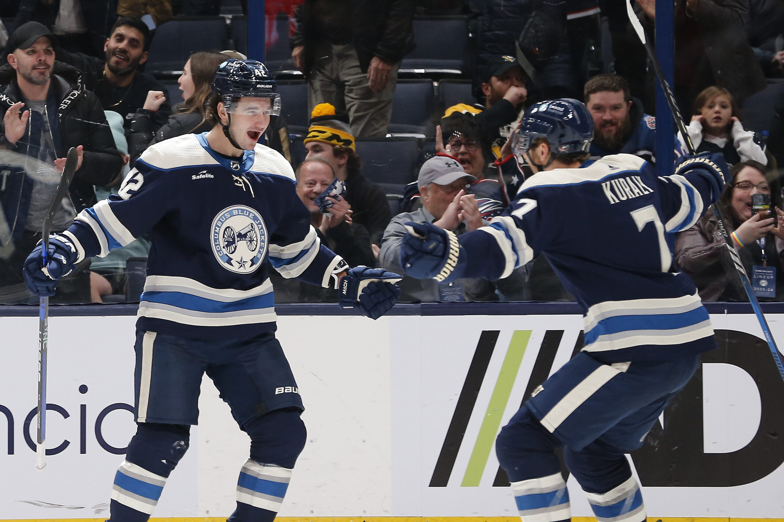
The Current Home Sweaters
And sometimes playing it safe isn’t the right call, either. There’s nothing really wrong with this entry, but it seems rather plain. The first alternate had enough contrast with the black, but some have a legitimate gripe with a darker secondary colour.
We do understand that Columbus is the Blue Jackets, but there’s more blue than an Eiffel 65 song. Sometimes some bells and whistles are OK within reason. These are just plain and as exciting as toast.
The Current Away Sweaters
These white away ones are a little bit better because of the white contrasting against the blue. However, these are still an “ehh” entry on the list. Not trying to pick on Jackets’ fans, but these seem tepid at best.
There’s a little bit of difference, but still pretty basic. Let’s hope some new threads are on the horizon for Columbus.
Other Considerations
The 2022-23 Reverse Retros are a decent entry. The lighter shade of blue on a the current sweater is kind of nice, but we went with the first alternate by just a little bit.
As mentioned before, let’s hope there are some newer sweaters on the way. We don’t mind the logo, but some changes should be made to the wardrobe.
Main photo by: Russell LaBounty-USA TODAY Sports