SAN FRANCISCO — Before you launch at me with your pitchforks, pause and hear me out. Is it time for the Golden State Warriors to consider changing their logo back to a previous version?
Time For The Warriors To Do The Unthinkable With Their Logo
From “The City” to the Lightning Bolt
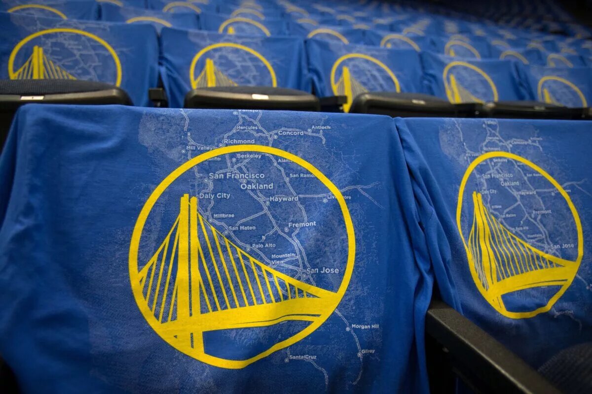
The Warriors did not stumble into their 1997 logo redesign. Ownership reacted to what had become the franchise’s fourth uninspiring visual identity since abandoning the iconic “The City” uniforms. The team wore “The City” from 1966 to 1968 after relocating from Philadelphia to San Francisco, and the design remains one of the most beloved in NBA history. The cable car crest and bold typography captured San Francisco’s civic pride during the franchise’s early West Coast years.
After the franchise shifted across the Bay to Oakland in 1971, the branding entered a prolonged identity crisis. The late-70s and 80s iterations felt corporate and sterile. By the mid-90s, the circular blue-and-yellow basketball logo looked functional but forgettable — clean, yes, but lacking edge during an era when the league embraced bold character marks.
Ownership pivoted hard in 1997. The Warriors unveiled the lightning-bolt logo in navy, orange, and metallic gold, leaning into the era’s appetite for aggressive, distinct branding. The design matched the late-90s aesthetic that defined teams like the Toronto Raptors and Vancouver Grizzlies — loud, stylized, unapologetically different. The bolt sliced through a basketball like a declaration of reset. That Oakland era, often defined by on-court struggle, still forged a cultural imprint. It built loyalty. That era created visual separation from “The City” nostalgia. It belonged to Oakland.
A Dynasty Mark — and What Comes Next
The franchise rebranded again in 2010, returning to royal blue and golden yellow with a modern homage to the Bay Bridge and its original West Coast roots. Since that redesign, the Warriors have won four championships (2015, 2017, 2018, 2022), cementing this logo in basketball history. The team won three of those titles while still playing in Oakland, anchoring the dynasty culturally to that city even before relocating back to San Francisco in 2019.
https://t.co/ynMJzvyIXW pic.twitter.com/3NtwqFysxW
— Mike Herndon (@MikeHerndonSk1) February 14, 2026
The 2022 NBA Finals branding revived a classic wordmark style reminiscent of the early 90s and late 2000s — a subtle reminder that visual eras in the NBA cycle back with purpose.
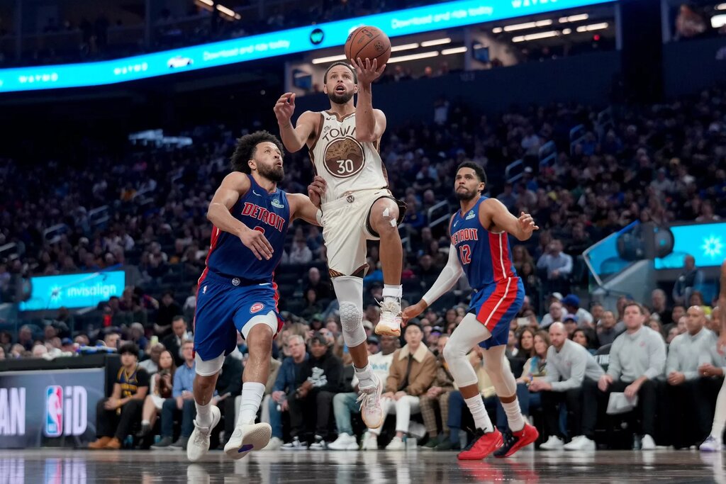
The franchise should consider retiring this current bridge logo after 2027. Not discarding it — preserving it. Enshrining it. This mark belongs to the Stephen Curry dynasty era and should remain frozen in that context. Many analysts believe the 2026–27 season — after which Curry, Draymond Green, and Jimmy Butler III can become free agents — could serve as the last run for the Steve Kerr–led Warriors.
A refreshed variation of the late-90s lightning-bolt identity, reimagined in today’s blue and gold, would honor Oakland’s aesthetic edge while allowing San Francisco to claim a distinct visual chapter. The 90s logos carried personality. They were unmistakable. In an era when fans demand cultural individuality from franchises, a deliberate logo shift could signal the transition from dynastic memory to the next competitive cycle.
San Francisco deserves its own imprint. Oakland already has its banners.
© Kelley L Cox-Imagn Images