Enough is enough already has got to be the growing sentiment whether you’re a die-hard lifelong fan or a [somewhat] innocent part of middle management. Heck, even franchise chief operating officer Kevin Demoff has probably grown quite weary of what might be considered whining, to him at least. Still, the long-awaited rebranding of the Los Angeles Rams is turning into yet another 2020 nightmare.
Whining or not, Rams fans have a legitimate beef about getting it right because the purpose of a rebranding is to upgrade. Make better. Move with the times. That first-leaked draft cap was widely and unanimously voted to be a hideous effort to do that. The colors were all wrong and it looked to be an attempt to unite two NFL teams playing in the same venue, one representing the NFC and the other representing the AFC. Doubting this was their intention, however, let’s examine some real mistakes.
Five Mistakes in the Rebranding of the Los Angeles Rams
Mistake #1: If it Ain’t Broke, Step Away From the Toolbox
To quote the legend @Fred_Dryer during a meeting with the @RamsNFL (& @SGERD5) in early 2018;
“There’s your damn brand, RIGHT THERE!” pic.twitter.com/abfilADG53
— JimEverett.eth (@Jim_Everett) March 9, 2020
Why tamper with perfection and history? The Rams horns on their helmet are one of the most recognized sports designs. Their helmets are not only widely imitated across the country in college and high school sports but worldwide. Most fans, in fact, were content with their current design. They might have been ecstatic with the re-coloring back to the throwback Los Angeles Rams, the original color upgrade which including their own California Sunshine gold (yellow, if you prefer). The Ramshead logo itself had already withstood the altering from St. Louis colors. The font used was bold and confronting. A tweak here and there may have been all it needed, like earlier Ramsheads. The arena of sports logo graphics and design does not require the battle of rocket scientists.
Mistake #2: ‘Man’s Got to Know His Limitations’
That old Dirty Harry quote could not be any truer here and sorry to say, Mr. Demoff, (raising a mug) ‘this Bud’s for you.’
>Hey, I can’t balance a checkbook. Never have, never will. I haven’t the patience for it or the desire to try and right that ship. Thus, I don’t write checks. See where I’m going with this, K.D.?
From Getty photos, you seem to be fond of pastels in your wardrobe. And I know you remember the two different shades of blue in a short-lived version of the St. Louis Rams jersey design. I can never forget, though I forgave in time, your choice of wearing clothes extremely close to the Seattle Seahawks colors during the NFL draft a few years back. My point? You aren’t qualified for or are capable of judging, designing or hiring a crew to design an NFL uniform. Wait. Any American football uniform. Ever. In your position, that’s not necessarily a bad thing. You have the means at your disposal to hire those that know football while having excellent creative taste. You’ve just got to know where to look, which brings me to my next point flawlessly…
Mistake #3: ‘Location, Location, Location!’
It’s a popular real estate mantra, sure, but I’m speaking of more than the physical location or relocation of a building or business. It applies to the product as well. More specifically, know your target audience.
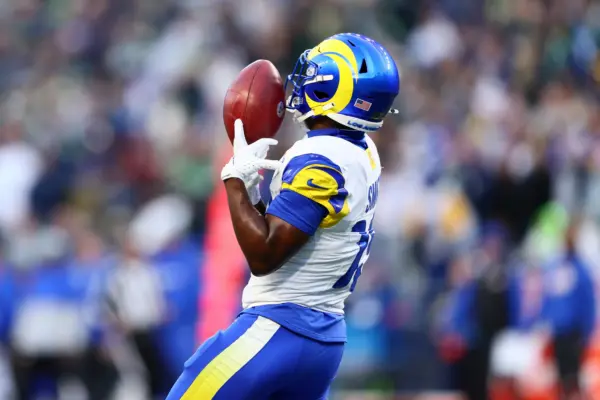
For example, roughly a third of loyal Rams fans wanted the return of the old blue and white-only jerseys. The ones that closely resemble the Indianapolis Colts. That could be fine if the team moved to Lone Pine, Ferndale or Barstow, California. Two problems there. The first being, those fans are mostly the older ones. They have more black and white printouts of Bob Waterfield and Norm Van Brocklin displayed in their man caves than Todd Gurley and Aaron Donald. Not a bad thing, it’s just that their numbers are dwindling and you don’t plan for the future mainly targeting them. Second, the team moved to Los Angeles. The one of the largest NFL markets and a place of style and trendsetting. Plain is mostly unacceptable there and it doesn’t fit the new stadium concept.
Stylewise, the new design color scheme appears to be a moderate success though they and everything else about the rebranding says this is a ‘kinder, gentler’ Rams team. But this is football. Like crying, there shouldn’t be any kinder and gentler in football (despite any and all front office urges to attract that Disneyland crowd). The overall concept misses wide mostly due to a failed Ramshead design. It lacks detail, depth and expression — football-ish expression. I repeat, it’s FOOTBALL, not a cartoon called Hoof Patrol. Frankly, the new release is on the level of the 1940s logos.
Mistake #4: When Listening is Not Necessarily Hearing
Seriously. Have you seen the talent out there? The fans are so disappointed that they’ve taken it upon themselves to correct this issue. It’s important to them. The Rams must learn to understand that they are also in competition when representing their team with 31 other fan bases. Additionally, when team ambassadors like Hall of Fame running back Eric Dickerson and the team’s all-time leading passer, quarterback Jim Everett, openly side with fans it’s time to rethink matters. This can only strengthen the fan base at a time when too many extremely liked players getting away has broadly lowered morale.
Furthermore, it would’ve been marketing brilliance to include Rams fans from day one in a graphic arts talent contest where submissions were the only consideration for the new rebranding. This idea may have helped boost the fan base while avoiding all the current backlash of a designing misfire. The alternative designs on social media alone are amazing and set an example for future rebranding anywhere across the league. Dear NFL, the future is interactive.
UPDATE: The Rams organization says they are now listening and considering a change to a widely-accepted logo. Let’s hope they think accordingly regarding the helmet and jersey to accompany.
Mistake #5: Humble Pie is Good Medicine Long Term
It took longer than expected but the Los Angeles Rams eventually changed head coaches awhile back. That turned out fine. In fact, change is usually for the better when something hasn’t worked even when pride and personal comfort zone advise otherwise.
Respectfully, not altering the new logo is a mistake that hasn’t happened yet and is easily avoided. Like a contract or two negotiated in recent years, Rams fans urge their team to make this change. Take the loss with the intent to make things better in the long run. Sure, winning makes most issues with NFL teams fade away or take a backseat but consider this off-season so far. Also, consider that Rams fans are socially distancing themselves from this rebranding like it’s a dangerous disease and with various new logo designs. They’re threatening to continue to represent in throwbacks (as well as bootleg gear) at a time when the anticipation of exciting new team apparel added to their collection should be at a boiling point, pre NFL draft and new stadium.
#ramslogo bootleg stuff being sold online—
not exactly a good sign— pic.twitter.com/tj8COv5Hre
— ᑭᖇO ᖴOOTᗷᗩᒪᒪ ᒍOᑌᖇᑎᗩᒪ 🏈 (@NFL_Journal) March 27, 2020
While we’re on the subject of making corrections, winning is indeed everything but (thanks to the massive business side) it’s no longer the only thing. Don’t be naïve, team logos and colors do matter.