Sweaters and hockey have been synonymous with each other since the infancy of the sport. Teams have been identified by their iconic colours and patterns. Some of them are classic while others are classically awful. This summer our annual series focuses on the best and the worst sweaters in each team’s history. Today we have the best and the worst NHL All-Star Game sweaters in team history.
NHL All-Star game Sweaters: The Best and Worst
How We Did It?
We at Last Word on Hockey used a variety of methods to compile this list. Polling came from social media, our writers, and fans. We wanted to get a variety of opinions when we put out our list. This compilation will likely spur debate. However, we wanted to see who had the most memorable sweaters in each team’s history. Let’s put our best foot forward with the best sweaters.
The Best of the NHL All-Star Game Sweaters
1983-88 All-Star Sweaters
These orange, black, and white sweaters just bring all the nostalgia back with this look. The teams were separated by the Prince of Wales and Clarence Campbell Conferences and it was peak NHL.
This look is actually toned down from wild-looking 1982 sweaters that looked like a grade-school teacher unloading their compliment of star stickers. The 1985 classic was the ultimate with players like Wayne Gretzky, Mario Lemieux, and Jari Kurri on the ice.
A variation of these sweaters would last until 1988 (which had the league logo instead of conferences) before switching to black as a base instead of orange. However, these sweaters are timeless.
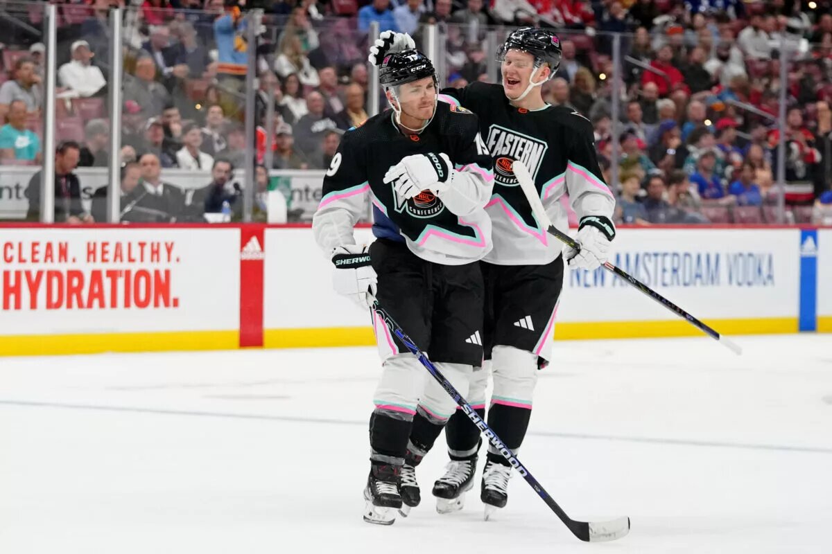
The 1994-97 All-Star Sweaters
This look would eventually serve as a template for the Dallas Stars sweaters of the late 1990s and early 2000s. These jerseys debuted in 1994 to coincide with change to Eastern and Western conferences.
With the @NHL All-Star Game tomorrow let's throw it back 🔄
In 1994 Mike Richter is named All-Star MVP after he saved 19 of 21 shots in the second period, including three saves on sharpshooter Pavel Bure pic.twitter.com/0UBnUxfw4d
— Rangers on MSG (@RangersMSGN) February 3, 2023
According to NHL Uniform Database, the names and sleeve numbers on the Eastern Conference’s uniforms are black with silver trim. The pants would also be replaced by shells that went over top.
This look would somewhat return in 2023 with an art deco colour scheme. These played off the Reverse Retro theme and were liked by our writers.
2004 All-Star Game
There are some mixed opinions on khaki giving an old-time look to sweaters. However, this is an instance that just plain works.
These uniforms play off on the Minnesota Wild’s colour scheme with green for the West and khaki for the East. The Athletic had these sweaters on top of its list of best and worst All-Star Game sweaters.
This look was the signature look of All-Star squads when playing EA Sports NHL games. These sweaters are just great to look at and have plenty of core memories.
The Worst NHL All-Star Game Sweaters
2024 All-Star Game
We know the NHL wants to have popularity levels like the NHL and NBA. However, sometimes it’s a money’s paw type situation when you make that wish.
Canadian pop star and Auston Matthews fan, Justin Bieber, collaborated with the league via his Drew House fashion line. There were four distinct designs with red, gold, white, and blue as the base with stars on the front. The Toronto Maple Leafs star probably had a lot of explaining to do with this look.
We understand the NHL wants to latch onto pop culture, but what’s the cost for these ugly sweaters? These ones should be tossed into the bin at goodwill.
1982 All-Star Game
Remember what we said about the plethora of stars? It looked like the NHL had to fill its quota of stars on a jersey and used that number for one season.
We love the orange, black, and white colour scheme and the forward-thinking design. However, the gazillion stars kill the look of this sweater by a million.
Previous and future incarnations of the All-Star Game sweaters would prove orange, black and gold would work. However, this is one that overdone by the accessories.
2015 All-Star Game
One trend that’s been in modern sports jerseys is the use of neon green. Some teams have been able to pull it off like the Seattle Seahawks at times. However, others can’t made the look work.
The neon green isn’t the worst thing about the uniforms. There’s odd-looking striping and weird number pattern that are just a few of the more questionable fashion choices.
This is a bad look in era and not just boomer energy saying that. We hope there’s no nostalgia for these sweaters to come back.
Other Considerations
The 1973-78 sweaters were a nice and consistent look. We loved the stars on the pants as a neat touch.
The 2018 sweaters were the third year of the four-division tournament format. We like the red, black, and white themed ones, but the other ones missed.
Main photo by: Jasen Vinlove-USA TODAY Sports