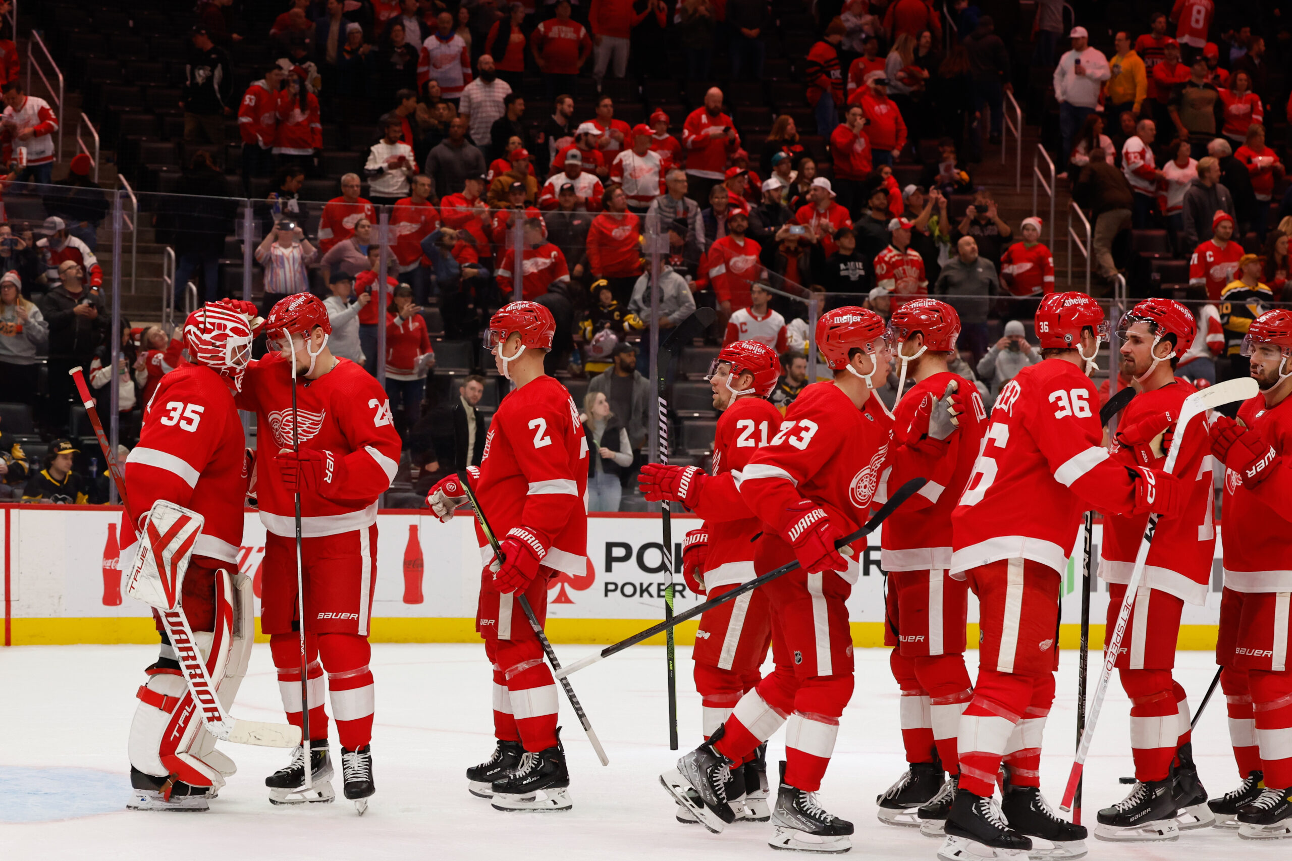
Sweaters and hockey have been synonymous with each other since the infancy of the sport. Teams have been identified by their iconic colors and patterns. Some of them are classic while others are classically awful. This summer our annual series focuses on the best and the worst sweaters in each team’s history. Today we have the best and the worst Detroit Red Wings sweaters in team history.
Detroit Red Wings Sweaters: The Best and Worst
How We Did It?
We at Last Word on Hockey used a variety of methods to compile this list. Polling came from social media, our writers, and fans. We wanted to get a variety of opinions when we put out our list. This compilation will likely spur debate. However, we wanted to see who had the most memorable sweaters in each team’s history.
Let’s put our best foot forward with the best sweaters
The Best of the Detroit Red Wings
The Reds
These sweaters are simple, yet effective. Detroit tried on a couple of nicknames before settling on the Winged Wheel and the red sweaters. The franchise went by the Detroit Falcons and Detroit Cougars before settling down on the Red Wings name.
There have been some minor cosmetic changes to the number and the crest. However, things mostly stayed the same on the sweater since the wheel’s inception in 1932 when James Norris Jr. invested in the team. Norris played for the Winged Wheelers in Montreal as part of the new nickname.
This red sweater has appeared on the character Cameron Frye in the movie “Ferris Bueller’s Day Off” and is just iconic. Frye angered his dad by being a Red Wings and Gordie Howe fan while living in Chicago.
Loren Lacy from Shelby Township, MI, channels his inner Cameron Frye. He's today's #DRWFanoftheDay #IMTH pic.twitter.com/3lSVOFNGtq
— Detroit Red Wings (@DetroitRedWings) March 12, 2015
The Whites
Detroit started off with white sweaters before flipping to red in 1932-22. However, that would cause an issue when the Wings would play the Montreal Canadiens. The Red Wings rectified the issue with a white sweater that was a pallet swap of the red jersey.
However, the white sweater most hockey fans know is when red sleeves were added in 1956. These ones were the home jerseys until the league made dark colours for home teams.
Detroit enlarged the winged wheel crest in 1982-83 and the sweaters have been a constant. If it isn’t broke, don’t fix it.
2016 Stadium Series
The Wings have kept it pretty much old-school with their sweaters. However, this one for their matchup with the Colorado Avalanche was a bold choice.
Don’t be fooled by the sleek look because there’s the old school English D on the sweater. This time the D is in red unlike post entries.
There are also white sleeves and a white diagonal stripe. This is a solid entry for a team that likes to go old-school more often than not.
The Worst of The Detroit Red Wings
The Low-Effort Reverse Retro
Many teams got exciting sweaters with the first set of Reverse Retros in 2021. However, it seemed like the designer for the Red Wings entry did what Spongebob SquarePants did when he studied on what not to do at a stop sign. This just reeked of procrastinating before slapping this low-effort entry together.
This sweater has the look of a practice jersey with the simple gray stripe on a white background and red logo. The Reverse Retro in 2022-23 may have drawn some weird looks, but it least it looked like the designers tried.
Detroit’s entry was ranked one of the worst Reverse Retros and just was a sad one all together.
The Kiddie-School Cougar
As mentioned before, the Red Wings were the Cougars when the franchise debuted in the 1926-27 season. The team did start with the trademark old English D with white pants. However, the team would undergo a couple of looks before landing on a heinous-looking entry in 1928-29.
What ever happened to the Detroit Cougars? pic.twitter.com/KxYIgeBDcx
— Bobby….. PANTR ARE STANLEY CUP CHAMPIONS (@Bobby_Gilbert94) July 9, 2024
Detroit’s franchise can trace it’s origins from the old WHL Victoria Cougars that basically had their players purchased and moved to the Motor City.
The logo on the front of the sweater has a seemingly hastily-drawn cougar slapped on the front. Grade-school students do a better job in drawing the cat-like figure. That decade didn’t have fancy graphic design programs that could smooth out the rough edges. However, this one is just bad.
Falcon Punched
Detroit would change names from the Cougars to the Falcons in the 1930-31 season and would go under that moniker for the next two seasons. The Red Wings name would finally come to be in 1932 and that name has stuck.
Hall of Famer Jack Adams would change the name to the Falcons as the club struggled in the first part of the 30s. Adams and Norris would settle on the Red Wings nickname together and change the team’s look.
However, the 30s style problem of striping was part of these sweaters. Matters weren’t helped when the Detroit Falcons name in gold appeared on the front. It just seems like there was a lot to cram onto the front of a jersey and it’s just too busy.
Other Considerations
We like the Centenial Classic sweater that was a palette swap, but had different striping on the sleeves. That was for the 100th anniversary of the NHL against the Toronto Maple Leafs.
On the bad side, the 2023 Reverse Retro tried to pay homage to the horizontal striped sweaters from back in the day. However, it seemed like they were copying the Chicago Blackhawks homework a bit.
Main photo by: Rick Osentoski-USA TODAY Sports


