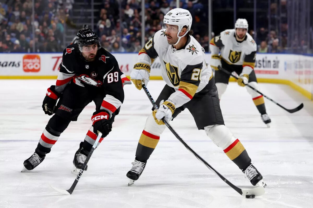
Sweaters and hockey have been synonymous with each other since the infancy of the sport. Teams have been identified by their iconic colors and patterns. Some of them are classic while others are classically awful. This summer our annual series focuses on the best and the worst sweaters in each team’s history. Today we have the best and the worse Buffalo Sabres sweaters in team history.
Buffalo Sabres Sweaters: The Best and Worst
How We Did It?
We at Last Word on Hockey used a variety of methods to compile this list. Polling came from social media, our writers, and fans. We wanted to get a variety of opinions when we put out our list. This compilation will likely spur debate. However, we wanted to see who had the most memorable sweaters in each team’s history.
Let’s put our best foot forward with the best sweaters
The Best of the Buffalo Sabres
The Goat(ed) Head Sweaters
Buffalo has had some deep peaks and valleys in their time in the NHL. This team is known for its blue, gold and white colour scheme. However, the franchise went the way of many 1990s teams and added black sweaters. Usually we bemoan a team going to that trope. However, the Sabres nailed these sweaters that first came into being in 1996 when the team moved out of the old Aud.
THE LEGEND OF THE GOATHEAD RETURNS 😈#LetsGoBuffalo pic.twitter.com/a5nJRYzu9a
— Buffalo Sabres (@BuffaloSabres) January 21, 2023
It’s not unheard of to change looks when moving to a new building, Many were nervous about the departure from the old colour scheme. However, these jerseys symbolized a great period in Sabres history. The black, red, grey and white colours seem to fit that era and symbolized the team’s great period. A Reverse Retro sequel with the current white, blue and gold colours happened for 2022-23.
These sweaters are now part of the regular rotation as of 2022. The blacks ones are just a bit better than the white ones, but both are great and top our list.
Classic Blue and Gold
The Sabres came into the league in 1970 and made a good first impression with both sets of sweaters. We like the road blues just a little bit better, but the white ones are still nice in their own right.
Buffalo wanted to shy away from any nicknames like bison when coming up with a team names. Sabres was the winning choice, but the buffalo with a pair of swords was the logo that has pretty much stayed with the team for many years.
There was the beloved goathead in the 1990s and a less-than-popular choice that came into being in 2006. However, the franchise has returned to the old-school logo. There have been changes to the shades to have a more navy blue, but you can’t argue with a classic.
The Red Swords
We finish the best of list with another favourite from the 90s. Some sweaters brought out the worst of that era, but the red sword alternates were a pretty snazzy combination.
This jersey came into being in 2000 and stayed with the club until 2006. The “Buffalo” wording at the bottom was a bold, but unique touch.
Buffalo’s first Reverse Retro entry was a play on the crossing swords crest. However, it was does with the franchise’s current colour pallet.
The Worst of the Buffalo Sabres
The Buffaslug
There has been and will be some debate on the worst sweaters of each team. However, there’s no debating how dreadful these entries are. The Buffaslug sweaters are some of the most universally dislike sweaters in the history of the NHL.
Who’s the first player you think of when you see this jersey? pic.twitter.com/cd975vm68C
— Spittin' Chiclets (@spittinchiclets) July 10, 2024
This monstrosity came to be in the 2006-07 and replaced the goat head logo. Western New York hockey fans weren’t happy and a classic jersey was added according to NHL Uniform Database.
The Buffaslug was sent to the scrap heap after the end of the 2009-10 season. Buffalo went back to its old logo and has stayed mostly on the path.
Gold Alternates
However, the return to the old logo didn’t make the franchise immune to some bad sweater choices. The Sabres introduced a yellow third sweater in the 2013-14 season and that was one of the wilder choices.
It has a gold base with blue shoulder piping, grey sleeves and white in it as well. Buffalo is just over the logo in small type.
This one just misses the mark and would be on the worst for many teams. However, the sheer awfulness of the Buffaslug keeps in second place on the worst list.
40th Anniversary Alternates
Buffalo officially killed off the slug in 2010-11 and reverted to the circle crest with the swords and buffalo. However, the Sabres didn’t get out of the third jersey business.
The city name is in script writing and the logo is below the “LO” in Buffalo. This third sweater did have the original blue as the team kept navy as a primary colour.
These are fine, but this ends up on this end of the list because the other ones have been quality entries. We understand there may be some people annoyed at this one being on our list.
Other Considerations
Both Reverse Retro sweaters excellently mixed the 90s alternates with the modern colours as we mentioned before. Both the Winter Classic and Heritage Classic sweaters were also solid entries.
Despite the Sabres struggling over the last decade, they’ve still managed to look good for most of that tenure. Here’s hoping the franchise can turn it around soon.
Main photo by: Timothy T. Ludwig – USA Today Sports