Sweaters and hockey have been synonymous with each other since the infancy of the sport. Teams have been identified by their iconic colors and patterns. Some of them are classic while others are classically awful. This summer our annual series focuses on the best and the worst sweaters in each team’s history. Today we have the best and the worse Arizona Coyotes sweaters in team history.
Arizona Coyotes Sweaters: The Best and Worst
How We Did It?
We at Last Word on Hockey used a variety of methods to compile this list. Polling came from social media, our writers, and fans. We wanted to get a variety of opinions when we put out our list. This compilation will likely spur debate. However, we wanted to see who had the most memorable sweaters in each team’s history.
Let’s put our best foot forward with the best sweaters
The Best of the Arizona Coyotes
Classic Kachinas
The Coyotes are no longer with us and likely won’t be for a while. However, the franchise hasn’t really missed when it comes to their sweaters. Despite the chaos surrounding the franchise, the team has usually looked pretty good on the ice.
The team started and ended its tenure with the Kachina sweaters. This emblem actually is based on the supernatural beings in the beliefs of the Pueblo peoples. The franchise didn’t get a lot of things right, but the logo and these sweaters were excellent.

We like the black Kachinas just a little bit better than the white ones, but both are great-looking sweaters. It’s sad to see these jerseys be on the shelf for a while. However, bringing these sweaters back should priority one if hockey does come back to the valley.
Desert Night Sweaters
The last alternates were a pretty good entry for the franchise. These alternate sweaters were designed by Rhuigi Villaseñor, the founder of streetwear brand Rhude. It had the Coyotes modern colours, but they added some of the classic touches like Kachina.
There are some other sweet touches as mentioned by NHL Uniform Database. ” The captain patch is the team’s half-moon logo which forms the letter “C,” and the alternate patch is of what looks like two cacti kissing, forming the letter “A.”
These sadly did not last very long with the franchise going inactive, but it’s an underrated design.
Peyote Coyote
This one is going to divide a bunch of people because there are a lot of strong takes on this one. In researching this topic, we saw these rank among both the best and the worst. Some really love these while some really hate these.
The jersey is green and has a desertscape at the bottom part of it. There’s a coyote head from the logo that’s on the front. This jersey has been repeated in both orange and purple. It’s been affectionately called the “Peyote Coyote” sweater.
The legacy the sweater left puts this one the good side since it inspired two different sequels that had a different colour scheme. These sweaters are memorable regardless of opinion.
The Worst of the Arizona Coyotes
The Running Coyote
There are a number of jersey aficionados that absolutely love this one. However, it’s been called the “Roadkill” sweater by people that didn’t like it. This is the first time a realistic full-body coyote was on the front of the sweater.
CHAT WITH OEL TODAY! Fan chat today with Oliver Ekman-Larsson at 3pm. Tweet questions til then using #AskOEL. pic.twitter.com/KXgBXCGcdd
— Arizona Coyotes (@ArizonaCoyotes) March 21, 2014
However, it didn’t seem on brand for the club. It did seem kind of plain with the basic black trope from the 2008-14 era. There was a bit of brick red on the shoulders and in the logo. This one just seemed to miss.
These sweaters are actually hard to find and a sought-after item.
The White Howling Heads
Arizona decided to do a rebrand when the club moved to the Jobing.com Arena for the 2003 season. There were a lot of vibrant colours after the team moved from Winnipeg. However, this rebrand stripped all that away.
The team went with brick-red, sand, white and black as part of their colour scheme. Hunter green, sienna and purple were put out to pasture in this new era of Coyotes hockey. However, the Kachinas would return for a few occasions before returning to the rotation in 2018.
Add Some Black to It
The last in the “Worst of” category has the Coyotes adding a bit of black to their sweaters starting in 2015. It’s not bad, but it’s on the worst of list because of the other selections ranking higher.
The club went with black pants instead of the brick red and had black added to the upper-arm area. It was the same for both the home and road sweaters. Arizona did keep the nice-looking PHX shoulder patches with the state of Arizona in the background. That patch keeps it from being further up the list.
Future Considerations
The franchise is currently inactive and the trademarks and logo are still currently held by Arizona. Utah is forging its own identity and probably doesn’t want to recall to an era with such a black cloud over it.
Despite the team not having whopping fan support, it stinks to see any fan base lose its hockey team. If the league does expand back to the valley, let’s hope a good ownership group can revive the club and bring back one of the nicer set of sweaters in the NHL.
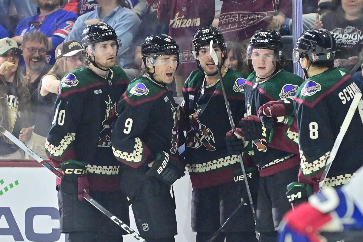
Main photo by: Matt Kartozian-USA TODAY Sports