Sweaters and hockey have been synonymous with each other since the infancy of the sport. Teams have been identified by their iconic colours and patterns. Some of them are classic while others are classically awful. This summer our annual series focuses on the best and the worst sweaters in each team’s history. Today we have the best and the worst NHL sweaters of teams gone by. This is the last installment our series.
NHL Sweaters: The Best and Worst of Teams Gone By
How We Did It?
We at Last Word on Hockey used a variety of methods to compile this list. Polling came from social media, our writers, and fans. We wanted to get a variety of opinions when we put out our list. This compilation will likely spur debate. However, we wanted to see who had the most memorable sweaters in each team’s history. Let’s put our best foot forward with the best sweaters.
The Best NHL Sweaters of Teams Gone By
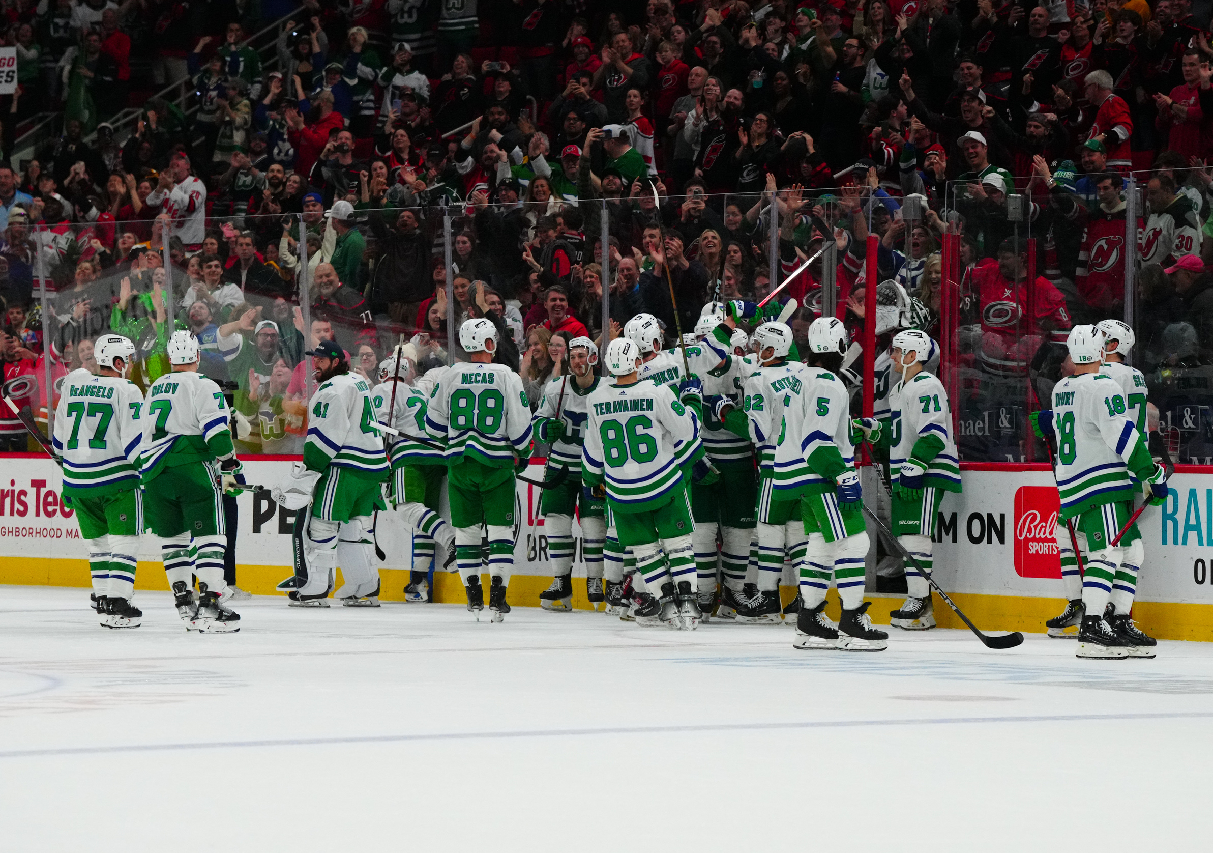
The Hartford Whalers Greens
This one was an easy choice from many sources. We did online polls, talked to writers and did other metrics and these were the clear winner.
We didn’t deserve Eddie Van Halen rocking out in a Hartford Whalers sweater but he gave it to us anyway. pic.twitter.com/PYCJFp5zBM
— Super 70s Sports (@Super70sSports) January 17, 2023
According to NHL Uniform Database, these Hartford Whalers gems were a makeover from the WHA days. Hartford would switch from green and gold to use royal blue. The logo got rid of the harpoon and made this awesome whale tail with the H and W as a visual Easter egg.
These sweaters still live on with the Carolina Hurricanes wearing these green greats a few times a season. Carolina owner Tom Dundon has embraced the Whalers past that the team ran from for many seasons.
The Quebec Nordiques Blues
Another team that many fans want to see return is the Quebec Nordiques. This was another team that was part of the WHA and NHL merger. These sweaters carried over from their days in the World Hockey Association.
Quebec never changed its look while it was on the ice. Although the Nords were going to rebrand in 1995 with a completely different look. The franchise did confirm they would use a husky and have other colours.
The fleur-de-lis and cool-looking logo would return for the Reverse Retros in 2021 for the Colorado Avalanche. We do hope to see this one again soon.
The Minnesota North Stars Greens
The Minnesota North Stars came into the league in the 1967-68 season as part of the mass expansion. However, the team would achieve its signature look in 1978. This came when the Cleveland Barons would merge with the franchise.
Minnesota would always have green its colour scheme, but the white and yellow striping would complete the look on the road sweaters. These road sweaters would add a black stripe in 1988 and that would last until a rebrand in 1991.
The Minnesota Wild would bring a variation of these back with the Reverse Retro sweaters. Some are even hoping the Wild co-opt this colour scheme in the near future.
The Worst NHL Sweaters of Teams Gone By
1920-21 Hamilton Tigers
We dug deep into the archives to try and find some ugly old sweaters and we came up with some doozies. This one is from the old Hamilton Tigers franchise.
Hamilton had an NHL team in 1920, but the franchise was revoked in 1924-25. The team was trying to play off its connection to the CFL Hamilton Tiger-Cats.
However, these were close to the Pittsburgh Steelers bumblebee tops. We understand striping was a thing back in the day. However, this would be more befitting of an English soccer team.
1927-30 New York Americans
The New York Rangers were not the first NHL team in the New York City area. Meet the New York Americans that were later rebranded the Brooklyn Americans.
The New York Americans played their first NHL game at home – at the "Old" Madison Square Garden in 1926 vs the Montreal Canadiens. Over 17,000 came out to watch New York's first NHL team. pic.twitter.com/Z6hWbfNNBV
— The Hockey Samurai 侍 (@hockey_samurai) April 14, 2022
This franchise began play in the 1925-26 season and actually played at Madison Square Garden. The team would fold after the 1941-42 season and the Rangers would be the last team standing into New York metro area.
We singled out the 1927-30 sweaters that have the team city and nickname on the front. There’s also an ungodly amount of stars and stripes on there.
2007 Atlanta Thrashers Skyblues
Hockey in Atlanta hasn’t worked on two occasions. This bad sweater comes from the second team known as the Atlanta Thrashers that eventually became the Winnipeg Jets.
The sky blue design first was an alternate in the 2003-4 season. This uniform tossed symmetry out the window and had a stripe down the arm of the left sleeve. That arm-sleeve also had the city Atlanta going down vertically.
However, these jerseys reached its awful peak with the Reebok Edge design in 2007. The bottom stripe was eliminated and served as the home sweater until the move up north.
Other Considerations
We did enjoy the blue Colorado Rockies from the 1976 season. Usually all primary colours is not a good look, but this blue road sweater worked.
We hate to pick on Atlanta again, but the red alternate was pretty bad. This was almost a jersey you’d see on a football team.
Thanks for checking out this Summer Series. We’re almost to our Puck Drop Previews that will begin on September 1.
Main photo by: James Guillory-USA TODAY Sports


