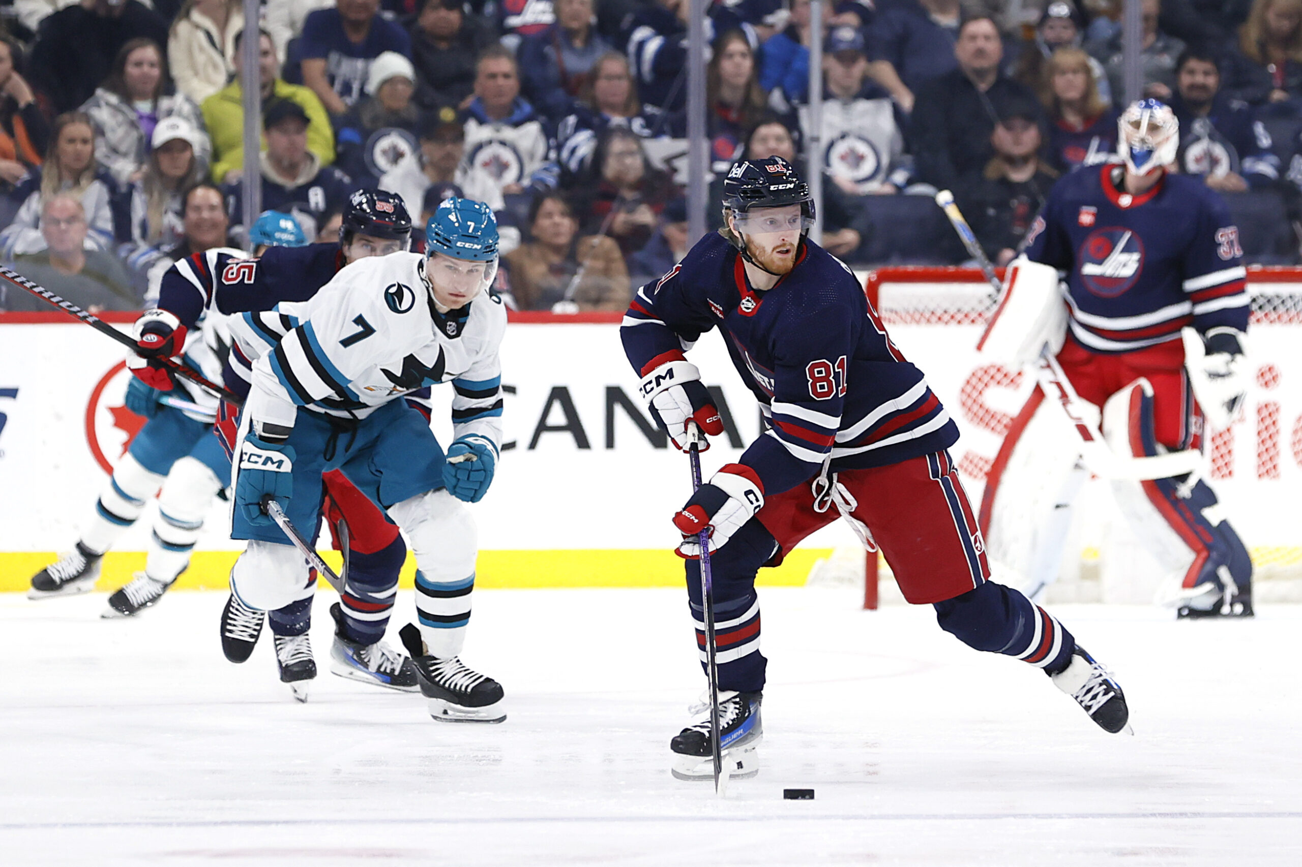
Sweaters and hockey have been synonymous with each other since the infancy of the sport. Teams have been identified by their iconic colours and patterns. Some of them are classic while others are classically awful. This summer our annual series focuses on the best and the worst sweaters in each team’s history. Today we have the best and the worst Winnipeg Jets sweaters in team history.
Winnipeg Jets Sweaters: The Best and Worst
How We Did It?
We at Last Word on Hockey used a variety of methods to compile this list. Polling came from social media, our writers, and fans. We wanted to get a variety of opinions when we put out our list. This compilation will likely spur debate. However, we wanted to see who had the most memorable sweaters in each team’s history. Let’s put our best foot forward with the best sweaters.
The Best of the Winnipeg Jets
2019 Heritage Classic
For purposes of this article, we’re lumping the old Winnipeg Jets (the ones that became the Arizona Coyotes) with the new that was the Atlanta Thrashers. After all it is our list and we can change the rules how we see fit. Our favourite Jets sweater of any iteration is an and ode to the team’s origins in the World Hockey Association. This uniform debuted oddly enough against another team with Atlanta roots in the Calgary Flames. These jerseys have proven very popular and have become the team’s alternate home sweater since 2021. It’s a great tribute to the city’s hockey roots and should stay around for a long time.
2016 Heritage Classic
The 2019 Heritage Classic was a sequel of the very nice-looking 2016 edition. This one was in white with blue shoulder yokes and red pants.
The Winnipeg Jets winning the WHA's Avco Cup in 1979. pic.twitter.com/0LPdnMv2sI
— Old Canada Series (@oldcanadaseries) April 24, 2023
Winnipeg wore these sweaters and looked good fashion-wise. However, that did not translate to a victory as it was blanked, 3-0, by the Edmonton Oilers. This is still a great throwback to the past from the team’s WHA roots. We hope these can come back once in a while as well.
The Original Jet Set
We’ve been debating which set of Jets regular sweaters gets the nod. Is it the original or the new edition of the Jets franchise? It was a close vote, but the old school Jets jerseys get the nod. Many Winnipegers have fond memories of the old Jets before moving down south to Arizona. It’s a perfect blend of the blue, red, and white colours. This sweaters remind fans of the days when Queen Elizabeth II’s portrait was hanging up in the old Winnipeg Arena.
The Worst of the Winnipeg Jets
Recycled Sweaters
If you remembered the New York Rangers best and worst sweaters countdown, the uniforms with the shield logo were easily the worst. However, it seemed like general manager John Ferguson was in love with the design. Ferguson basically just copy-and-paste the Rangers jerseys of the mid-1970s and put the Jets logo on them. We always bemoan low-effort jerseys and this one of the most low-effort looks. It’s not necessarily a terrible look and it works fine for the Jets better than it did with the Rangers. However, copying someone’s homework and just changing up some things is peak laziness.
The Johnstown/Winnipeg Jets
It seems that copying things isn’t just a problem stuck in the 1970s or 80s. This was still an issue for Jets sweaters in 2018.
Blake Wheeler Winnipeg Jets alternate jersey swap #WinnipegJets pic.twitter.com/7U8YCiUgo6
— Jordan Santalucia (@jsantalucia96) September 15, 2018
Winnipeg introduced an alternate jersey with sky blue, black, and white. There’s a cursive “Jets” across the chest and the colours seem to be fine. However, this sweater is way too close to that of the Johnstown Jets of the EAHL. (No, not the EA Sports Hockey League.) It’s a decent-looking sweater, but copying takes points off this attempt.
The 2021 Reverse Retro
Winnipeg decided to bring back its original sweater design with the 2021 Reverse Retro, but put a new twist on it. However, the seems like a cursed design. The Jets decided to go with a dark grey base according to NHL Uniform Database. Winnipeg also used its current colour palette on top of the old Ferguson-era design. We like the idea of trying to do the old design with a modern twist. However, it would have been better if the darker blue would have been the base instead of grey.
Other Considerations
Winnipeg’s modern sweaters are decent enough. We do like the road ones a little but more than the home ones. However, they’re more than serviceable. The 2023-24 RCAF Centennial are a little bit busy for our liking, but at least they didn’t go with tan pants.
Main photo by: James Carey Lauder-USA TODAY Sports


