Sweaters and hockey have been synonymous with each other since the infancy of the sport. Teams have been identified by their iconic colours and patterns. Some of them are classic while others are classically awful. This summer our annual series focuses on the best and the worst sweaters in each team’s history. Today we have the best and the worst Toronto Maple Leafs sweaters in team history.
Toronto Maple Leafs Sweaters: The Best and Worst
How We Did It?
We at Last Word on Hockey used a variety of methods to compile this list. Polling came from social media, our writers, and fans. We wanted to get a variety of opinions when we put out our list. This compilation will likely spur debate. However, we wanted to see who had the most memorable sweaters in each team’s history. Let’s put our best foot forward with the best sweaters.
The Best of the Toronto Maple Leafs
The Blues
Toronto had been known as the Arenas and St Pats before settling on the Maple Leafs name in 1927. The Leafs actually kept the green of the St Pats until changing to blue in 1927.
Some wonder why the Leafs would be blue and use the Canadian national symbol that’s associated with the colour red. According to NHL Uniform Database, the current flag of the country was not adopted until 1965. This is nearly four decades after the christening of the franchise.
After some initial experimentation with striping, Toronto would find the sweet spot with their sweaters in 1934. There was a time that blue sweaters would have a white shoulder stripe in the 1970s and 80s. However, the uniforms restored to factory settings in 1992 and have rarely changed since.
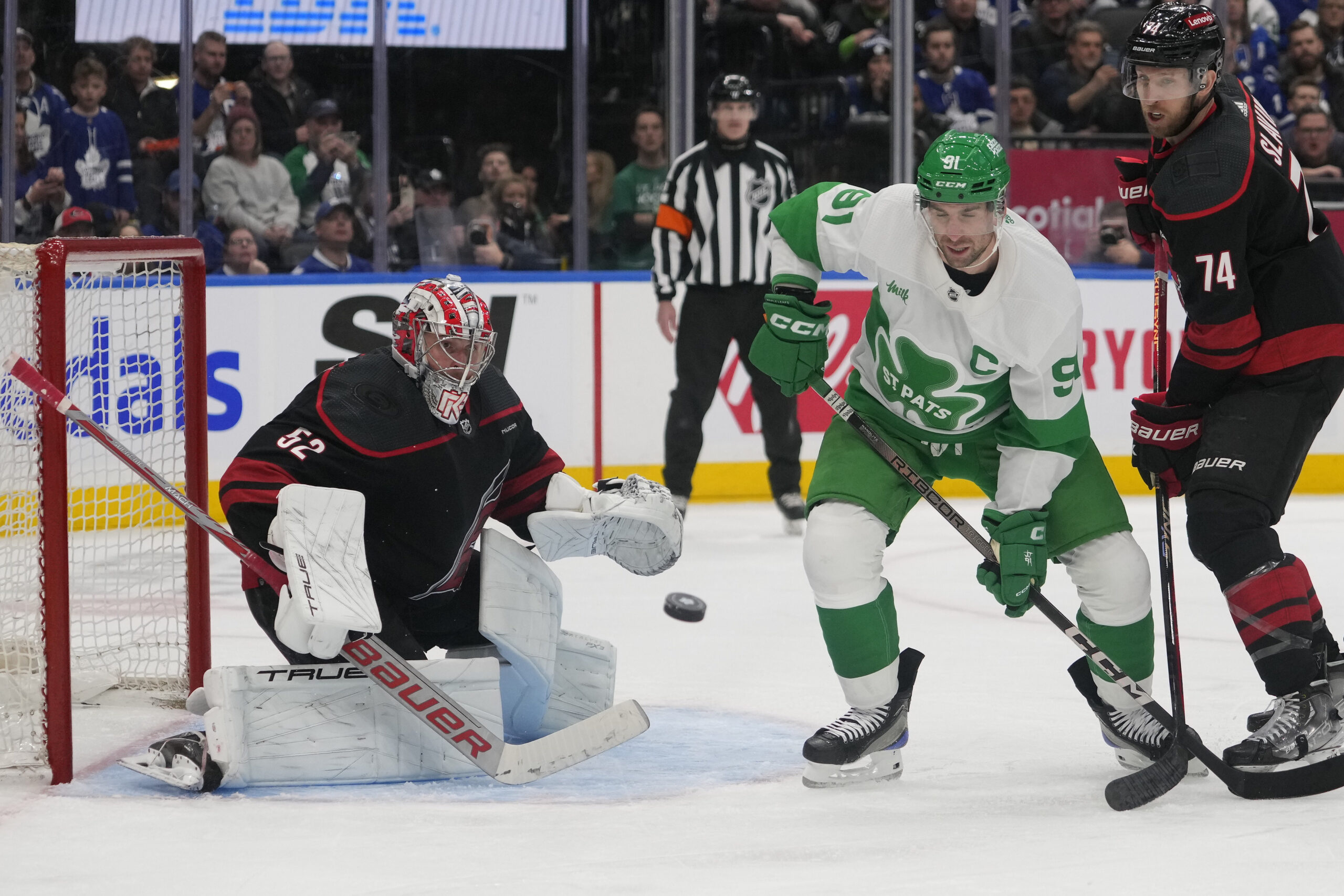
The Current St Pats Sweaters
Toronto has started to honour its St Pats at times since 2002. The Leafs would wear green and white on games close to St Patrick’s Day in 2019. Toronto from 2019 to 2023 would have replica jerseys of their 1922-25 St. Pats.
The Toronto Maple Leafs have released a new version of their annual tribute uniform to the Toronto St. Pats, these will be worn for a game on March 16th against Carolina
Story: https://t.co/QVFZY6IY2w pic.twitter.com/hPHbvOS7ex
— SportsLogos.Net (@sportslogosnet) March 12, 2024
However, we like the new ones that debuted in the most recent season. There’s a shamrock that says St Pats on the front and has a nice green stripe on them.
It’s a nice look with a modern twist and let’s hope these stay the St Patrick’s Day sweaters for a while.
2000s White Alternates
Prior to 2003-04, white sweaters were worn at home. The Leafs were wearing the white ones they donned since the 1992 redesign. However, the franchise brought back a version of the team’s white sweater that they wore from 1958 until 1970.
Toronto wore these again in 1998-99 when it closed down Maple Leaf Gardens. This vintage look would come back as an alternate sweater in 2000 and last until 2007.
This look has a blue shoulder yoke and an older-looking Leafs logo on the front. We’d like to see these come back once in a while for special events.
The Worst of the Toronto Maple Leafs
2002 Heritage Uniform
Being one of the older NHL franchises, Toronto has a lot of commemorative sweaters. Some of these have been hits while others have been complete misses.
We did mention that Toronto started honouring their St Pats past, but its first entry wasn’t a good one. These sweaters were made to celebrate the 75th anniversary of the team changing its name.
These sweaters were worn in March 2002 when the Maple Leafs played the Buffalo Sabres. Toronto’s look made them look like trees and the brown helmets were a bad of a jolt to look at. We’re glad Toronto got better at making these throwback sweaters in later seasons.
1996-97 Maple Leaf Gardens Anniversary Sweaters
Toronto celebrated the 65th anniversary of Maple Leaf Gardens in 1996-97 with a nod to the past. The Leafs donned replicas of their original blue sweaters.
Love it! 1999 Leafs Jersey … Still have this one in my collection. #torontomapleleafs #nhl #hockey #gettingold pic.twitter.com/4tVDghoDMJ
— Sergei Berezin (@serber94) March 7, 2021
This look even took the nameplates off the back of the sweaters, but there were a number of things off with this one. The striping was just plain bad and there was so much of it. We understand older sweaters had a penchant for this, but this was a bit much.
We also had to question the number font used on the jerseys. Honouring traditions is fine, but the Leafs could have chosen a different era to honour with this look. These would also return in 1999 for the final ride at the Gardens.
1927 Whites
We know it feels like we’re picking on the past, but this was a very plain-looking sweater. The great Conn Smythe (yes, that one) bought the team in 1927 and put the team in white sweaters for the rest of the campaign.
This look would also have the Leafs donning a green leaf that said Toronto below. There would also be green numbers on the back of the jerseys as well.
Toronto would begin the process of incorporating blue into the look in the 1927-28 season. However, seeing green leafs in a plain white sweater might have made people do a double-take.
Other Considerations
The Reverse Retros were both kind to Toronto with the 2021 look adding gray to the 1970s and 80s sweaters. A palette swap of the 2000s alternates was also a good touch in the 2022-23 Reverse Retro.
The Toronto Arenas 1918 sweaters had way too many stripes and a plain block “T” in the front. A sequel in 2017 with the Next Century edition wasn’t much better.
Main photo by: John E. Sokolowski-USA TODAY Sports


