Sweaters and hockey have been synonymous with each other since the infancy of the sport. Teams have been identified by their iconic colours and patterns. Some of them are classic while others are classically awful. This summer our annual series focuses on the best and the worst sweaters in each team’s history. Today we have the best and the worst Chicago Blackhawks sweaters in team history.
Chicago Blackhawks Sweaters: The Best and Worst
How We Did It?
We at Last Word on Hockey used a variety of methods to compile this list. Polling came from social media, our writers, and fans. We wanted to get a variety of opinions when we put out our list. This compilation will likely spur debate. However, we wanted to see who had the most memorable sweaters in each team’s history. Let’s put our best foot forward with the best sweaters.
The Best of the Chicago Blackhawks
The Red Homes
Chicago is a proponent of the “if it ain’t broke, don’t fix it” model. These iconic red sweaters came to be in the 1955 season after having black road and white home sweaters for a number of years.
The logo of Chief Black Hawk was in a circle before that point but then the circle was dropped. There have been a few changes to the Native American head and the collar here and there. However, Chicago hasn’t messed with this sweater too much.
The red ones were the road sweaters until the 2003-04 season. These iconic threads have a part of the Blackhawks look for 20 years and these sweaters will stay there for a long time.
The White Sweaters
This was a tough choice on which one to go with, but the white ones just miss out on first place. Some like the more weary-looking warrior, but the modern version works just as well.
Many people think of Clark W. Griswold wearing his white Blackhawks sweater at home during National Lampoon’s Christmas Vacation. We mentioned Adam Sandler rocking the Boston Bruins sweater in Happy Gilmore, but this one is just a little more well-known.
Style Tips from Your Favorite Christmas Movies
Clark Griswold's Blackhawks jersey >>> http://t.co/INHl5A1PXY pic.twitter.com/NnvzE9SHVY
— Complex (@Complex) December 3, 2014
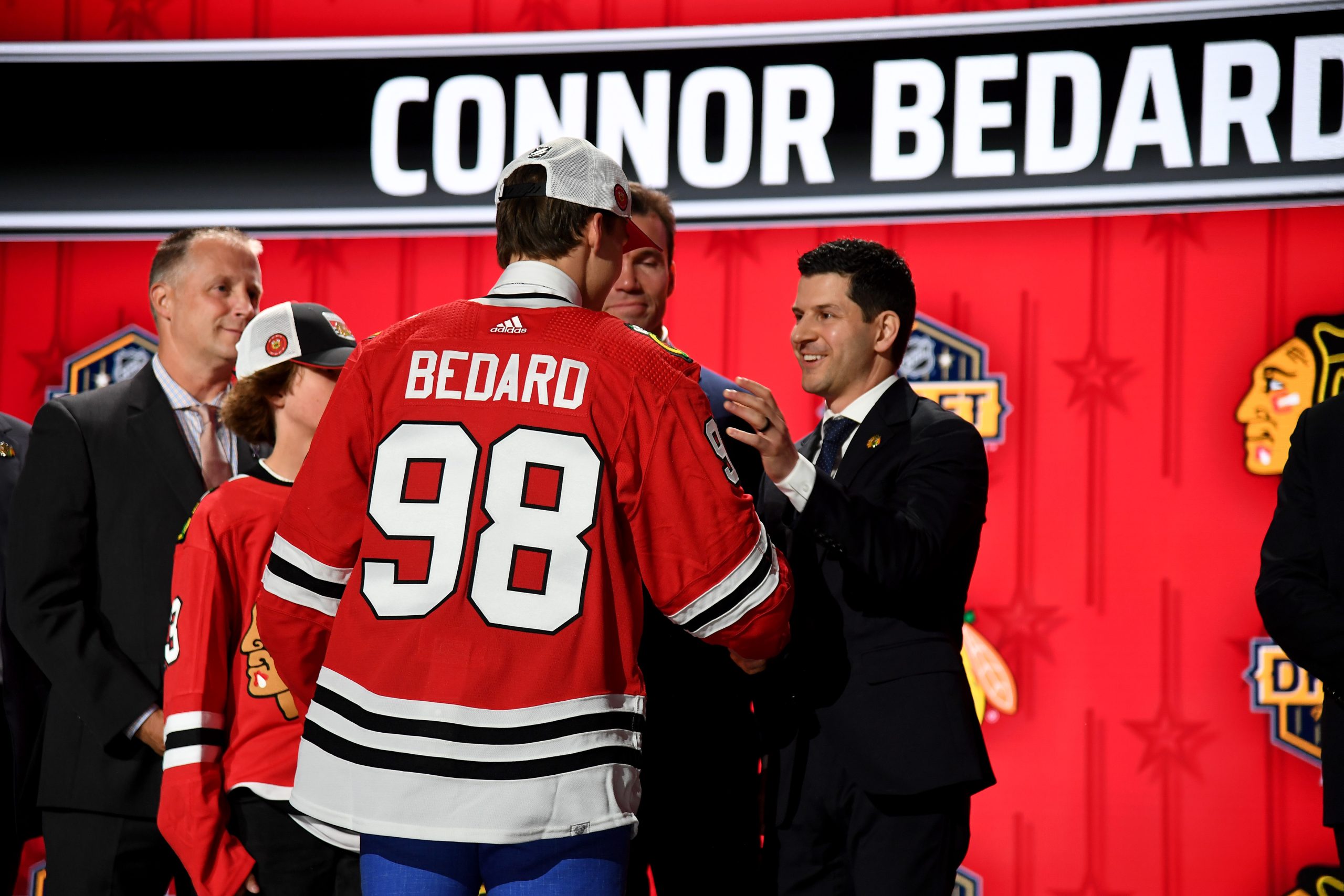
In fact, Griswold sweaters are up there with the names of Patrick Kane, Jonathan Toews, Stan Mikita, and the emerging Connor Bedard.
The Black 2019 Winter Classics
We’ve bemoaned the “just make the jersey black trope” and probably will a few more times in this series. However, this seems like one of the few times we’ll let it slide. It just has a great look to it and is a nice historical recall to the early days of the franchise in the late 1920s.
The Athletic did a ranking of Blackhawks’ jerseys from the past and present and this one scored second on their list. Hawks writer Mark Lazerus even said “the United Center scoreboard is kept black-and-white, and it looks sweet.”
The stripes also are better distributed than the original sweaters that debuted in the 1927-28 campaign. We’d love to see these come around once in a while.
The Worst of the Chicago Blackhawks
The 2016 Winter Classics
This game was a whole lot of a letdown from the 6-1 drubbing by the Minnesota Wild to the jerseys themselves. Usually a special occasion means a nod to the past and Chicago does pretty good with this concept for the most part.
#Blackhawks not sorry for being in yet another outdoor game. "We kind of deserve it." Read: https://t.co/yKbv6eyrFG pic.twitter.com/exDRlVk9EQ
— Mark Lazerus (@MarkLazerus) February 20, 2016
In contrast, this one was just seemed like “slap the logo and change the striping on it a bit.” We did like the black helmets, but this entry is just a bad one.
Let’s hope this gets relegated to the scrap heap of history.
The Black and Tans
Chicago had slowly working on other colours into the original black and white pallet. The year 1934 saw the addition of red to array of Blackhawks colours and that seemed to work out pretty well.
However, the franchise would add tan in 1935-36 and that would not go over so well. Chicago would end the tan experiment in 1937 and stay away from it for the most part.
The Blackhawks would bring the sweater back in 2009, but the tan shells stayed in the museum. This black sweater looks okay, but the shorts kill the look.
The Barber Poles
Many clubs had barber pole striping and we’ll be ripping these apart soon enough. However, these ones are up there for bad. These sweaters were towards the end of Fred McLaughlin era and they were a whole bunch of yikes.
The 1937-38 season was the first season that Chicago wore these black and red striped monsters and they lasted until the beloved jerseys came to be in 1995. There would be some changes to the striping here and there, but the general look stayed the same.
These barber poles would return for the league’s 75th anniversary in 1991-92 and the 2022-23 Reverse Retros. However, they’ve kept in the back of the closet for a long time.
Other Considerations
The 2014 Stadium Series is a play on the 1996-2007 black alternates that also played pretty well. That game was known for the snow that came down at Soldier Field. The 2022-23 Reverse Retros just missed out on the bad side of the list, but they should be shunned for their dreadful look.
Main photo by: Christopher Hanewinckel-USA TODAY Sports