This year the kits were talked about a lot on social media — and not always for the most positive of reasons. Keep in mind, this is an opinion piece, but I would love to hear from readers their rankings on the kits, whether in the comments or on Twitter. Also, another thing to keep in mind: some teams had to make a form of a white kit. However, (most) teams neglected to be creative with the white kit. So, points for creativity will be deducted.
I am grading the 12 teams’ kits with the following criteria: uniqueness and creativity. Oh, and I will also be ranking them based on my own personal preference.
Also, one more shout: keep in mind this is grading the kits, so it can include the whole outfit. We’re not just looking at the jerseys (but there is a high emphasis on them)!
Without further ado, let’s take a look at the NWSL kits.
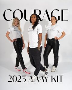
Speaking as plainly as this kit, it’s a white shirt with a sponsor slapped on the front. It’s boring, bland and not creative at all. I’ve seen some white kits hit it out of the ballpark by adding a splash of color. Look up the 2020 Houston Dash away kit. That was a gorgeous example of being creative while also following the rules of having white for away kits.
North Carolina gets a big, fat zero for creativity or uniqueness. It’s at the bottom of the list.
The idea isn’t bad, but it also seems to be a copycat of what Chicago did a few years ago with the “Elevated” kit. However, Chicago did it better, with a much more intricate design, almost looking tech-y. Angel City’s isn’t the worst, but compared to their inaugural kit last year, it’s pretty lame. The coast of California is too big. If Angel City would have done a map of Los Angeles, that would have been better. Technically, this kit encompasses rival San Diego. Don’t ever include your rival in anything! That’s the first lesson!
It’s not last place because it at least has some color on it, let’s get that out of the way. Portland’s look is basically an “Ed Hardy” and grunge, white T-shirt. Portland’s away kit looks like something I would see a punk rock band singer wear, or something a skateboarder would rock. It doesn’t look like a soccer jersey. It just looks like a tattoo on a white shirt. I don’t care how many times the players claim they like it — it just looks… bad.
But, Portland does get points for uniqueness. They could have very well put a white shirt on the market, but they elected to spice it up. It just doesn’t happen to be my type of spice.
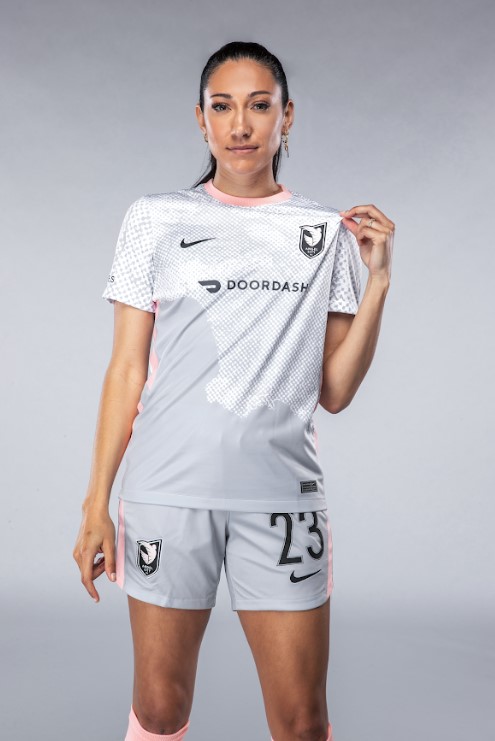
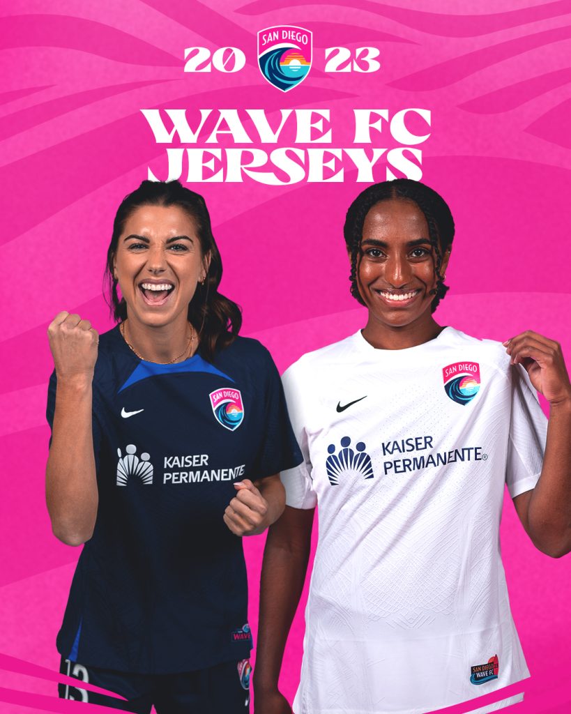
The home kit is basically the same as last year, but I am digging the pink letters on the back. Hopefully, in the bright California sun, it is easy to read. The away kit is, again, a white shirt with the sponsor on the front. San Diego gets points for the pink lettering. Maybe Inter Miami can take some notes in MLS.
It Can Stay on the Rack… But I’m Not Buying (Rankings #8-6)
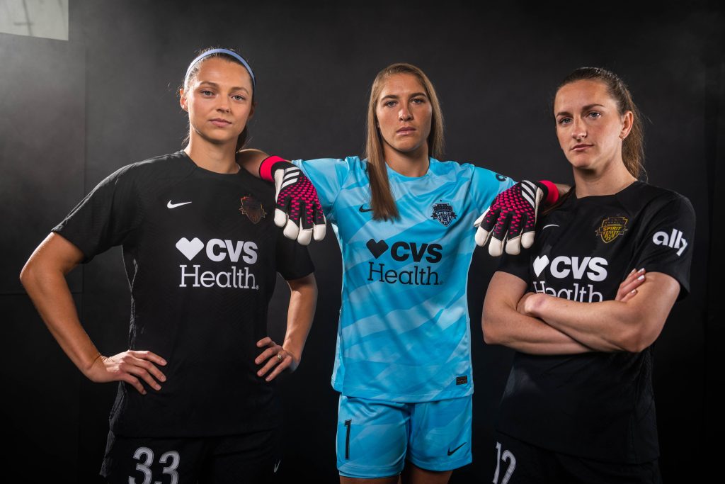
Black is one of my favorite colors. It’s a slimming color. But for a soccer jersey to just be plain black? Not only is it just a black T-shirt, but it’s also going to be rough for the players during the summer time. Black attracts light and heat, and white deflects it. At least when Gotham did their kits last year, they had a sky blue lightning bolt going through it. Although, Washington gets some points for two things: the glossy crest and the goalkeeper being in the kit announcement. We need to appreciate goalkeeper kits, too! Aubrey Kingsbury is rocking this year’s look.
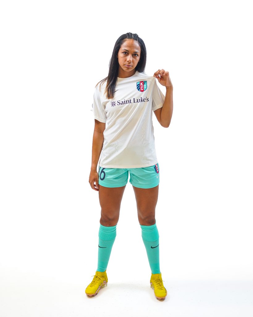
Kansas City had a gorgeous red kit for their home look last year, and they get to keep that this year. And, their kit didn’t hit it out of the park for their white, away kits. It’s a white shirt. But, and those who love the Kansas City teal will agree, the teal shorts and socks make the look. Instead of just another white and black combination, I give Kansas City credit for sticking with their brand and going for teal shorts. It does enough to distract from the white shirt.
Houston is going to look really good in the fall when everything is orange and black. I like the kit, it’s a nice color combination, but it doesn’t stand out. Houston has a history of keeping their home kits too simple. Most of their kits have been orange shirts. While the look is sleek color-palette wise, there is no cool pattern or design that go with it. If the shirt had some black and orange pattern, then we’d be talking. When I was in eighth grade, we got bright orange sweatshirts for our small, 8th grade class. We were nicknamed the “traffic cones.” I can’t think of anything else that looked like more of a traffic cone than this.
Scrounge up some money for these Kits! (Rankings #5-4)
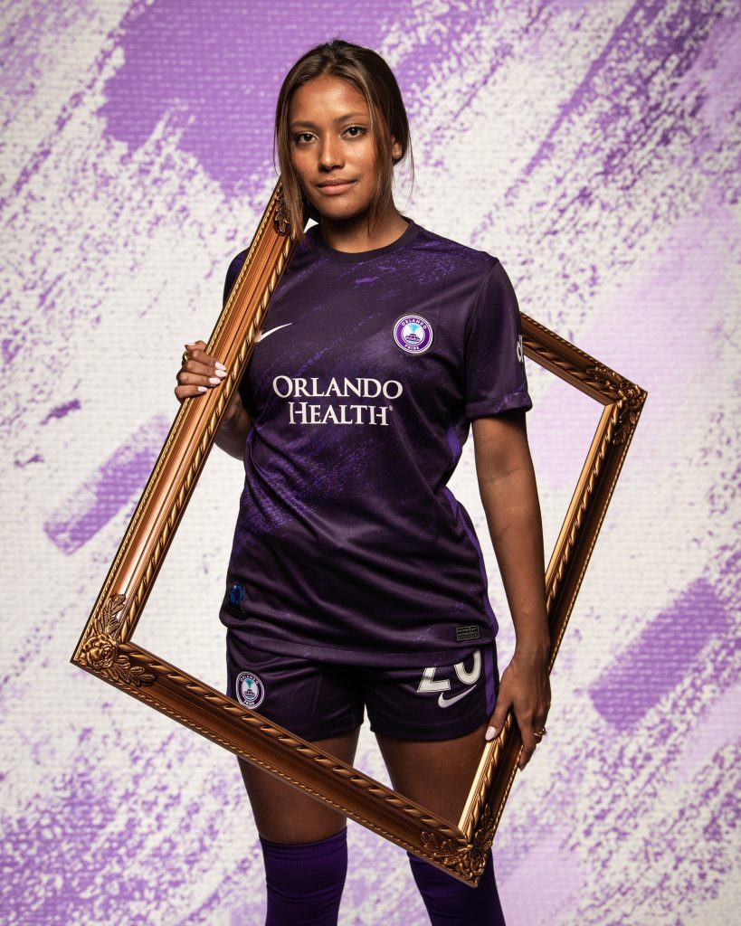
Orlando had some big shoes to fill with a home kit. Their 2020-21 home shirt was a gorgeous space design, with stars and everything. And a killer purple pattern. This kit isn’t as great as that, and Orlando may never have a kit that great again. But, the new Highway kit has a nice pattern and has a great story behind it. The purple almost looks dusty like the highway. But for real, read the story about Mary Ann Carroll, the only woman part of the Highwaymen.
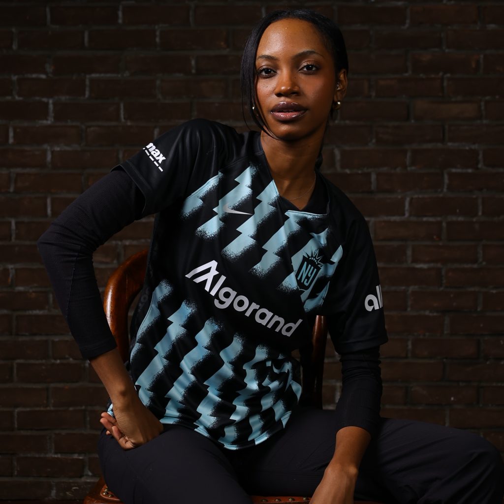
Gotham and their sky blue color are a marriage in perfect harmony. The rebrand has been a gift for Gotham, but it’s nice to see their connection to the former Sky Blue FC brand by keeping a “sky blue” color. It’s amazing that SBFC never wore sky blue… but that’s another story for another day. Gotham has their brand, and they nailed it with this kit. It almost reminds me of the lightning bolt kit the Philadelphia Union had a few years ago, and I loved that kit. Gotham’s only fault is that there were kits that were better. This is a solid kit though, and you will get your money’s worth for it.
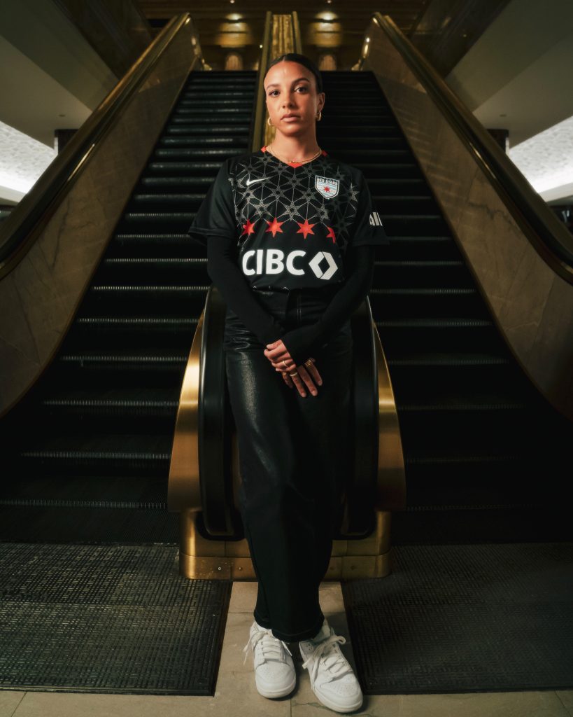
Stop me if you heard this before: the Chicago Red Stars put out a great kit. This club has a history of getting it right. Whoever designs these kits needs a raise. This isn’t a black shirt like Washington’s. The silver and red stars on the kit stand out, making it unique. Chicago dubbed this the “Foundation” kit. The club stated, “The stars represent the bedrock of the foundational framework being laid as we prepare to enter a new chapter for the club.” That’s a big deal for Chicago, whose longtime owner, Arnim Whisler, is selling the team. Chicago needs a breath of fresh air, both on and off the pitch. With this kit, they’ll look good. But can they feel good and play well?
I love a good pattern and I love the pop of color that OL Reign does here. Their last home kit was a little bland, but this pattern is a head-turner. OL Reign ha sone of the bigger sponsors on their shirt, in regard to size and importance. However, it doesn’t destroy the pattern of the kit at all. The red on the sleeves and the little red Nike logo pop, but not in a clash-y way. It looks good, and points to the designing team for sticking with the crest colors and brand.
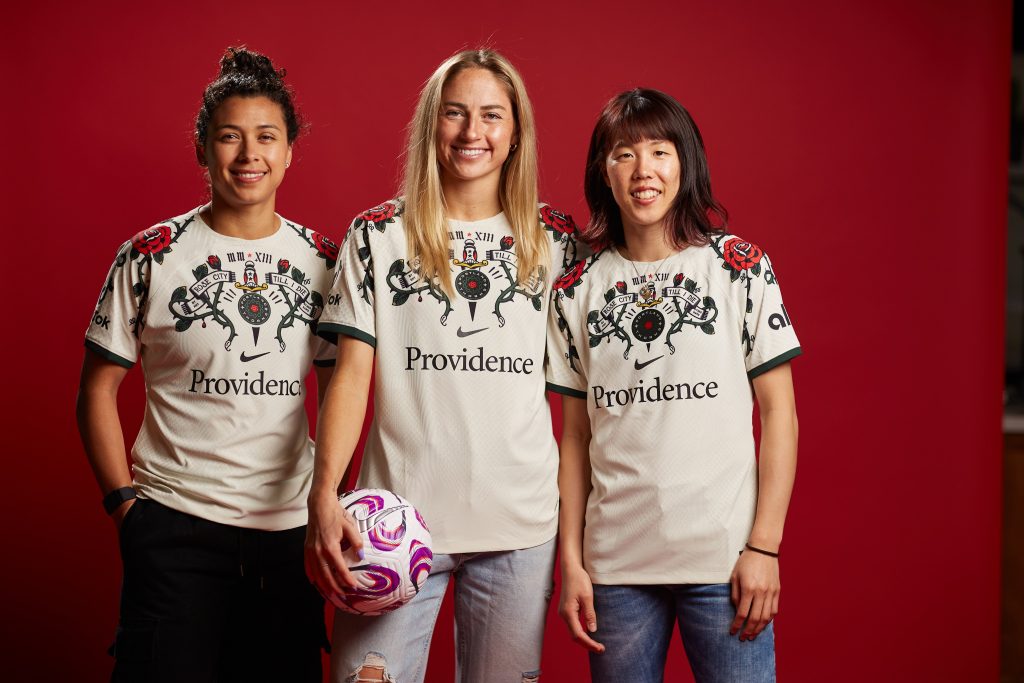
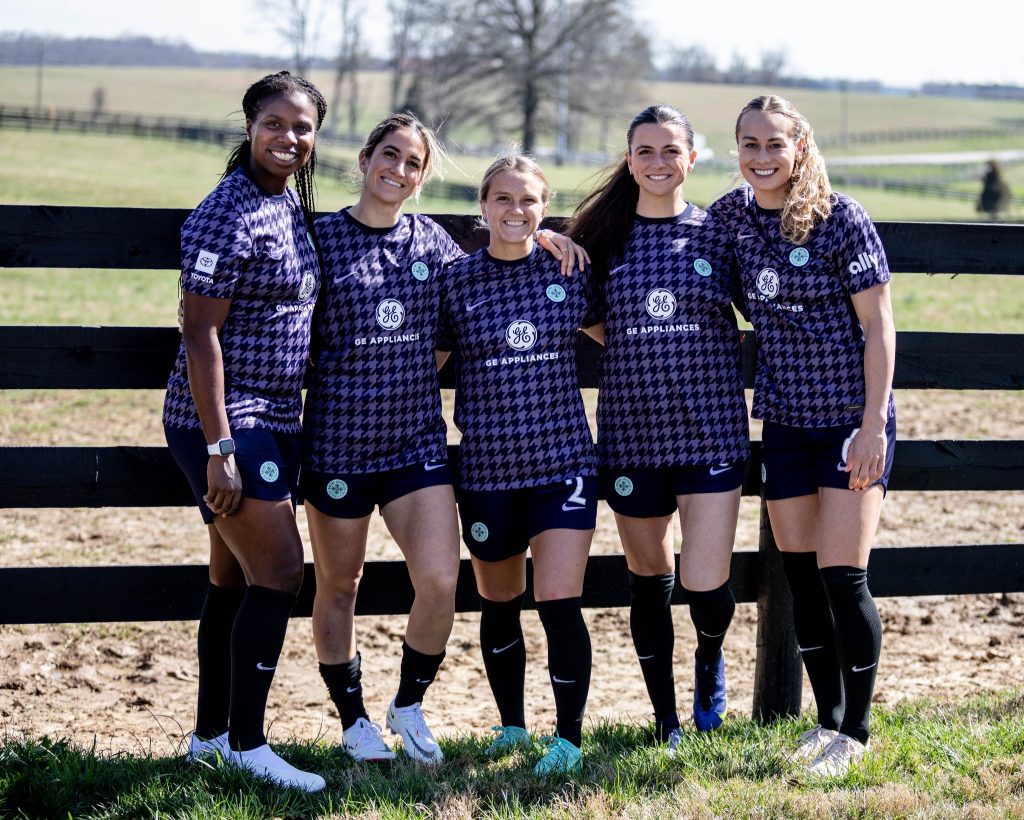
Racing Louisville, take a bow. You win first place on my list. First off, the “Houndstooth kit… and I’m from Pittsburgh where we have the Pittsburgh Riverhounds. A+++ in my book for making me think of my beloved club every time I’ll see this kit. But all ‘Steel City’ jokes aside, this kit is beautiful. The pattern is awesome and fits in well with the country-style of Kentucky and Louisville. The black shorts and socks are sleek, and I love that Racing put their mint green crest on the shorts and shirt. The designers nailed this. Racing will be the best dressed team.
(And, if you listened to the Last Word SC Radio NWSL preview podcast with myself and Daniel Sperry, they’ll look good and play well this season).
What do you think? Do you agree with my picks? Let me know in the comments or on Twitter. I love having discussions with fans, and kits are great things to discuss and share our love of the game. Either way, I hope you enjoy the 2023 NWSL season. I know I will!
Rachael Kriger is a senior editor at Last Word on Soccer, and the lead Seattle Sounders writer. She has been with the site since March 2018, and serves as a social media expert and regular contributor on the Last Word SC Radio Podcast. Personally, Rachael lives in Pittsburgh, Pa., and is a nine-year basketball coach, an avid photographer and big Riverhounds fan. She loves her beloved Russian National Team and cried when they beat Spain in the 2018 FIFA World Cup.