Sweaters and hockey have been synonymous with each other since the infancy of the sport. Teams have been identified by their iconic colors and patterns. Some of them are classic while others are classically awful. This summer our annual series focuses on the best and the worst sweaters in each team’s history. Today we have the best and the worse Colorado Avalanche sweaters in team history.
Colorado Avalanche Sweaters: The Best and Worst
How We Did It?
We at Last Word on Hockey used a variety of methods to compile this list. Polling came from social media, our writers, and fans. We wanted to get a variety of opinions when we put out our list. This compilation will likely spur debate. However, we wanted to see who had the most memorable sweaters in each team’s history.
Let’s put our best foot forward with the best sweaters
The Best of the Colorado Avalanche
The Original Burgundy Sweaters
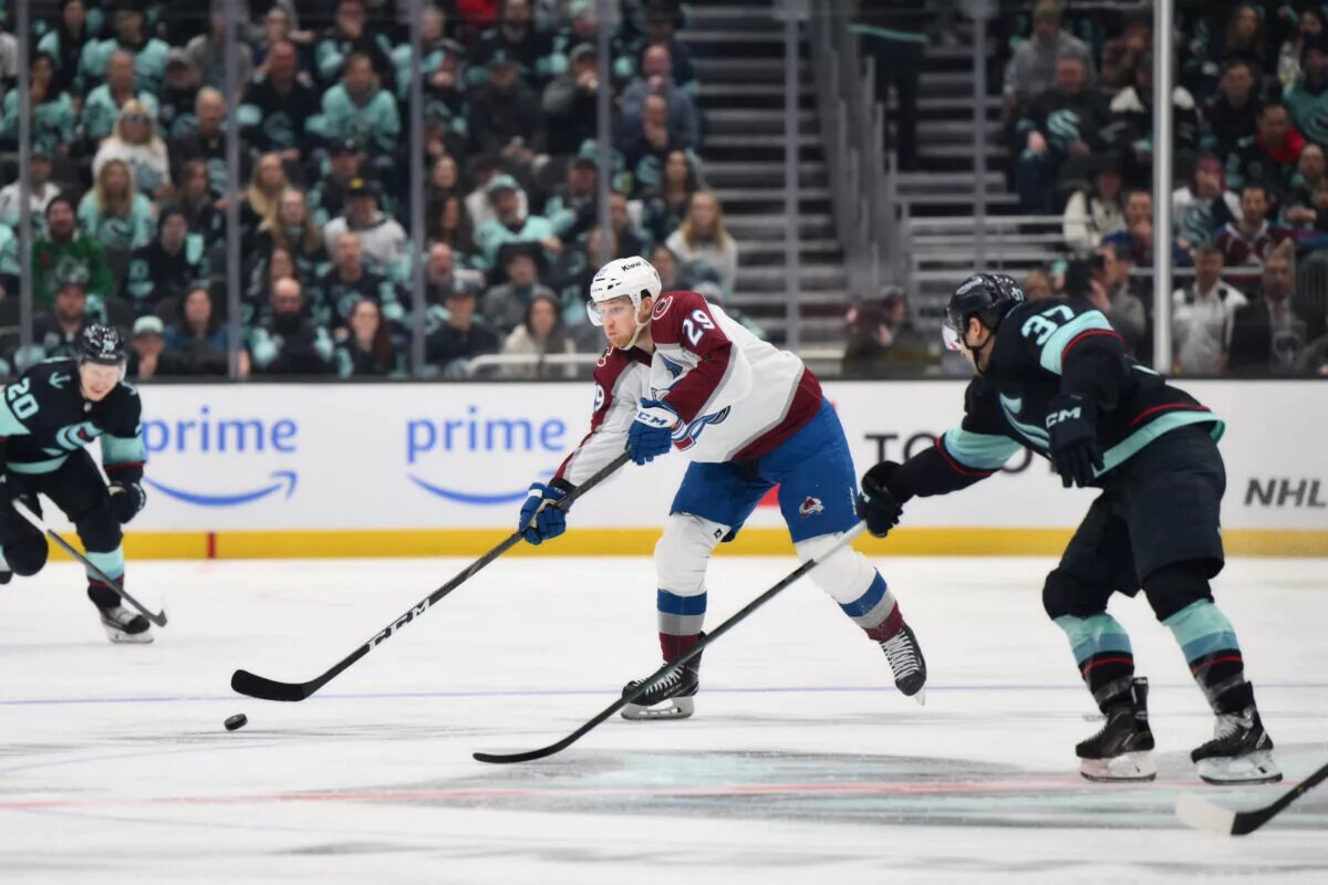
Many wondered what the Avalanche’s look would when they moved from Quebec City. There was some trepidation on what the team’s look would be like. However, the team made a good first impression when they stepped onto the ice in the 1995-96 campaign.
According to the great resource known as the NHL Uniform Database, the team “changed its colors to burgundy, steel blue, black and silver. The crest features the letter “A” in the shape of a mountain, with a puck sliding down in a similar manner as an avalanche.”
Colorado immediately experienced success and won a Stanley Cup over the Florida Panthers in a four-game sweep. These sweaters are iconic and symbolize the best of times in the team’s history.
2021 Reverse Retro
This might make a few Quebec Nordiques fans made, but the franchise made the old “N” logo look pretty good. The league had every team do Reverse Retros in the 2021 season and this old to the Nordiques got over pretty well.
This is by far my favorite "Reverse Retro" jersey: the Quebec Nordiques-inspired Colorado Avalanche pic.twitter.com/tYn65a2oZD
— Stephen Whyno (@SWhyno) November 16, 2020
These sweaters were recoloured in the Avalanche’s current scheme and had the fleur-de-lis from the Quebec days on the bottom. This was one of the better Reverse Retros from the first set.
Colorado hasn’t attempted implementing more elements from the Quebec jerseys, but we wouldn’t be opposed to seeing these return once in a while.
2023 Reverse Retro
The franchise have done a great job of honouring the past in their Reverse Retros. Colorado honoured Quebec in its first outing and then followed it up with an ode to the Colorado Rockies. The Rockies eventually turned into the New Jersey Devils, but the Avalanche took their current sweaters and added Rockies colours to it.
Colorado’s state flag has a “C” with a circle on the inside part. These sweaters takes colours from the state flag, which was also the Rockies colours.
We hope these ones make a return as well. However, New Jersey owns the Rockies’ history, so that may be a bit harder for a return.
The Worst of the Colorado Avalanche
2020 Stadium Series
I wonder if the Avalanche were trying to cosplay as the Avengers in this one? These sweaters came into being for the 2020 Stadium Series game in February 2020 against the Los Angeles Kings.
2020 Colorado Avalanche Stadium Series jersey pic.twitter.com/MRZGit0j3B
— Every NHL Jersey (@everynhljersey) August 6, 2023
Colorado had an “A” that also had some mountains below it, but it looked more like a superhero getup. The “Captain Avalanche” sweaters I called them didn’t even make them play well as the Kings won at the Air Force Academy in Colorado Springs by a 3-1 score.
These ones haven’t been worn other than that time and there’s a good reason. This sweater should be forgotten about.
The Blue Avalanche
Colorado’s uniform set from 2009-15 was pretty woeful, but this alternate sweater takes the cake. The Avs ditched the trademark bottom piping and just had shoulder yoke stripes.
However, this one was the worst of the lot. The word “Avalanche” was set diagonally down the front much like the New York Rangers and Carolina Hurricanes. This one falls flat and has been locked up in the closet.
The Burgundy Colorado
The Blue Avalanche alternates weren’t the first failed attempt at a diagonal third sweater. In 2001, Colorado made its first attempt at an alternate sweater. This first entry also wasn’t a good entry, but it was a smidge better than the blue thirds.
Colorado’s striping choice was an odd one to say the least with black, white and blue. That striping doesn’t match the sleeves and seems to be a bit peculiar.
We can appreciate them taking a risk, but this one was a miss. However, it wasn’t as bad as the 2009 alternates.
Other Considerations
The white sweaters also deserve a bit of love for being pretty nice. However, the Reverse Retros were just a tad bit better.
On the bad side, the current alternates seem to be a bit of a miss. We like the ode to the Colorado state flag, but the shoulder yokes and striping make it an odd combo.
Main photo by: Steven Bisig-USA TODAY Sports