Sweaters and hockey have been synonymous with each other since the infancy of the sport. Teams have been identified by their iconic colours and patterns. Some of them are classic while others are classically awful. This summer our annual series focuses on the best and the worst sweaters in each team’s history. Today we have the best and the worst Nashville Predators sweaters in team history.
Nashville Predators Sweaters: The Best and Worst
How We Did It?
We at Last Word on Hockey used a variety of methods to compile this list. Polling came from social media, our writers, and fans. We wanted to get a variety of opinions when we put out our list. This compilation will likely spur debate. However, we wanted to see who had the most memorable sweaters in each team’s history. Let’s put our best foot forward with the best sweaters.
The Best of the Nashville Predators
The Original
Nashville debuted in the 1998-99 season and has a very-nice looking prehistoric logo. The Sabertooth tiger really jumps out and has elements of all the team’s colours in it.
For @sroarke_nhl, the original @PredsNHL jerseys were the best of the best. https://t.co/rHjSXfrOZ3
Vote for your favorites all month at: https://t.co/2JzLuYkBLe #NHLGreatestUniforms pic.twitter.com/s7lXHKBksG
— NHL (@NHL) December 4, 2017
Both the white and the blues ones are nice-look sweaters. The white home sweater has a triangle in the background to make the tiger pop. However, we’ll go with the blue sweater as our choice in this slot.
The grey piping and gold accents really complete the sweater. Nashville made a great first impression to hockey fans that were still unsure of hockey would work in Tennessee.
Chrome Predators
The Predators went with a new alternate sweater in 2009 after a failed first attempt for in 2001. (We’ll get to that one a bit later.) Nashville is known for being cutting-edge and progressive in their sweater designs.
Some may not like the minimalist approach with the colours, but this “Chrome” jersey is a nice and clean look for Nashville. There are some different parts like taking gold out of the logo.
It does have a Terminator-like feel to it, but it’s a nice change from the other sweaters that the club had donned. It’s straightforward and a look that Nashville fans would love to see return.
The 2011 Homes
Nashville decided to change up its look in 2011 after many years of a white or blue home sweater. The predators leaned into the gold home sweater and it was a nice change.
There were elements of blue on bottom of the sweater and the end of the sleeves. The numbers had a different look with stripes on them as well. It’s a unique concept, but one that works.
The Predators would wear these sweaters until the 2017-18 season. These were the ones that Nashville wore during their run to its only Stanley Cup Final so far.
The Worst of the Nashville Predators
Pardon Me, but Do You Have a Better Sweater?
One of the most universally panned sweaters is the “Grey Poupon” sweaters that Nashville donned in the 2001-02 season. These uniforms had a front-facing view of the Saber-tooth tiger logo that’s been with the team since its inception.
Retro lookback with @cmace30 reflecting on the ol' "mustard" jerseys!@LyndsayRowley pic.twitter.com/Evj59p4dvU
— Bally Sports: Preds (@PredsOnBally) October 20, 2022
The Predators had worn blue and white as their main colour base since the team came into the league. It was the first alternate sweater in the team’s history and it made a bad first impression.
Nashville would do better in future attempts in creating alternate sweaters. However, this one is absolutely forgettable. Some people love these ironically, but they are in the minority.
The Current Homes
A new look was on the horizon for the Predators after reaching the Stanley Cup Final. However, it seems that the switchover to new home sweaters fell a bit flat. There’s nothing wrong with the sweater per se, but it seems a bit plain.
The unique attributes like the lines through the numbers and the vertical piping were different, but well-liked. Nashville also made the change from blue helmets to gold ones. We don’t hate it, but the blue ones were liked just a bit better.
It’s a no-frills uniform and we’ve seen that it’s worked. However, this one is just a miss.
The Dixie Flyers
We love a good ode to hockey history and we really like when lesser-known clubs are brought to light. However, this one just missed when the team tried to pay tribute to the Nashville Dixie Flyers of the Eastern Hockey League.
The Predators wore these in a 4-2 loss to the Dallas Stars in the Cotton Bowl during the 2020 Winter Classic. The Predators next attempt at an outdoor sweater was a much better entry.
Other Considerations
Nashville’s 2022 Stadium Series sweaters inspired by the Hatch Show Print concert poster were on the front. The gold buckets were a bit of risk, but they seemingly work.
The current road sweaters have people divided with some loving the minimalist look while others thing it’s a bit too plain. Nashville has mostly been good in its team sweater history.
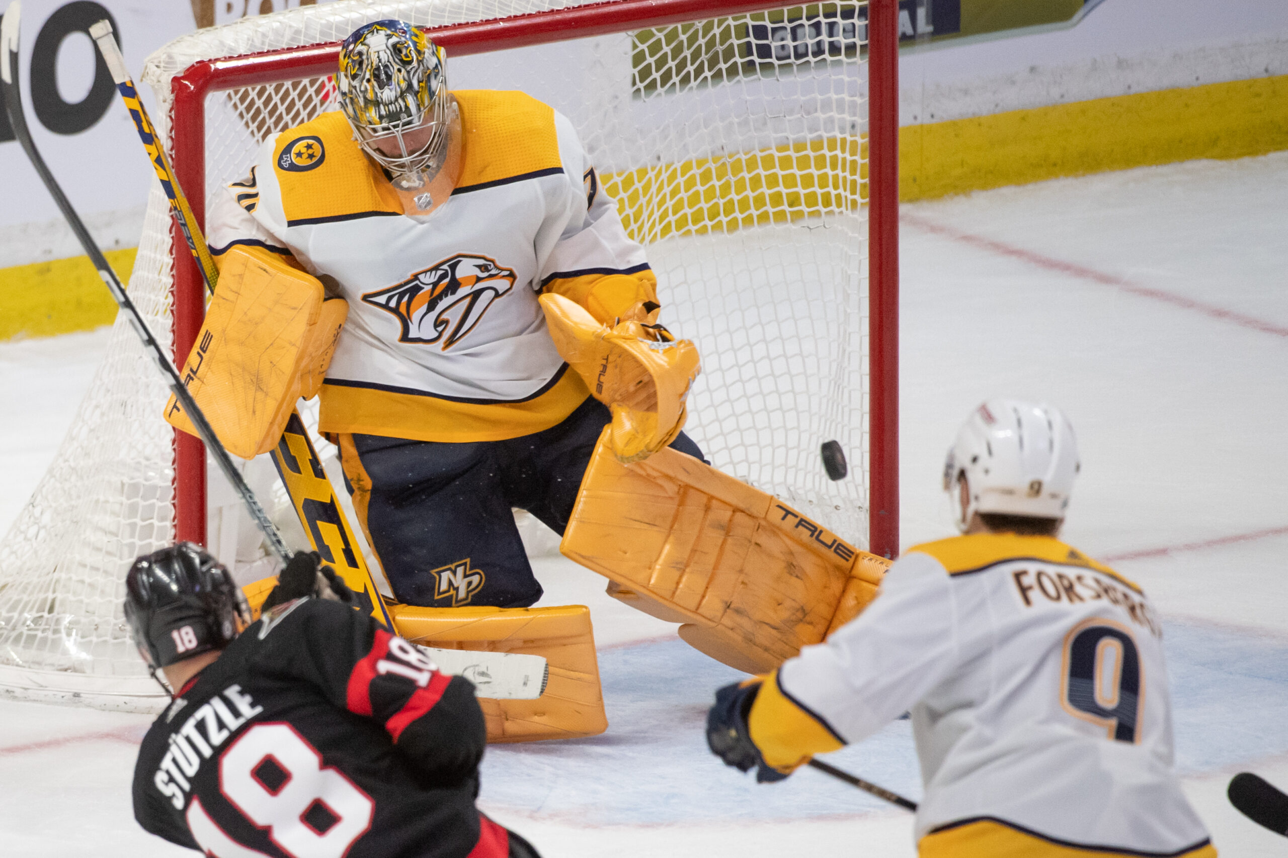
Main photo by: Marc DesRosiers-USA TODAY Sports