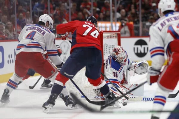
To date in North America, there’s one thing in common about all non-hockey fans. Most people in the United States know of hockey but it still lacks the popularity of sports like football, basketball and baseball. It continues growing year after year, though. Hockey continues gaining exposure on social media, thanks to goals like the lacrosse-style play between Trevor Zegras and Sonny Milano. Zegras, a budding young star, also scored a direct lacrosse-style “Michigan” goal later in the season (and again, a few months later). And certain breakthroughs, like the league’s recent seven-year TV deal with ESPN, create hope that things will continue trending in the right direction.
But not everyone has hopped on the hockey bandwagon in the United States yet. And asking a non-hockey fan what they know about hockey? More than half the time, the answer they provide has something to do with Disney’s “The Mighty Ducks” movie series from the ’90s. And unsurprisingly, that old Mighty Ducks of Anaheim logo carries tons of nostalgia. So much so, that it’s pushing people to hate the Anaheim Ducks’ current logo.
Anaheim Ducks Logo Voted Worst in NHL, Mighty Ducks Voted Best
In a just-for-fun Twitter poll, popular hockey analytics account JFresh collected votes for the best and worst logos league-wide. It went beyond just current logos too. He also aggregated votes on 22 retro logos to stack-rank them simultaneously. With over 3,500 votes, the poll asked respondents to rate every logo on a scale of one to ten, with ten being the best. And while most teams had little to no correlation between logos, there was one extremely notable and telling pair of logos sitting at opposite ends of the vote.
🪅 SURVEY RESULTS: NHL Logo Ranking 🎉
Over 3,500 of you rated each current NHL logo. Here are the results: pic.twitter.com/6iPqNq7qzn
— JFresh (@JFreshHockey) July 20, 2022
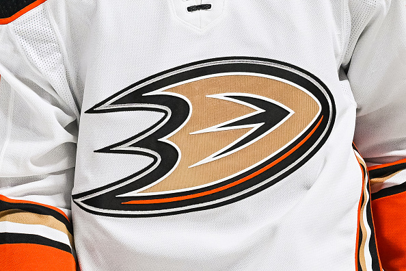
Ducks Change Ownership, From Mighty to Plain
The Ducks logo changed back in 2005, hand-in-hand with their name change. Disney sold the Ducks franchise that summer, but the new owners pledged to keep their new team in Anaheim. However, they took the club through a major rebranding, staying from the original theme based on Disney’s movies and animated TV series. They tried keeping it close, opting to remain “Ducks”. But they were no longer the Mighty Ducks of Anaheim; instead, they became the Anaheim Ducks.
In addition to the name change, the Ducks went through a full change to their colour scheme and logo. The team nixed their purple and teal look, in exchange for a more modern orange and black look. The new colours, especially the prominent orange, remained a unique pallet for the NHL. That being said, their purple and teal were one of the most unique, iconic jerseys in hockey. Perhaps most devastating though was the loss of the “Wild Wing” duck mask logo. Unfortunately, these details harked back to Disney, something the new owner intended to stray away from.
And stray they did, with or without the support of their fans. Let’s be honest, it was very much without their fanbase’s support. If the world needed more proof of that, this poll confirms it.
Anaheim Ducks Vintage Logo Rated First Overall
Among 22 vintage logos, the Ducks ranked first with a stellar-8.3 rating. That put them ahead of some absolutely loved logos across the league, like the Hartford Whalers (7.8) and Quebec Nordiques (7.4). No other logo broke 8.0. And, if comparing it against the rankings for current logos, only the Detroit Red Wings and their Original Six “Wheeled Wing” look reached 8.0. That means, the Mighty Ducks logo rates higher than any NHL logo, past or present.
I also asked you guys to rate some vintage logos. I’m sure there won’t be any hurt feelings here… pic.twitter.com/xQmtiOmCQb
— JFresh (@JFreshHockey) July 20, 2022
If Quebec or Hartford still played in the league, they’d almost certainly be using that same retro logo everyone loved. Only seven active teams had their retro logos ranked ahead of their current ones. And of that seven sit the Winnipeg Jets, who technically exist today as an entirely new, separate franchise. So they really shouldn’t count. But even then, the gap between those other teams’ present and past logos isn’t super wide. The most notable gaps are the Washington Capitals and Florida Panthers.
The Caps currently use a vintage logo from their 70’s and 80’s days (word art with a hockey stick as the “L”). They flipped to this after a full rebrand through the 90s and 2000’s decades. The eagle logo from those years ranked ninth amongst retro looks with a 6.5 score. That sits well ahead of the 4.3 score their current logo received. Similarly, the Panthers rebranded roughly six seasons ago, away from their unique leaping cat logo. Their new shield look got grief for appearing too much like a European soccer logo and ranks 27th in this survey with a score of 4.9. The leaping cat received a 6.6, ranking seventh in retro logos.
Anaheim Ducks Current Logo Rated Last Overall
So, the Caps’ old logo scored 2.2 points better than their current one. The Panthers’ old logo scored 1.7 points better than their current one. And those really were the only significant jumps, besides the Ducks of course. Anaheim’s current logo ranks, again, dead last with a 3.7 score out of ten. That means their old logo scored a whopping 4.6 points better than their current one. Numerically, it is more than twice as appealing to fans.
The best part is that if you mix the polls to stack retro and current logos together, the result remains the same. The Anaheim Mighty Ducks logo ranks first out of all 54 logos in the poll. The Anaheim Ducks logo ranked dead last, 54th out of all 54.
So, what’re we doing? Undoubtedly, every chance the team gets to utilize their logo, jerseys fly off the shelf. Maybe there’s a method to that madness; currently, it’s a really good way to blow up sales from time to time. Bringing the look back full-time might make the appeal wear off. When fans think of the Mighty Ducks, of Paul Kariya and Teemu Selanne, the old purple and teal era comes to mind. But when thinking of John Gibson and Ryan Getzlaf, it’s the new orange and black era. Maybe, someday, both will carry at least some nostalgia with hockey fans. Two decades in, though, and fans still don’t see much appeal in their uniforms today. Ultimately, bringing back full-time would surely make a lot of hockey people happy.
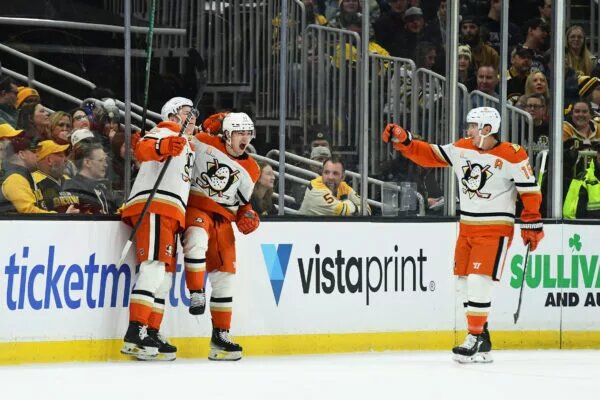
Main photo:
Embed from Getty Images