The FIFA Women’s World Cup is set to kick off in about 40 days. Due to the hemisphere seasonal changes, the World Cup begins later than usual, with a July 20 start. Australia and New Zealand are the hosts for the tournament, in which the U.S. women’s national team will look to three-peat their title, and the first-time expansion to 32 teams.
Kits are always a hot-topic during World Cup tournaments. Last year, the 2022 men’s World Cup had some knockout kits, but some were also too plain and dropped the ball. This year, the women’s World Cup has the same issue.
Ranking the 2023 FIFA Women’s World Cup kits
Please note, kits for Zambia and Morocco have NOT been released as of publishing.
There are 30 kits we are ranking, since two have not been released. These will be broken up in categories of five, with six categories. The categories are as followed:
- You’re at the WC, Do Better
- Meh, It’s a Shirt
- It’s OK
- Getting Closer…
- I’d Buy It
- Shut up and Take my Money!
Without further ado, here are the best — and worst — kits for the 2023 FIFA Women’s World Cup.
You’re at the World Cup, Do Better
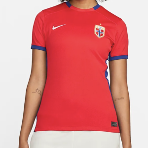
30. Norway
Do better. This is a red shirt with a Nike label slapped on it! I see the navy blue hints around the arms and the neck, but that’s not enough. Nike dropped the ball at the 2022 men’s World Cup last year. This was not a good start for Nike a year later.
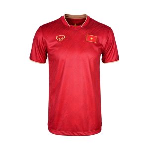
29. Vietnam
A debutant at the World Cup, and Vietnam are wearing a red shirt. I dig the flag instead of a regular crest but also… it’s a red flag. It blends in too much with the shirt.

28. China
These teams really love their red shirts! I’ll give China a bit of credit for having a yellow crest, yellow Nike logo and yellow around the neck and arms. Either way, it’s too bland. Red is going to have a big World Cup, though.
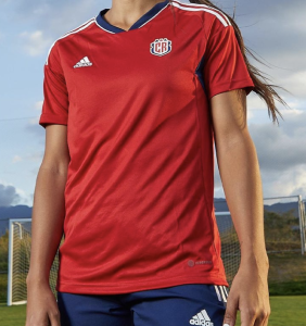
27. Costa Rica
I hate to do this. If you follow me on Twitter, you know that I am a big fan of my beloved Ticas of Costa Rica. Four years ago, Costa Rica didn’t make the World Cup (thanks to poor officiating in Concacaf, they were robbed). Again, it’s a red shirt. But a couple things give Costa Rica an advantage over the other ‘reds.’ Costa Rica got rid of their partnership with New Balance (still scratching my head over that) and joined the Adidas team. While I’m still not sold on the new crest compared to the older one, I appreciate the combination of white, red and blue — Costa Rica’s colors. Either way, it’s still bland. Their white kit is worse, though.
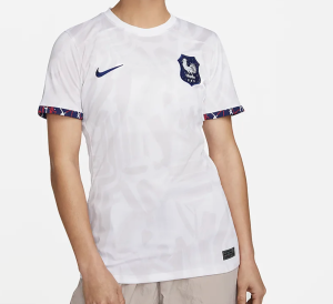
26. France
Cue the meme of the Miss Universe contestant screaming “FRAWANCE.” Creative sleeves aren’t enough. And the pattern is so dull and it’s, say it with me, white! It blends into the kit itself. France has a better second option for their home matches, but this one is rough.
Meh, It’s a Shirt
25. Haiti
Haiti is, without a doubt, my favorite story at the World Cup. They have such a young, talented, bright squad. Mexico hosted the Concacaf qualifiers last year, and no one expected Haiti to break out and snag a spot for the FIFA inter-confederation playoffs. Two Concacaf teams won in the playoffs, along with Panama. The region is sending six teams to the Women’s World Cup. That’s a big deal, and shouldn’t be overlooked. This kit, it has some positives, but the blue is too dark to really see the patterns on the shirt. It’s a shirt, because I can’t see the pattern. If the blue was lighter, we’d have a Top 10 kit.
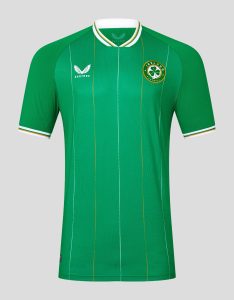
24. Republic of Ireland
Another World Cup debutant, the Republic of Ireland have their signature green kit going with them to Australia and New Zealand. The kit is pretty plain, and the lines down the the middle and sides are distracting. They look almost washed out. The collar gets points, though, for incorporating an old-school look that Ireland proudly dons.
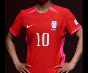
23. South Korea
I see what South Korea is attempting to do with the pink, but the fact that it’s a really bright red and a fuchsia pink don’t really mix well together. I like the big, bold letters, but the pink is so drowned out by the bright red. Points for effort, but they missed the mark.
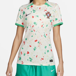
22. Portugal
This is the definition of doing too much. Portugal will also be wearing their signature red-and-green look. This kit, though, looks like my nieces, both under the age of six, drew on it with red and green marker. There is no flow with the different shapes. It just looks like a parent would be happy a child drew on a shirt, rather than the wall.

21. Netherlands
I give the Netherlands points for creativity, and doing something new. The white background on the crest clashes with the dark background on the kit. But, there isn’t too much they can do about that. With a little bit more flow than the Portugal kit, it just looks like the cover of Lifehouse’s album “Smoke and Mirrors.”
It’s OK
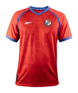
20. Panama
Give it up for another debutant, Panama! Panama has a similar kit to Haiti, their Concacaf counterpart. They both qualified thanks to the inter-confederaton playoffs. However, while Haiti’s kit is too dark to see the pattern, Panama has a good red hue to highlight the octagons. However, it’s a boring pattern. I give Haiti points for the blue lines going down to the arms. It’s a decent kit.
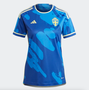
19. Sweden
It looks like a pond? Or it looks like someone spilled bleach on the shirt. Either way, it’s not my favorite of the Adidas kits — and Adidas really hit it out of the park with some others. Yellow could have been incorporated more.
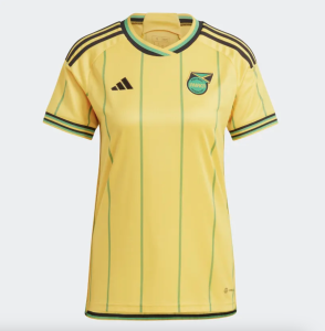
18. Jamaica
Jamaica… it’s not the worst, but it’s not the best Jamaica kit. In all fairness, Jamaica’s navy kit from 2022 and the 2021 kits were just breathtaking. I do appreciate the old-school style, but this is a team of young, powerful players. I don’t think the ‘old school’ and almost baseball style fits Jamaica. They’re vibrant, they’re young. They need something to match that!
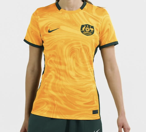
17. Australia
One of our hosts for this summer’s tournament, Australia is breaking out a kit that… looks like past kits. I like the swirls on it, and it’s not too busy. It’s rooted in tradition for Australia, but it’s not eye-popping either. But, Australia’s play will be something to watch this summer. I mean, how can you not watch Sam Kerr?
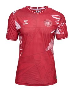
16. Denmark
It’s a little too busy for me, but I give Denmark plenty of points for creativity. There’s a lot to the pattern, including a stamp-like design. However, it’s creative and that’s what we’re here for. I mean, look at last year’s World Cup. Lack of creativity hurt, especially with the African teams.
Getting Closer…
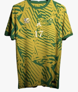
15. South Africa
I don’t love this kit, but I don’t hate it. Sure, it’s busy, but it’s not just a plain yellow or green kit. My biggest gripe is two things: the pattern doesn’t really flow and the numbers are way too small. Other than that, hey, it’s creative and it pops.
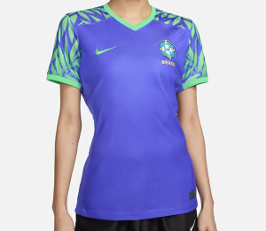
14. Brazil
Of course, Brazil is going to wear the canary yellow kits. That is their signature design, after all. Brazil’s secondary kit is simple, but the flower-leaf design on the side is what makes it pop. I like the light green color, and how the crest is tinted to match it. The blue-ish purple is nice, too. It’s a very pastel-inspired kit, but it’s the perfect blend for a summer World Cup.
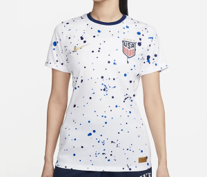
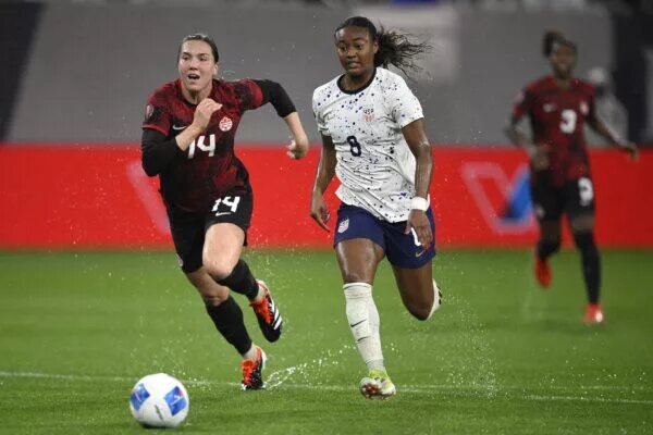
13. United States of America
Contrary to mixed fans, I like this kit. I don’t love it, per se, but I do like it. The placement of the stars is great, and I hated when it was three stars on a row, with just one up top. The gold Nike logo is fitting, considering the U.S. are the returning champions. But, I don’t think it’s a boring kit, and it reminds me of a snow globe. Plus, it’s not just stripes. Points for that!
12. Philippines
My highest-ranking debutant — Morocco and Zambia are still unknown — the Philippines took stripes and did it right. I love the sideways stripes. I don’t mind that it’s a red and a darker red, it looks cool. But, I do knock the Philippines to “Getting Closer…” because of the lack of maybe a black or white collar. But either way, this is a cool kit for a debuting team. It’s not boring, that’s for sure!
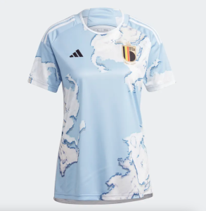
11. Belgium
This is a pretty cool kit because the design isn’t boring and it looks like a couple different things. It looks like a river through the Arctic, or it looks like clouds through the sky. It’s a nice kit, and sure, the crest does clash, but it’s different and unique.
I’d Buy It
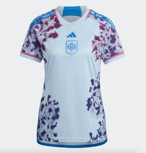
10. Spain
Now we’re getting to the good stuff! Spain’s flower kit gets a lot of points. I like the fact that the crest matches the jersey (Belgium could have been in this spot if that happened on their sky-blue kit). The purple color of the flowers is good, and it blends well with the light blue background. The adidas logo and the placement of the crest aren’t my favorite, and honestly, they could have avoided flowers on the shoulders with the Adidas three stripes. But overall, it’s a creative, fun, pastel-y kit.
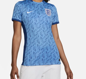
9. England
Busy, yes. Cool? Oh yes. I love the design and the pattern. This is what Portugal could have been if there was more consistency with their design. I don’t hate the combination of light and darker blue. It’s a good kit, it matches the England crest and it’s better than what Nike has given us before. Also, the navy blue sides are a nice touch.
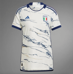
8. Italy
Italy’s marble-style kit is nice and the colors are certain ‘smokey.’ I don’t mind the red and the green sticking out on Italy’s crest. It’s not my favorite kit, but I would still spend money on it. The marble design is worth it, and I like the hint of gold marble as an undertone. Very smooth from the Italians, who had a World Cup to remember in 2019.
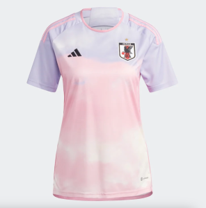
7. Japan
Pink isn’t my favorite color, but goodness this is a nice kit. The combination of purple, white and pink is smooth and it is going to look great on the Japanese players. This is a kit that screams creative. The ombre-style makes the transition from pink to purple smooth. The black Adidas logo is a bit disruptive, but other than that, it’s a great kit.
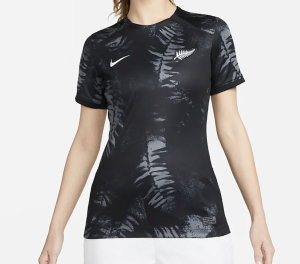
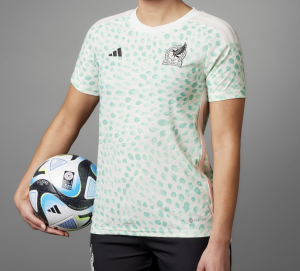
6. New Zealand
The Football ferns have a kit of … ferns! I love the incorporation of their crest on their kit. Some say it’s boring. Some say it needs color. I think it’s perfect. Honestly, it works well with New Zealand, a team that wants to be a dark horse in this tournament and is constantly overshadowed by fellow co-host, Australia.
Shut up and Take my Money!
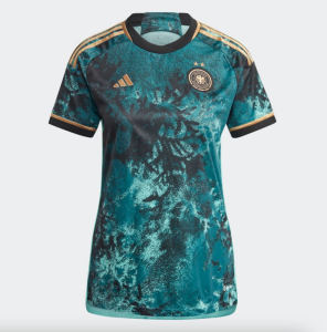
5. Germany
Spoiler alert: all of Adidas’ kits that have this style are in my Top 5. I adore the design and the splash of colors. The crest blends well with the dark and midnight blue design. There are dark colors, lighter colors and a hint of gold. Germany hit this one out of the park. The best part is the three stripes being gold.
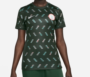
4. Nigeria
Is it as good as the 2019 or 2022 World Cup kits? Not quite, but it’s still unique. Nigeria always serves a ‘Top 5 worthy kit,’ and they did so again in 2023. The video-game design is cool, and the hint of pink is a welcome addition for a team that regularly uses green, white and black. It’s unique, but not as good as Nigeria kits from the past. Still, it’s Top 5 material.
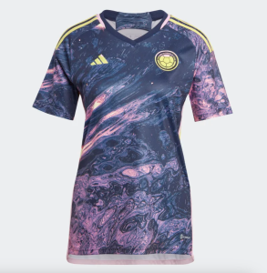
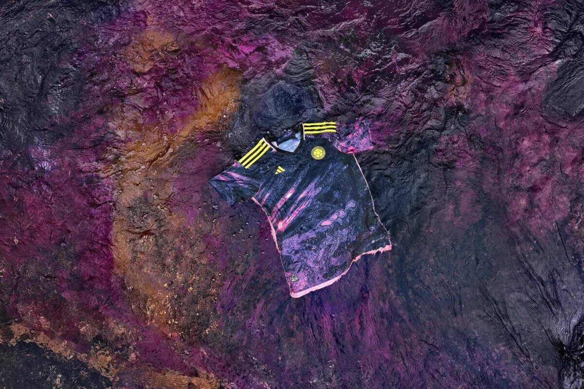
3. Colombia
I went back and forth on which Adidas kit should be No. 1 — spoiler alert? Colombia’s kit takes you to outer space. After missing the tournament in 2019, Colombia is coming back, and doing so in style. I love the yellow Adidas logo and the crest, along with the three stripes. It doesn’t clash with the purple, pink and dark blue. Actually, it quite compliments it. No matter where Colombia finishes in the tournament, at least they have a wicked kit.
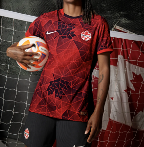
2. Canada
Oh… Canada! Canada knocked it out of the stadium with this kit. It looks like a video game, and very futuristic. I love the dark maple leaves on the kit. While they could have tweaked the crest to be a little darker, everything about this awesome. However, it’s hardly a red shirt, with the cool design and the connecting dots. This is the highest ranking Concacaf jersey, and for a good reason. Way to go, Canada.
And… the No. 1 kit is…
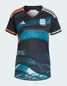
1. Argentina!
Argentina, what a kit! The team’s first World Cup appearance was in 2019, and now they’re coming back in 2023 with a sick design. I love the black, white and blue. It looks like the Northern Lights. Bonus points for the sky-blue tinted crest. I don’t know where they got the orange from, but I don’t care, it looks cool. Of course, Argentina will be wearing their signature blue and white kit, but this is a top-notch secondary kit. Colombia could have been No. 1 too, but something about the blue just stands out.
P.S. — Pour one out for Mexico. El Tri Femenil did not qualify, but they had a great kit regardless for this year.
See how we ranked the kits for the 2023 NWSL season, too! Yes, we dove into *that* Portland design.