The Army-Navy rivalry is one of the oldest in all of college football. It’s also the most “classic” of the great rivalries — the game that most harkens back to the early days of college football. There is still a lot of connective tissue between the game today and the way it’s been for well over one hundred years. The players are still students first. The entire student bodies from both schools attend the game. And the pre-game traditions are, literally, as old as the game itself.
Ranking Army’s Rivalry Series Uniforms
But in the last seven years, Army has partnered with Nike to add a new fresh, and modern tradition to this classic rivalry: the rivalry series jerseys. Sometimes uniform efforts in college football miss the mark. Often times they lack meaning and significance. Not so with the Army rivalry series. Army and their apparel partner have absolutely nailed it in the seven-year effort.
Background
Army and Nike have hit the marketing jackpot: they’ve created smart, sharp, modern, and aesthetically pleasing uniforms that have an unmatched depth of meaning across college football. The looks appeal to all college football fans — not just Army and Navy fans. In a game that needs as much marketing support as possible, this effort drives significant interest in the two weeks leading up to the game.
But more importantly, West Point’s history department has made sure that each iteration of the uniform has significant meaning for the Army that the institution represents. That’s the element that sets this series of alternate uniforms apart from every other alternate uniform in college football.
See The In-Depth Meanings and Representations of Each Year’s Uniforms Here
This not only builds brand loyalty to a natural fan base that, admittedly, Army hasn’t cultivated well over many years, but it also helps Army West Point tell the overall Army’s history and story to all those that tune in for the game. That makes it a little easier to ask for a little more money next go around.
This is the seventh year of Army’s rivalry series uniforms. We rank each Rivalry Series uniform:
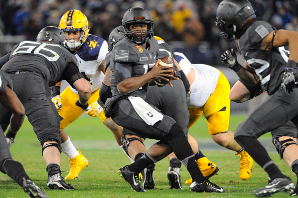
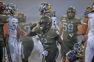
7. 2019: 1st Calvary Division
Being seventh on this list is like finishing last in the Olympic 100-meter dash. It might not look so great at the moment, but when you realize you’re still the eighth fastest person in the world, it lessens the blow a little bit.
The nod to the Air Cavalry of the Vietnam era was a nice touch, but Army didn’t do enough to emphasize the Vietnam War era connection. The matte olive drab helmets were nice. But there were too many things going on with this uniform — two tag stripes on the upper portion in addition to the school crest and Nike swoosh, the unit patch on one side, the flag on the other, and numerals. Also, the coloring of the shoulder pad area — especially on an away white uniform, was unnecessary. The trousers and helmets would have created the offset appearance perfectly fine. That was accentuated by the classic shoulder pad strapping of the Navy uniforms that year.
A solid effort, but one of the uniforms has to be seventh on this list.
Plus, that year was a Navy win.
6. 2021: Special Forces Command
Last year’s rivalry series was the first, and still only, uniform to reflect a unit that isn’t an Army Division. It represented the Army’s Special Forces Command and was meant to honor the United States Army’s response to the September 11th terrorist attacks and, more specifically, Task Force Dagger.

This uniform was heavy on meaning but missed the mark with the imagery. There’s so much you can do with the Special Forces theme, but the desert camouflage wasn’t the best look for either Special Forces or for the Global War on Terror. This combination may have been better to save for a home jersey and then hammer the black look — something they’ve done quite well (See 1st Infantry and 82nd Airborne below).
But even with the coloring nit-picking, the uniforms are sharp. It’s almost impossible to make crossed arrows look bad. And the Operational Detachment-Alpha unit designation patches over the U.S. flag were a nice touch. Task Force Dagger led the early invasion into northern Afghanistan on horseback, so that connection — and the unit patch — justifies the desert camouflage and, in the end, ties everything together.
Also, this was a Navy win as well.
5. 2022: 1st Armored Division
This year’s iteration comes in at fifth. It’s a little unfair because we haven’t seen them in action or against the Navy “Astronaut” uniforms on the field nor do we know if it’s a winning uniform. But, we’ve seen the uniform so it gets a ranking.
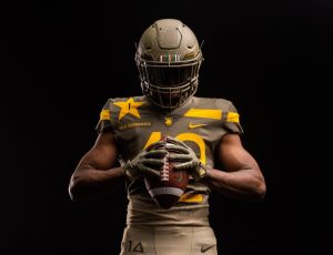
Look, there’s a lot to like in this uniform. The almost matte, almost olive drab on the upper half looks great. The yellow vertical piping across the shoulders, especially with the same color helmet, nails what the 2019 uniform missed. The inclusion of the player’s cadet regiment in the prominent yellow star adds a much-needed personal touch.
The only knock on this uniform is the mud splatter pattern from the trousers to the jersey and again on the helmet. Maybe if they kept it to just the trouser-jersey transition and left the helmet completely olive drab it would have come off perfectly. The accent lettering is also well done on this version, although the main numerals may be a little too thin for television.
If Army wins, this uniform might get bumped up a notch or two.
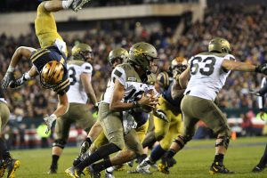
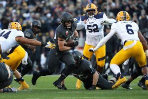
4. 2018: 1st Infantry Division
To recap — 2019, 2021, and 2022 are great uniforms with a lot to like. But the top four are nearly flawless alternate uniforms.
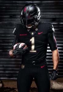
Seriously. As nice as these all-black uniforms looked in the release photo shoot, they looked even better on the field with a less glitzy sheen on them. The classic matte black, with gold numerals and accented with deep red secondary lettering were a masterpiece of gridiron fashion.
They looked even better against Navy’s lackluster effort that year. The Mids went with a plain white with just a juiced-up helmet. They didn’t even bother to play in the uniform game.
And the symbology is great as well. That deep red is the same red as “The Big Red One” and this particular unit is one of the oldest units in the Army. Fitting for such a classic black/gold uniform combination.
And, of course, it was an Army win that year.
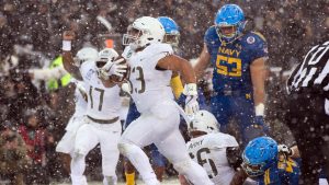
3. 2020: 25th Infantry Division
One thing COVID didn’t get to was the 2020 Army Rivalry Series uniform. Honoring the 25th Infantry Division, Tropical Lightning, the game was played in a fog on the Hudson River due to COVID.
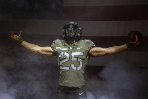
When you think “Army”, green is the first color you think of, and with good reason. This two-tone masterpiece should hang in the halls of any sports marketing firm. The off-white stenciled numerals were the <chef’s kiss> perfect accent in the foggy weather for the combat-looking uniforms.
Juxtaposed with the “Seafoam” Navy helmets and uniforms, this inspired creation looked even better. The worn-looked unit patch on the helmet was also brilliant. And while lettering on the trousers is almost never a good idea, when it reads “Wolfhounds”, you can most assuredly pull it off. One of the more underrated units in Army history, their dogged fighting in the Pacific theater during World War II is the stuff of Army lore, and this regiment has more Medal of Honor recipients than any other Army regiment going back to the Spanish-American War.
And, yes, this was an Army win year.
2. 2017: 10th Infantry Division
Sometimes this universe comes to perfect harmony. The planets align. The equinoxes. And the 2017 Army Rivalry uniforms. Those are examples of perfect alignment in the universe.

On its own, this uniform is probably middle-of-the-pack. But on that cold, snowy day in Philadelphia, it was just about as perfect as a football uniform could be. All white — no odd piping or striping — with just some Army green numerals, it was the perfect tribute to the Army’s “Mountain Division.”
Navy brought their A-Game that day, as well. The Mids donned ocean blue uniforms with powder blue helmets. That color contrast was a thing of college football beauty. Think USC-UCLA, except in snow.
The absolute best part of this uniform was the vertical gold bar on the back of the helmet. Modeled after the white bars on the back of Officer’s helmets during the Normandy Beach landings, it was a simple stroke of symbology that carried enormous meaning and was perfect for a team full of men who would soon be leading Soldiers just as the mark inspirations had 62 years prior.
And it was Army’s first two-game winning streak in the series since 1996.
1. 2016: 82nd Airborne Division
Absolute. Perfection. Army’s first win in 15 years. The Army’s most storied unit. And the perfect college football uniform. The 2016 Army Rivalry Series was it.
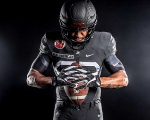
That matte black. That “All American” name tag. That numeral font. The Devils in Baggy pants. The skull and crossbones tactical unit identifier on the backside of the helmet. And to top it all off, the parachutist’s webbing on emblazoned on the helmet.
Hang this one in the Louvre. It just doesn’t get any better than this.
Honoring one of two units that parachuted in behind enemy lines during D-Day, 1944, and in Italy and Belgium as well. It’s been rumored that Vegas changed the lines on this game immediately after seeing these uniforms for the first time. Put up next to Navy’s high school All-Star game get-up, this game was never in doubt.
Rarely in life do we see something so perfect. The Godfather. The Mona Lisa. Mikhail Baryshnikov. Add the 2016 jerseys to that shortlist.