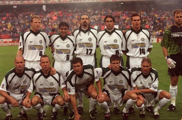
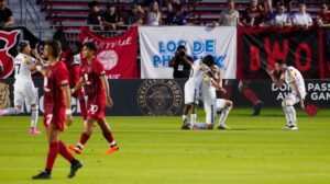
The Colorado Rapids are a founding member of Major League Soccer. They were established on October 17, 1995 and played in the inaugural season in 1996. They’re one of the few MLS original to go through multiple rebrands and color changes. Let’s take a look at their history and the symbolism behind it all.
A History of the Colorado Rapids Name and Colors
A brief history
There were ten clubs that competed in the very first year of the competition back in 1996. Colorado were joined by Columbus Crew, Dallas Burn (now FC Dallas), D.C. United, New England Revolution, New York/New Jersey MetroStars (now New York Red Bulls), Kansas City Wiz/Wizards (now Sporting Kansas City), LA Galaxy, San Jose Clash (now San Jose Earthquakes) and Tampa Bay Mutiny. Tampa Bay folded in 2001 along with Miami Fusion.
1996 ↔️ 2020
Originals. 🔥 pic.twitter.com/8amp6BHQAB
— Major League Soccer (@MLS) February 6, 2020
Origins of the Colorado Rapids name, colors, and crests
Almost every sports team in Colorado has a nature related name. The Denver Broncos, CU Buffalos, and CSU Rams all take names for the native animals. Then there’s the Avalanche, Nuggets, and Rockies to round out the other major professional teams in the front range with mountain-related names. Colorado’s MLS team took the best available themed name, opting for the rivers and a complement to the winter themed Avalanche. It’s not obvious how the club settled on this name. There doesn’t seem to be an internet record of a fan vote, write in contest, etc. In any case, the team’s name, theme, and symbolism are straight forward.
Colorado Rapids played at both iterations of Mile High Stadium, playing at old Mile High from 1996-2001. They began play at Dick’s Sporting Goods Park, their current home, in 2007. Colorado won their only major trophy in club history in 2010, defeating FC Dallas at MLS Cup 2-1 in extra time. These stadium moves happened the same years the Rapids had crest and color rebrands.
Here is the Round of 16 thread of the HTHL Vote for the Best Kit in #Rapids96 History. Voting for this round ends Saturday May 23rd. Round Three will start on the 24th. #MLS #StrengthAtAltitude pic.twitter.com/Nb7xqO57ck
— Holding The High Line (@rapids96podcast) May 17, 2020
The Rapids started out with their “river” crest with green and white kits, with variations that included gold or black accents in the MLS 1.0 era. It’s not clear why the team went with green as the primary color. It completed the color wheel for MLS, as there’s no other team with green as its mail color. Corporate might have started its single-entity theme by saying “hey Colorado, we need a green team. You’re the green team.” The green and white could be a reference to the state’s license plate similar to the Rockies City Connect uniforms. Colorado State University’s colors are also green and gold.
From 2003-06, the Rapids wore vertical blue and black stripes, exclusively with the circular logo, retiring river crest. The secondary kits were all white. When the Rapids moved into DSG Park, they rebranded to the Burgundy and Blue they wear to this day. These colors match that of the Colorado Avalanche, also owned by KSE. The dark red/brown color comes from the origins of where the word Colorado comes from. It’s not obvious whether the blue is for the sky or the water of rivers, but my guess would be water. The sky is more of a deeper blue (see the state flag) at this altitude.
Embed from Getty Images


